As part of our new website redesign, we’ve added a lot of new features and integrated various technologies to optimise your browsing experience wherever you are and whatever kind of device you’re using.
Here’s a quick guide to some of the things we’ve implemented along with helpful links so you can learn more and use them for your own projects.
ExpressionEngine
One of the most fundamental changes is that we’ve now started using ExpressionEngine for the front-end of the main heartinternet.uk site.
The primary reason for this is because of its incredible flexibility; our designers created the new look and framework and ensured EE was set up to power it exactly as we wanted, rather than the typical opposite approach of designing to fit the existing framework of the CMS.
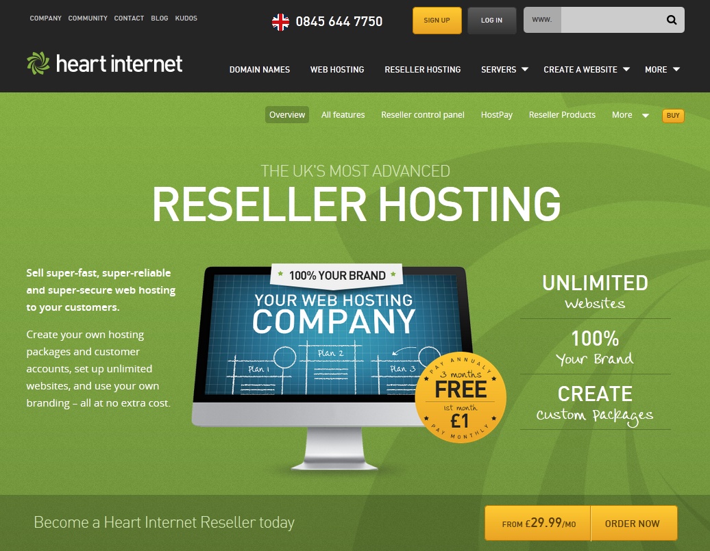
Another big advantage is that we could create a series of versatile design components that could be easily restyled exactly as we needed for each particular product or page. This ensured the new look was consistent across the board, but was still flexible enough to give each of our services the individuality needed to explain it and showcase it to its full potential.
If you’re interested in finding out more about EE, take a look at these links:
- ExpressionEngine developer’s toolbox
- A newbie’s guide to ExpressionEngine
JavaScript & jQuery
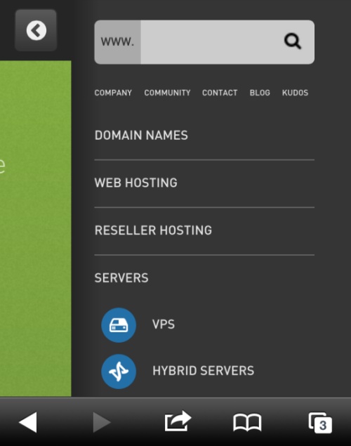
We’ve utilised various snippets of jQuery and JavaScript across the new website, but the most significant is the mobile-friendly navigation. Whenever you view heartinternet.uk on a smartphone or tablet, you benefit from practical jQuery-powered navigation that works quickly and efficiently to ensure that you aren’t kept hanging around waiting for pages to load. Searching for domains and ordering hosting is faster than ever.
We also modernised the 360 Name Finder using some fun JavaScript and bold colours that work well on both mobile and desktop computers. If you’re using a phone or tablet, simply go to https://www.360namefinder.co.uk for fast domain name and social media username lookups on the go.
We’ve written a post on 22 practical jQuery plugins for designers and developers, but you might also want to check out:
HTML5 & CSS3
Much of the new Heart Internet website utilises HTML5 and CSS3, which means we’ve been able to introduce a lot of detailed styling and interesting design features without adding to page load times in the way that image equivalents would.
Whilst HTML5 and CSS3 are still a good way off becoming the norm, selective use of the latest markup and stylesheet code balances great new design features with the need for supporting older browsers.
A while back we listed a wide range of tutorials and guides to both HTML5 and CSS3 that are still relevant today. Take a look at:
Responsive Design
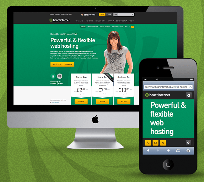
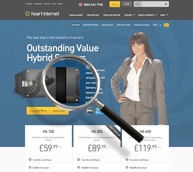
Responsive design has become so much of a bandwagon term in the industry that it can sometimes feel like a trend rather than a necessity, but it’s vital that your website works for a vast range of screen resolutions, especially if you have a web-based business.
Designing for consistency and practicality on such a wide range of devices and for so many resolutions is always going to be a challenge for any web designer. We’ve spent hundreds of hours optimising the new Heart Internet website so that it’s quick, attractive and functional from the smallest smartphone to the largest iMac.
Find out more about getting started with responsive design with these handy articles:
- Responsive web design guidelines and tutorials
- Ultimate guide to responsive web design: 55 stunning tools, tutorials, and examples
Designed for Retina Displays
We’ve designed our website images to provide optimal viewing on Retina displays. If you’re looking at Heart Internet on an iPhone 4 or newer, a third generation iPad or later, or the latest 13” and 15” MacBook Pros, you can enjoy excellent high-quality images that are perfect down to the very last pixel.
With more pixels per inch (PPI) and pixels per degree (PPD, which takes into account the distance viewed from as well as resolution), images for Retina displays are bigger but have the advantage of more detail than when viewed on normal screens. If you don’t have a Retina display, don’t worry – you’re not missing out on any information or seeing completely different images, it’s just a more aesthetically-pleasing bonus!
If you’re thinking about designing for Retina displays, you may find the following articles useful:
- How to create Retina graphics for your web designs
- Designing a responsive, Retina-friendly site
Which of the new things we’ve introduced are must-haves for you when you’re designing or viewing websites? Let us know in the comments!
I loved the new look of your website I am a reseller
I am just curious is there any update coming for eXtend e.g where people can create database with their own desired name instead of auto generated ones
Or are you gonna give or make options where when the reseller is assigning a hosting package to a domain to choose from 2 control panels
eXtend or cPanel
Hi Ahmad,
Thanks for your kind words about our new site. We’re currently looking into refreshing eXtend but we aren’t considering using cPanel as an alternative to eXtend because we believe that eXtend is a more powerful control panel.
Cheers,
Rob