Whether you are starting from a blank page or you want to make an existing website responsive, doing it with Sculpt is really easy. In this post I will walk you through how to create a simple business landing page using Sculpt.
I haven’t edited the CSS so that you can use my example .html file with a fresh install of Sculpt.
All the components I used can be found in the example index file that comes with Sculpt, and by visiting Font Awesome to see all the icons you instantly have access to.
Let’s get started…
Creating a website using Sculpt is a lot like building a wall, with each row 12 bricks wide. Your content can be divided amongst all the 12 columns or it can cover one (and anything in-between) as long as the total is 12. If you choose to include a component that is only eight columns wide, the four you leave blank still contribute to that total of 12.
| 1 | 2 | 3 | 4 | 5 | 6 | 7 | 8 | 9 | 10 | 11 | 12 |
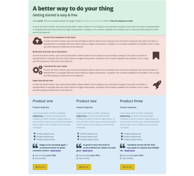
For example, on the page I have created, the header row is the full 12 columns wide (shaded green), with the sales pitch rows using an interchanging 1 column by 11 column lay out (shaded red). That is then followed by the product pods which use one row that is 3 x 4 columns wide (shaded blue).
The HTML to create the header is as follows:
<div class="row"><!--Header row starts --> <div class="column twelve"> <h1 class="tighter">A better way to do your thing</h1> <h3 class="tight">Getting started is easy & free</h3> </div> <div class="column twelve"> <p>Hello <b>world</b>. This is <i>an example website</i> for <a href="https://www.heartinternet.uk/sculpt">Sculpt</a>. Sculpt is a <span class="light">responsive framework</span>. And it is <span class="extrabold extralarge">free for anyone to use!!</span></p> </div> </div><!-- row ends-->
The code to create the sales pitch 1 column and 11 column lay out is:
<div class="row"><!--Sales pitch row starts-->
<div class="column one">
<p><i class="fa fa-cloud-upload fa-5x"></i></p>
</div>

<div class="column eleven">
<strong>Access from anywhere in the cloud</strong>
<p>Ut enim ad minim veniam, quis nostrud exercitation ullamco laboris nisi ut aliquip ex ea commodo consequat. Duis aute irure dolor in reprehenderit in voluptate velit esse cillum dolore eu fugiat nulla pariatur. Excepteur sint occaecat cupidatat non proident, sunt in culpa qui officia deserunt mollit anim id est laborum.</p>
</div>
</div><!-- row ends-->
And the code to create one of the product pods is (you simply repeat this another two times to get your three pods):
<div class="row"><!--Product row starts--> <div class="column four"> <h3>Product one</h3> <p class="bold">Product strap line</p> <p class="light">Lorem ipsum dolor sit amet, consectetur <b>adipisicing</b> elit, sed do eiusmod tempor incididunt ut labore et dolore magna aliqua. Ut enim ad minim veniam, quis nostrud exercitation ullamco laboris nisi ut aliquip ex ea commodo consequat.</p> <ul class="fa-ul"> <li><i class="fa-li fa fa-tags"></i>Product feature one</li> <li><i class="fa-li fa fa-group"></i>Product feature two</li> <li><i class="fa-li fa fa-comments"></i>Product feature three</li> </ul> <p class="extrabold"><i class="fa fa-quote-left fa-3x pull-left"></i>Happy to be renewing again. I recommend them for great customer service - <a href="#">Read more</a></p> <form class="styled"> <input type="radio" checked="checked" name="radios-01" id="option-01"/><label for="option-01"><span </span>Pay annually <b>(save 10%)</b></label><br> <input type="radio" name="radios-01" id="option-02" /><label for="option-02"><span></span>Pay monthly</label> </form> <a href="#" class="button attention"><i class="fa fw fa-shopping-cart"></i> Buy now</a> </div> </div><!--Row ends-->
Images and Icons
In my sales pitch rows and product pods you will see I have used a variety of images, including clouds, bookmarks, cogs and a rocket; these are all taken from Font Awesome. To use any image from Font Awesome, simply change the name within the class. For example:
<i class="fa-li fa fa-bars”>
<i class="fa-li fa fa-bolt”>
<i class="fa-li fa fa-cogs”>
…and so on.
You can see all the available images here https://fontawesome.io/icons/ and examples on how to use them here https://fontawesome.io/examples/.
Quick and easy to get started
Once you start to implement the idea of rows and columns up to a total of 12 you’ll find creating your responsive website with Sculpt is incredibly quick and easy. Thanks to its simplicity, using Sculpt on an existing website is as hassle free as possible too.