We’re all so focused on web 2.0 and the newer era of social networking websites and start ups that it’s easy to forget just how much web design and development has changed over the past few years. With that in mind, we’re heading back to the bygone years of 1997, 2001 and even 2007 to see what some of the web’s most well-known websites looked like back then.
Apple
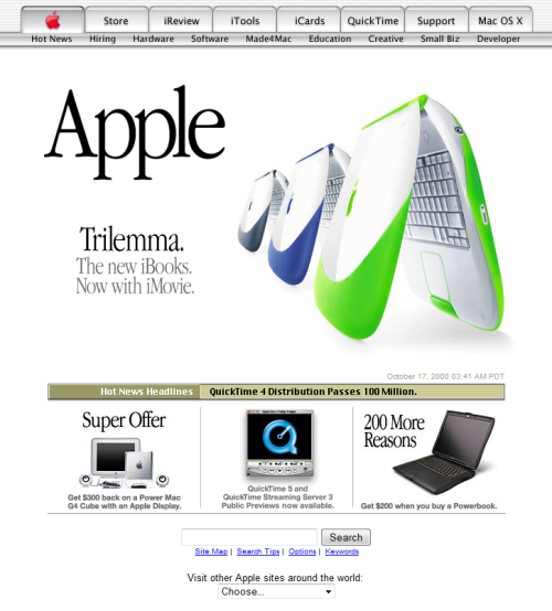
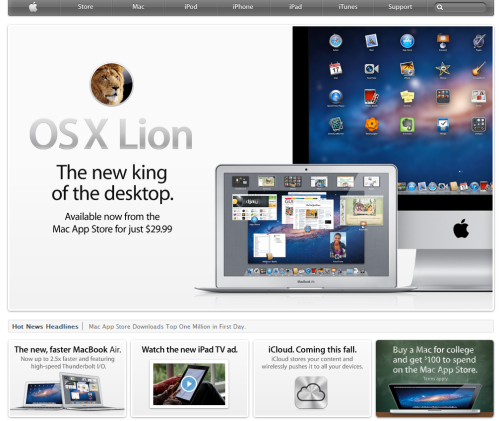
Back in the year 2000, Apple.com had an eerily similar layout and the same trademark simplicity it has today.
Apple.com in 2000
Apple.com today
BBC
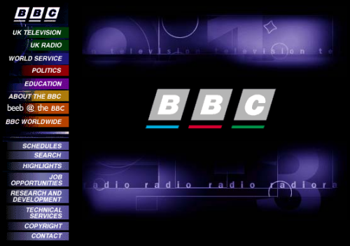
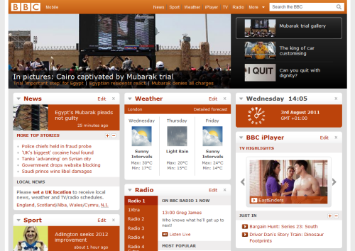
Over the past fourteen years, the BBC website has moved on from frames and a splash page to being an attractive at-a-glance news website.
BBC.co.uk in 1997
BBC.co.uk today
Coca Cola
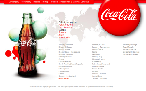
It’s difficult to identify which is the older design – Coke’s 2003 website design has barely aged over the past eight years.
CocaCola.com in 2003
CocaCola.com today
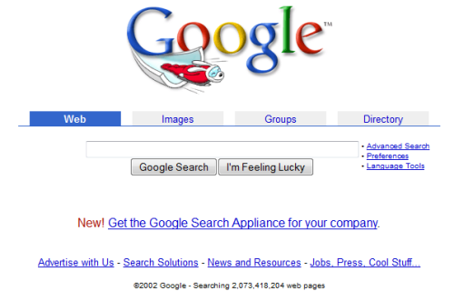
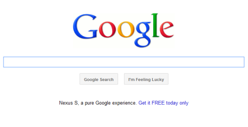
Google is notorious for keeping a similar style since its creation; however, even its simple homepage has changed over time.
Google.com in 2002
Google.com today
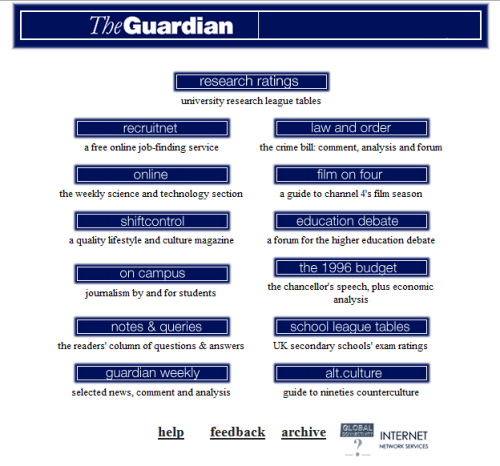
The Guardian
Another example of how a simple button website has been fleshed out into a modern news website.
Guardian.co.uk in 1996
Guardian.co.uk today
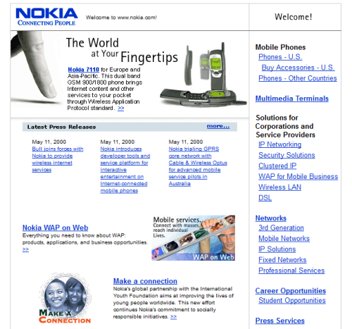
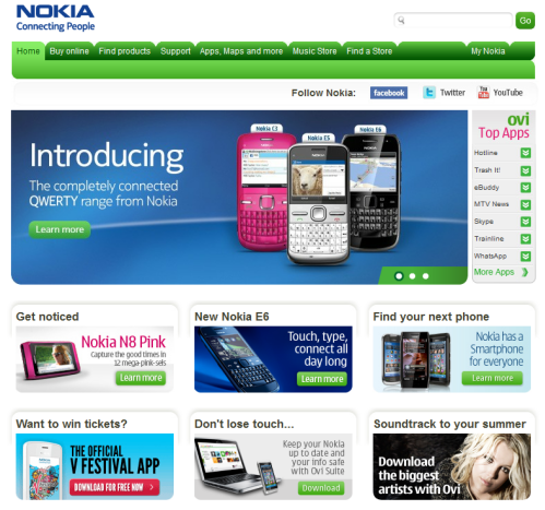
Nokia
A splash of colour brings Nokia.com into 2011.
Nokia.co.uk in 2000
Nokia.co.uk today
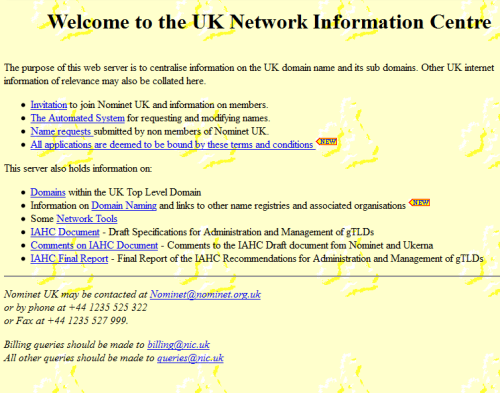
Nominet
Nominet’s website has changed beyond recognition.
Nominet in 1997
Nominet today
Starbucks
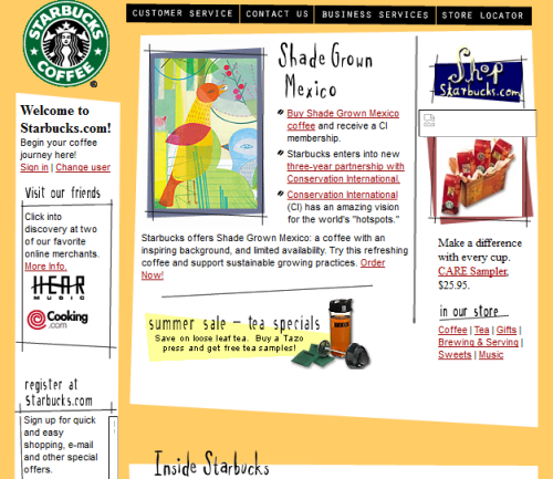
Starbucks.com was more colourful back in 2000.
Starbucks.com in 2000
Starbucks.com today
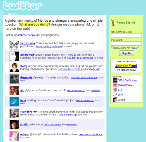
Although relatively new, Twitter has undergone several transformations over its existence.
Twitter.com in 2007
Twitter.com today
Wikipedia
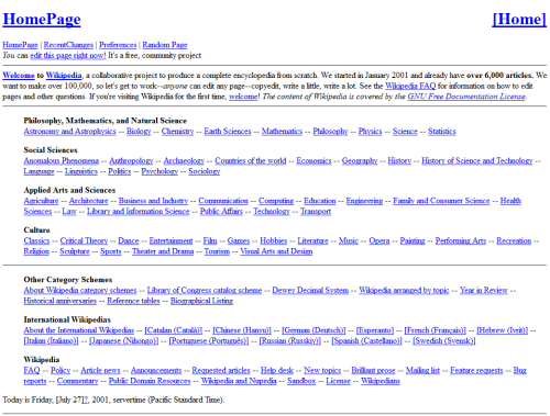
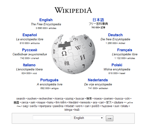
Ten years ago, Wikipedia’s homepage was completely text-based.
Wikipedia.org in 2001
Wikipedia.org today
WordPress
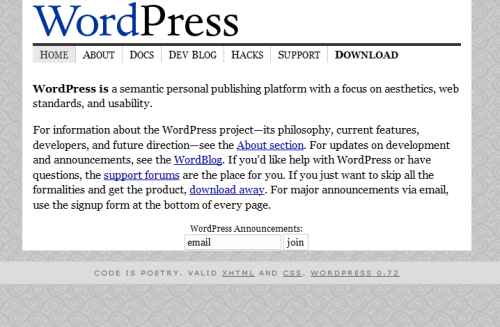
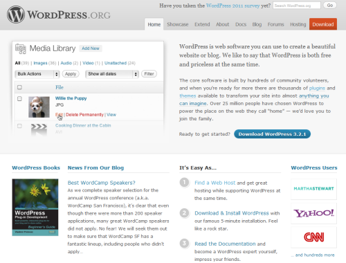
In 2003, WordPress.org had an extremely simple homepage, with no sign of the interactivity and importance it holds today.
WordPress.org in 2003
WordPress.org today
YouTube
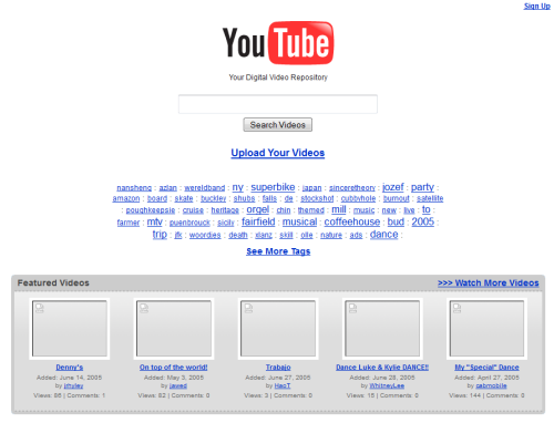
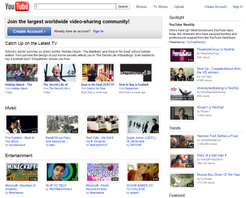
Six years ago, YouTube had a much more search engine feel to it than it does now.
YouTube.com in 2005
YouTube.com today
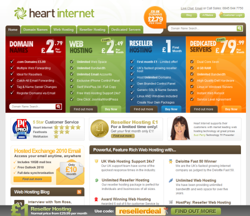
Heart Internet
We couldn’t end the list without a look back at our old Heart Internet website:
HeartInternet.co.uk in 2004
HeartInternet.co.uk today
Which sites are you most surprised by? Leave a comment below!







An excellent article, it’s always good to see the history of the relatively new medium of the net, mainly because it always moves so fast!Thanks for sharing 🙂
Excellent article, I think this not only shows the way in which brands have developed over the years but also how the Internet has made a vast amount of changes in terms of the features, languages and vast amounts of different file types now accepted by the Internet.
Wow – can’t believe how the old Guardian website looked!
The differences in the Google home search pages aren’t actually very different – like you said, just slightly less there mainly. If, however, you like at the design of Google’s website as a whole it has recently gone through a lot of changes – It’s even got a WordPress esque admin bar at the top of the page now 😉
Getting picky – The Twitter comparison doesn’t really work, needs to be a comparison of EITHER the old home page to the new home page OR the old stream to the new stream.
Still… I like the article 🙂
That was the old Twitter homepage, Phil – crazy huh?! Here’s a link to another month in 2007 for comparison: https://web.archive.org/web/20070113215016/https://twitter.com/
Glad you like the article 🙂
Jenni