
Pinterest is one of the most exciting social media channels around, and a fantastic place to share amazing visual content and connect with others.
So, in the spirit of sharing great content, here are some of our favourite social media infographics that we have come across on Pinterest.
For more great infographics, visit our Pinterest page and be sure to click follow on your favourite boards.
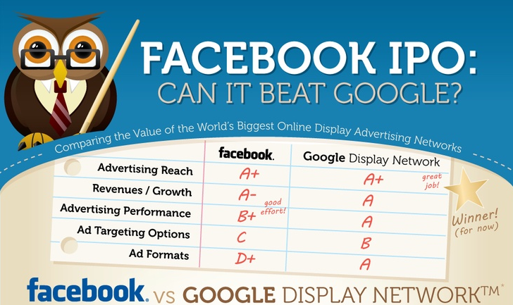
This one from WordStream provides a clear comparison of Facebook’s IPO and Google Display Network across several key areas and explains why Google was picked as the overall winner; do you agree?

BlueGlass’ Google+ infographic makes an excellent case for why more businesses should join this social media channel and provides some great tips on how to use it for the best results.
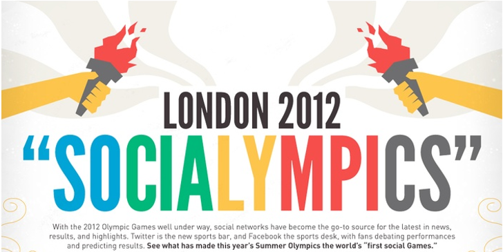
In this fantastic infographic, SEO.com offer an in-depth look at social media for the London 2012 Olympics with stats including the athletes with the highest followings, the number of Summer Olympics viewers and a social media scorecard for Olympic sponsors.
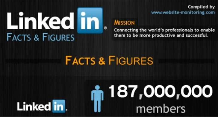
If you’re looking to get more from your personal or company LinkedIn account, take a look at this infographic from Website Monitoring with data covering user demographics, global reach and advertising.
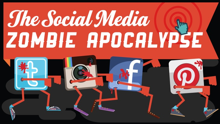
Far from being a farfetched fallacy, the zombie apocalypse is already upon us as this infographic from Confused.com shows with social media turning us into the walking dead.
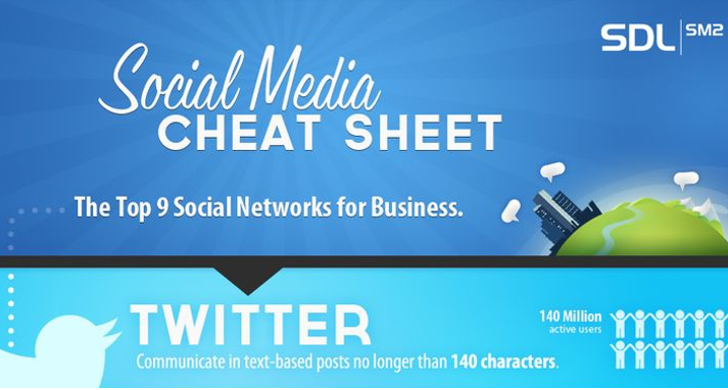
This one from SDLSM2.com is ideal if you have a range of social media channels and want some bitesize information to help improve your success across each of them.
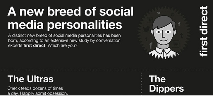
First Direct‘s social media infographic takes you through the different social media personalities that have recently emerged. Which personality are you?
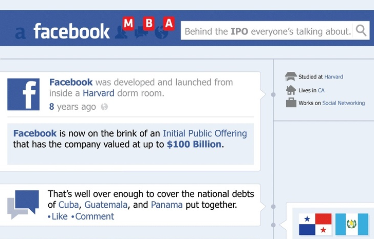
This infographic takes an amusing look at Facebook’s IPO and is full of facts across Facebook’s finances and usage.
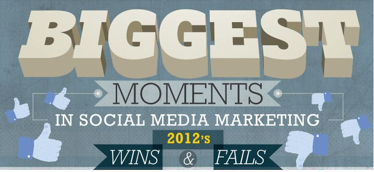
Social media has the potential to connect people instantly in powerful ways, but we also know that it has its pitfalls. Check out this infographic by MBA in Marketing to see the biggest wins and fails in social media during 2012.
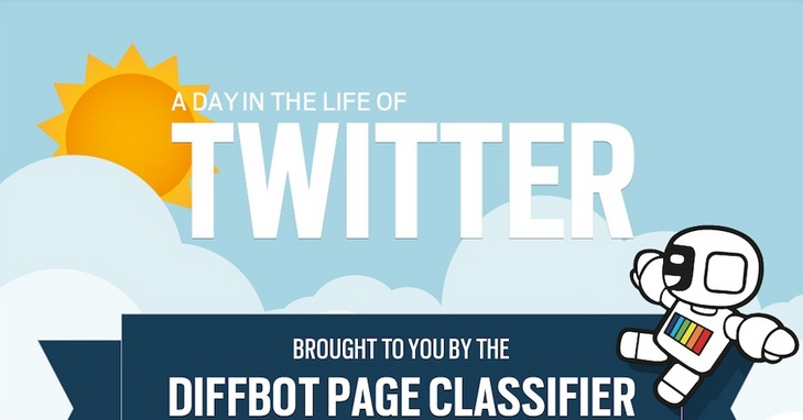
Diffbot analysed 750,000 links posted on Twitter to answer three key questions about how we use this channel every day; what are we sharing, which sites are we using and what languages are we sharing? Click the image above to find out.
For more excellent visual content, visit our Pinterest page.