
How often do you read everything on a web page? Not very often, right?
Research has shown that when it comes to reading information on screens, skim reading is the “new normal”, with many people now only word-spotting and browsing through text.
It’s been discovered that when the brain reads like this, the time allocated to deep reading processes is reduced, which means that we don’t have time to truly grasp complexity, understand another person’s feelings or create thoughts of our own.
By skim reading, we are basically limiting our ability to fully take in and process information, which means that we end up making a lot of assumptions about what an article or a web page is about based purely on the bits and pieces we pick up along the way.
These kinds of assumptions are exactly what dark patterns in UX rely on.
What are dark patterns?
According to Harry Brignull dark patterns in UX are features of interface design that are crafted to lead users into doing things they might not want to do, but that benefits the business who owns the website in question.
It would be wrong to think of dark patterns as just bad UX design or web development mistakes, as mistakes by their very nature, imply a lack of intention and Dark UX is all about intention.
Dark UX is deliberately misleading, and designed by people who have a truly solid understanding of human psychology. They know that people want to complete their task and consume written information in the shortest amount of time possible, so purposely design an interface that’s able to take advantage of that.
Dark UX relies heavily on the assumptions made by skim readers as well as ingrained habitual behaviours in order to lead users down a company’s desired sales, download or sign-up rabbit hole.
Dark patterns to avoid in your ux design
Princeton University conducted a crawl of 11,000 websites and found 1,818 instances of dark patterns on shopping websites, which together represented 15 types of dark pattern. That’s a lot of shade.
They found that those 15 types of dark patterns were present on 11.1 per cent of the websites that they crawled and that shopping websites that were the most popular, according to Alexa rankings, were more likely to feature dark patterns.
So as you can see, Dark UX is becoming more widespread and that’s why it’s important for web designers and developers to understand more about it.
With this in mind here are three of the most common examples of Dark UX patterns for you to avoid in your web design.
#1 Roach motel, aka obstruction
This is a form of UX design that makes it easy for a user to get into a situation, but makes it hard to get out.
An example of this is when you create an account on a website and then decide you want to close that account. However, the ability to do so is either hidden or involves such a convoluted and painstaking process that it’s nearly impossible to figure out how to get your account deleted.
In the short-term, this may seem like a winning strategy for companies as they get to keep a customer or subscriber, but once the user finally figures it out, they are extremely unlikely to come back to that service or recommend it to their friends.
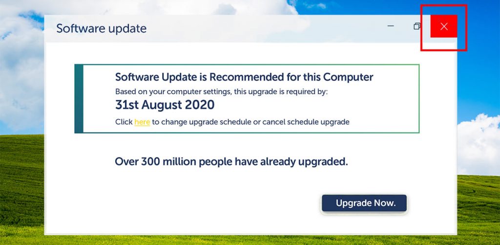
#2 Bait and switch
This is where the user sets out to do one thing, but then something very different, and usually completely unwanted happens instead.
Bait and switch usually involves a pop-up that appears during the use of a website that offers something attractive. It usually details a limited-time special offer or an upgrade option, but what it doesn’t do is provide a clear path for removing the pop-up. This leaves the user with no choice but to either leave the website completely or click on one of the options.
Some designers even go as far as making it appear easy to close the pop-up, and trick the user into clicking a cross that they understandably assume will close the dialogue box, but it doesn’t close the pop-up at all. What it actually does is act as a link that sends the user to a sales page or, in some cases, even initialises a download.
UX designer, Graeme Rutherford suggests that the alternative to bait and switch is simple honesty. If you want a user to complete your desired action, be honest and actually offer them something in return for their action. You’ll find that a reciprocal relationship is far more rewarding than one based on dishonesty.
#3 Confirmation shaming – aka manipulinks
Confirmation shaming really brings home the important role that language plays in user experience. It is the process by which websites use language to make users feel stupid or guilty for not buying a product or signing-up to something.
Basically, if the user doesn’t agree to do whatever it is that the business wants them to do, the language used on the website makes it clear that they doubt the intelligence or cognitive reasoning of the user.
Here’s an example of what we’re talking about…

It can’t be denied that confirmation shaming gives users cause to stop and consider the offer being shown to them, and in some cases, it will create some sign-ups and conversions. But, when the short term gain comes at the expense of insulting and disrespecting the user, is it really worth it? In the long-run insulting the intelligence of prospective customers doesn’t encourage repeat conversions or create consumer loyalty. It just creates bad will.
Turn away from the dark side
The key takeaway from all this is that if you want to build a trustworthy website that creates long-term relationships, encourages return visits and recommendations, you need to avoid the dark side of the web force.
Building a consumer relationship on the back of Dark UX is the equivalent of building a house on weak foundations. It may not collapse straight away, but it will crumble eventually.