If you’re a designer turning out visual assets all day long, you’ll know the pressure of finding the right stock shot. The deadline is looming, you’ve got a ton of work still to do – it’s time to grab a ready-made stock shot.
The benefit of having an account with a stock photography library is that the work has been done for you – you just need to find the right picture. It saves the hassle of hiring a photographer to take a picture for you.
The down-side is that stock shots that work for your client’s business will also work for thousands of others – so you’re likely to end up with imagery that feels generic and familiar.
Bad and boring stock photos can really impact on the effectiveness of a business’ marketing, and can even damage the perception of its brand.
You’ve seen it a million times: perfect models, with perfect hair and teeth, smiling and looking up to a bright and cheerful future, on a sun-kissed day. Thing is, if you’ve seen it a million times, so has everyone else… and the time comes when no one really sees it anymore.
Then, of course, there is the nightmare scenario: your client notices that you’ve used a shot that isn’t exclusively theirs…

People are very sussed about what is and isn’t genuine, these days, and photos which are obviously staged simply don’t resonate emotionally with customers. Real photos of real people is where it’s at!
1. Work within the client guidelines
Many established clients will have their own design guidelines set down. For some, this may be little more than a colour palette and a general ‘feel’, for others, this can be a carefully-designed, highly-detailed list of motives and objectives.
Such guidelines can, sometimes, feel like handcuffs – but they have rarely been put together arbitrarily. The client knows what works for their customers.
The creative challenge for the designer is to come up with something fresh and exciting within that framework. You may even find a good set of guidelines helps you, because knowing what you can’t use helps you zero in on what you can!
2. Have a great concept
Think it through. Get the writers/designers to give you as detailed a concept as possible. Discuss with the rest of the team the best way to visualise what you need, so you have an image in mind before you take a look at what is available.
Once you have a great concept that everyone gets behind, you’ll be driven to find the right assets to bring it to life.
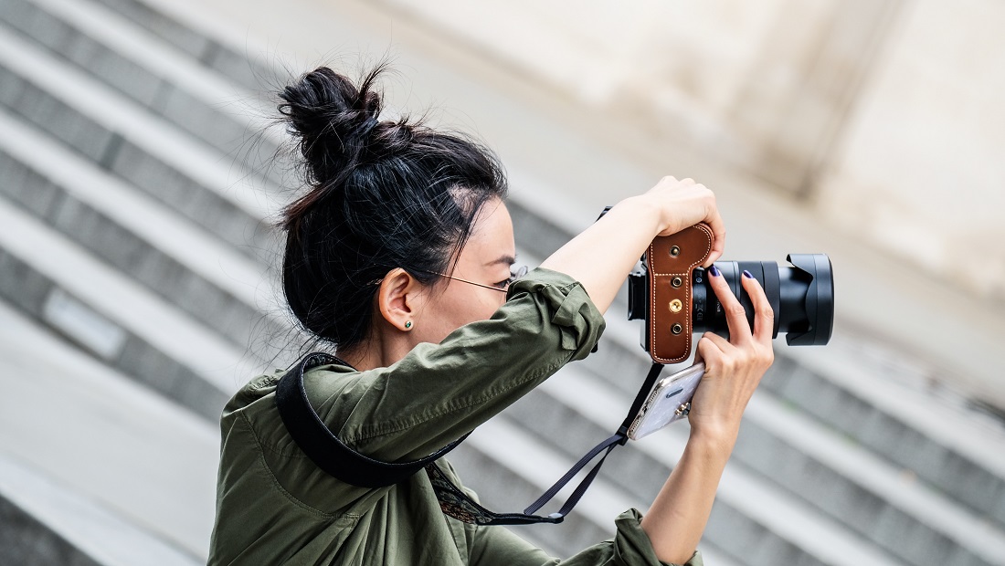
3. Take your own shots
It’s not expensive to set up your own photo studio – a pull-down back-drop, a few lights and a decent camera cost surprisingly little these days. So, taking your own good quality portraits, product and specific action shots has never been easier.
But, if you don’t have the room, time or spare budget for that, never fear – you can still do it yourself.
Thanks to the mobile phone and social media revolution – people are happier than ever taking and sharing photos – which means we’re used to seeing photos that aren’t perfect. You don’t need to be David Bailey to take good photos, so go for it. Pictures you take yourself will be unique and offer your design that element of authenticity.
4. Keywords count
Don’t spend time editing the wrong shot – spend your time finding the right shot. This requires patience, but it will pay off.
The photos in stock libraries are well-tagged, so using the correct and precise search terms will find you what you want.
Research your keywords. If you know the names that go with the real job roles and processes your client uses, you will be better-able to research the right image.
Don’t just limit yourself to a single library. It might cost more to license the right image from a library you don’t already have an account with – but, if it’s the right image and nothing else will do, cough up the readies rather than do a substandard job.
Obviously, if it’s the client’s or boss’ money you’re spending, it never hurts to check with them first: “Do you want it good, or do you want it cheap?”
5. Reject the low-hanging fruit
If you search for a ‘fruit picker’, say, in a stock library, the first images to appear will be the first ones that any designer is shown if they’re looking for a fruit picker.
The libraries don’t share information of how their algorithms work, but it’s reasonable to assume that they will show the most popular, most oft-used photos first. Given that everyone has deadlines to meet, it’s reasonable to assume that a lot of designers will be happy to use the first images that pop up, simply to save time.
Therefore, the first images you see, are the ones most people use. So don’t use those. Dig deeper.
Once you’ve found an image you like – drag it into Google Images and see where else it’s being used. This is a brilliant tool to help you avoid the obvious and keep your designs fresh.
6. Don’t be cheesy
Stock shots are, by their nature, generic. They’re meant to be suitable for as many likely commercial and editorial uses as possible because the more often a photo is used, the more the photographer and the library gets paid.
But this very generic nature is one of the things that marks out a stock photo.
People react to photos that feel genuine, so don’t use a photo of someone clearly pretending to be happy – use one of a person laughing uncontrollably.
Shots of workmen in crisp, clean uniforms are obviously staged shots of actors. There’s nothing wrong with showing someone with dirt under their nails when they’re really doing a day’s work – if that’s what’s appropriate for the client.
Photos that look more like news photos – shot on the fly with little regard for framing or lighting – rather than perfectly-posed sales brochure photos – are more effective.
7. Be authentic
If you choose an image that looks like a photo a real person has taken it – that isn’t perfectly composed, or exposed – then that communicates a lot of value to a potential customer.
Photos taken in real locations, using available light, appear more natural than photos shot before an infinity wall, under studio lights.
Every business wants to be represented by young, happy, beautiful people – the implication being that buying a product or service will make their customers young, beautiful and happy. It’s the basic psychology that has underpinned visual marketing since the Madison Avenue days.
But, increasingly, there is a reaction against that homogenised way of depicting customers. In a diverse world, people want to see themselves reflected more inclusively and more accurately.
It’s much more about being authentic than being perfect, these days.
8. Go elsewhere
Do you have accounts on all the main libraries?
There’s Getty’s iStock, or the British equivalent: Alamy or, alternatively, there’s Shutterstock – all of which have millions of images – but they are the world leaders and the first port of call for most designers.
So, go elsewhere – there are smaller, more responsive, often curated collections, like Death to Stock, or Creative Market, as well as digital asset specialists like Envarto’s Elements and Adobe’s Adobe Stock.
There are many sites like Unsplash, and PicJumbo as well as SplitShire and Pixabay (for a small selection from the many) which allow you to download and use shots for free – but you’ll need to carefully check the terms and conditions of their licenses, to be sure any commercial use is covered!
Inevitably, these smaller sites have fewer photos to choose from, and they will solve your problems less often. But they provide a very real alternative to the usual stock shot libraries and, between them, constitute a significant treasure-trove of possibilities.
Also, do you have to use a photo? These libraries also contain vast numbers of icons, illustrations, vectors, animations and video clips – all of which offer an alternative to bland stock shots.
9: Frankenstein it
If, after all this, you still absolutely cannot find the image you need… patch one together yourself.
Alter the colour balance and contrast, or apply a few filters to make it look older or grainier, if that helps. You can crop it to change the composition. This is basic stuff that can help make any standard stock shot look more in-keeping with the style you’re creating. But, if you need something more radical, you’ll need more advanced Photoshop tools, and a bit more time.
If the right face comes with the wrong body, but the right body has the wrong face, then open up the lasso tool and start cutting out. If the right arm has the wrong hand, find a better hand from somewhere else, and stitch the two together.
If the concept is right, but the assets are wrong, the best use of your time is to make them right.
10. License it
Make sure you understand the licensing terms and conditions when you download an image. Is the image for Editorial use only, or can you use it commercially? How long are you licensing it for and for which media?
This is crucial. The penalties for misusing visual assets are crippling.
So, make sure you are entirely sure that the specific use you intend is covered in the license you’re paying for (especially if you’re getting it free).
So, take the time to read their terms and conditions and then, if you’re not sure, drop them an email or pick up the phone and ask.
It’s better to be told ‘no’, than to get a solicitor’s letter.
Over to you…
Have we missed your favourite stock shot site? Is there a well-kept secret out there you can help to share with the world? How do you turn stock shots from bland and boring to brilliant?