
In the words of Lord Kelvin, “If you cannot measure it, you cannot improve it.” Executives rely on regular streams of survey data to make decisions and earn their bonuses. Satisfaction, brand awareness, whether or not to keep an old feature or build a new one — all of these can rely on survey data. Sometimes they only rely on surveys. If you want to prove to the powers-that-be a new design is an improvement over the previous version, you’re probably going to be comparing satisfaction scores from before the redesign to after.
We love surveys because the internet has made them so easy to do. A few clicks of a mouse and you can send all of your customers a questionnaire at zero cost to your organisation. But easy is a problem. When something valuable comes effortlessly, we tend to take it for granted. We don’t take it seriously. Doing important things well requires effort. The people who receive your surveys matter, and you should be making an effort.
Surveys suck
Because of this lack of effort, surveys tend to suck. They’re too long. They don’t offer an incentive to compensate for the respondent’s time. They’re not optimised for mobile. They overuse grid questions. And don’t get me started on Net Promoter Score scales.
But they don’t have to be terrible. These are your customers and every communication with them, including the surveys, deserves attention and respect.
Luckily, as UX practitioners, you have the skills to design an excellent survey. A survey, at the very least, people will not mind taking.
Better by design
Here are 11 steps you can employ today to improve the survey experience for your respondents and improve your data quality, covering everything from designing the survey to sending it out to respondents.
Have a plan
A lot of times people put out a survey because they are curious, but they fail to think about how it ties into their overall objectives. Ask yourself and your team:
What are your goals for the data? You should know the purpose of each piece of data you collect. Understanding the reason for each question makes cutting superfluous queries easier.
What variables do you want to compare? Males vs. females? Homeowners vs. renters? Education level? If you know this ahead of time, you know what questions you need to ask, how to recruit your respondents, and how many respondents you’ll need.
Are you planning on doing any advanced analysis? Conjoint? Regression? Text analytics? All this effects the types and complexity of questions you will be able to ask and if you are going to need specialised software to do the analysis.
Write out your plan. Be specific about your needs and objectives. Get the stakeholders to agree to it. The document will help you run a successful survey.
Keep it short
No one has time for your survey. They might consider it if you pinky swear it won’t take long and offer an incentive for their time.
I usually try to keep my surveys down to 10 minutes or less to complete. Even then I still get nastygrams from people who are outraged over my request for 10 minutes of their time but have enough time to write me a strongly worded email!
Here are some tips for designing a short survey:
Have a singular focus. Don’t pile on extra objectives that don’t serve the primary.
Know the difference between a nice-to-know and a need-to-know. Toss the nice-to-knows. Sticking to your analysis plan helps.
Make all questions classic tweet-length questions. The 140 characters rule is arbitrary, but it helps you be concise and makes your queries easier to read.
Keep open-ended questions to a minimum. Open-ends are taxing for the respondent to answer and they’re a pain for you to analyse.
Get an outsider to take the survey on a timer to make sure it can be done in under 10 minutes.
Mobile first
One online survey platform found 30 per cent of their survey respondents were on a mobile device in 2017. This number is on an upward trajectory from previous years.
Sure, almost any platform is optimised to work on mobile and desktop, but you still have to design your questions to make them easy to answer on mobile. This also satisfies your short survey objectives — classic tweet-length questions. You’re even better off not using fancy question formats. Sure, they’re fun and engaging, but are you entirely sure they’re accessibility compliant and work on every mobile device?
You also want to make sure respondents don’t have to switch to landscape mode to take your survey. According to research by GFK, 90 per cent of people answering a questionnaire on a mobile device will enter using portrait mode and less than half of those people will bother to switch to landscape.
How do we address this? One easy way is to make all scale and answer options vertical instead of horizontal.
Use friendly language
This is a survey, not Shakespeare. Talk to humans like a human.
Help respondents help you
You don’t want to put respondents in a position to give you bad data, but we end up doing that all the time by forcing them to answer questions they don’t believe apply to them, or by offering a limited number of answer options which don’t cover their situation.
We can avoid this by:
Making all questions optional. There are very few situations where you absolutely must make a question ‘required’, so why do it?
Offering exhaustive answer options. Don’t provide only the most common answer options or the ones that immediately come to mind. Do some research. Find out if you are unaware of other options.
Always offer an “other” as a final answer option. Most platforms will default to “Other, please specify _______” but only use that if you actually plan to analyse the open-ended data. Remember, we want to minimise the respondent’s cognitive burden by using as few open-ends as possible.

This is an example of a poorly worded question. It uses formal language and it doesn’t cover all of the possible answers. The only positive thing I can say about it is that it’s short.
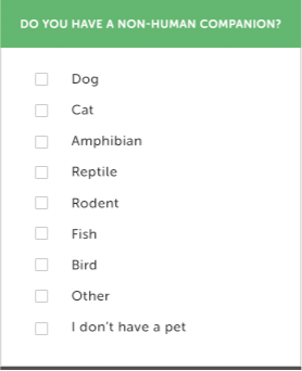
This is a better version of the same question. It’s still short, but it uses friendlier language. It covers most of the possible options and provides an ‘other’ for people who aren’t covered by this list. The checkboxes also indicate that multiple answers are possible.
Rating scales matter
All rating scales should be Likert scales. Likert scales are 5 to 7 options in length and have a neutral choice.
Odd numbered. Odd numbering allows for balance and a real middle option.
Provide a neutral option. Neutral is a valid option. Don’t force people to feel one way or the other about a subject. When you allow people to give you a neutral answer, you’re allowing them to say they don’t care about the question or the topic and then you are free to focus on issues or subjects that matter to them.
Balanced. There should be an equal number of opposing options. Such as the same number of positive options as negative options, as in this example:

Usually five or seven options. Five is fine. Seven gives a bit of nuance. Nine or more just gives you a false sense of increased accuracy. No one is so self-aware that they can accurately say they are “somewhat very good” rather than “very good.”
Label all your options. Don’t just leave a scale question as a bunch of numbers or stars. Your interpretation of four out of five may be very different than someone else’s, but your “good” is likely similar to another person’s definition of “good.”
Vertical. Remember, we need this to be easy to do in portrait mode on a mobile device. That’s much easier to do if your scale is vertical.

This is a poorly done scale question. It uses formal language. It’s not a Likert scale because it isn’t odd numbered. It also isn’t designed for mobile because it’s horizontal and not vertical.

Here is a version that is vertical, Likert, and uses friendly language.
Avoid using grid questions
When you say your survey is only a few questions long but one or all of your questions are in grid format with 5, 10, or 20 variables, that’s not a few questions. That’s a lot of questions. It’s also a problematic format to answer using a mobile device. Be honest with yourself and your respondents by breaking grids out into individual queries.
Reduce bias elements
Bias is like polluted air — impossible to avoid, but you can filter for it. The first step is to recognise bias. Here are some of the leading culprits in quant research:
Acquiescence Bias. We avoid disagreeing with other people. Even people we’ve never met. We counter this by preventing questions with answers like Yes/No, Agree/Disagree, or True/False.
Desirability Bias. We want to appear better than we are. Desirability Bias is usually a problem in consumption data. Don’t ask people how much candy they ate last week or how much TV they watched.
Sample Bias. Your sample doesn’t accurately reflect the population you’re trying to study. We counter this in a few ways. One, we use a sample size calculator to find out how many people need to complete our survey to have a statistically significant data set. Two, give up some control over the sample selection using random number generators or dice.
Research Bias. Your research point of view gets in the way of your research. We avoid this by being extra careful and thoughtful about how we word our questions. Are we leading respondents? Are we telegraphing what we want them to say? Sometimes respondents will answer the way they think you want them to respond rather than the truth out of acquiescence bias or to qualify for the incentive. We can avoid this by using Red Herring questions.
Red Herrings are fake but plausible answers to questions. For example, if I wanted to know if you use the service I’m surveying for, I would ask, ‘Which of the following services have you used within the last month?’

We can pepper Red Herrings throughout the survey as a way to improve data quality. If respondents use too many Red Herrings in their answers, we can eliminate their responses because the data is unreliable.

This question is telling respondents that we’re most likely looking for people who use Gmail.

This question is less obvious. We could be asking for anything and we’re also allowing people to select multiple options. FantasticMail is a Red Herring answer. It might exist but it doesn’t. If someone selects FantasticMail, we can consider deleting their response to improve the quality of the data.
Be gracious
Even when you’re offering an incentive, people still don’t need to take your survey. Show your gratitude on the invitation and the exit page. Thank them for the time they spent answering your questionnaire, tell them how what you learn will ultimately benefit them (by improving the service, or creating a new feature), be transparent with how you will use their data, and let them know when they can expect to receive their incentive.
Incentivise
We don’t do this nearly enough. We ask people to give us valuable decision making and benchmarking data and offer nothing in return. Offering an incentive tells your respondents, who are often your customers/users, that you understand and respect the fact their time and attention is valuable.
From a scientific standpoint, incentives reduce your non-response bias. If you’re only hearing from people who love (or hate) your product enough to offer their feedback for free, then you are just getting data from people who most likely do not represent the general population or your target market at large.
Incentives can come in many forms. Cash, gift cards, account credit, prize drawings, or you can use your imagination. How about a donation to a non-profit or offering to share the results of the study?
If you plan to go down the prize drawing route, consult with a lawyer first or outsource it to a company that handles prize drawings regularly.
Prototype and test
You wouldn’t launch a new design without testing it first and the same logic applies to surveys. If you want to ensure quality responses, you’ll do a test before the actual launch. If you plan to reuse the questionnaire for a tracking study, then don’t skip testing.
Grab someone who is not involved with the survey or the stakeholders and have them take the questionnaire and walk you through their thought process, which is called a cognitive interview. Make sure they understand your questions and time how long it takes them to finish the survey.
Create a mini-sample from the same population you plan to recruit your main sample from.
Do a dry run of your survey. Think of it as a rehearsal for the entire process, from the invitation to the incentive.
Look for anomalies. Are you getting an inadequate response to the invitation? Consider revising it. Are there a high number of respondents not answering, choosing “other” or not answering specific questions? Maybe it’s not worded correctly, or you missed something in the programming. Do you need to recode anything? Is the data you’re getting back usable? Are the incentives being processed as expected?
Make the appropriate changes and if you think you’re ready, deploy the survey to your full sample audience.
And you thought surveys were just a bunch of questions! I’ve only scratched the surface. But don’t be intimidated. This is a good place to start and a great place to start thinking critically about the surveys you are either involved in or receive. Follow these tips and use your UX know-how to make your questionnaires better and increase the quality of the data you get back. Well designed surveys are part of how we make confident data-driven decisions.
Great article! I love the discussion of bias and techniques on how to avoid it. The incentive suggestion to donate to charity is an excellent one. We recently published a similar article where in addition to information covered here, we talk about the use of open-ended questions in surveys, as well as how to analyze the survey responses: https://getthematic.com/insights/customer-survey-design/