Accessibility is finally going mainstream. It used to be a niche discipline that concentrated on disabled customers, a ‘nice to have’ that often got forgotten or lacked the necessary resources and budget. The smartphone and the recent focus on inclusive design have changed that.
These days there’s a real push for websites and digital products to be accessible for the full range of human diversity. This includes blind and deaf users, those with cognitive impairments, as well as neurodivergence and people with temporary or situational impairments (from arm injuries or ear infections to distracted drivers or new parents juggling multiple tasks while carrying their newborn).
To mark the eighth Global Accessibility Awareness Day, we’ve rounded up a ton of articles that will help you design and develop more accessible and inclusive products. We cover the necessity and benefits of accessibility on the web and then move onto very practical tips and tutorials.
Here’s to an accessible web for everyone!
Overviews
An accessibility analysis of the top one million home pages recently found that 97.8 percent had automatically detectable issues, which prompted Ethan Marcotte (who coined the term Responsive Web Design) to write a thought-provoking article about ‘the web we broke’.

Why the adoption of web accessibility keeps failing
An exploration into why accessibility still hasn’t been widely implemented, including a theoretical understanding of the subject of ‘adoption’, and what we can do about it. Part 3 of a series on ‘forgotten’ web innovations, which also includes posts about peer-to-peer and the muted web.
Building accessible websites and apps is a moral obligation
What if web accessibility was legally required (which it is in some countries) in the way handicapped access is in physical businesses? Chris Ferdinandi argues that the web is accessible by default and that we have to fix it, if we break it.
10 website accessibility myths debunked
UserZoom looks at 10 things that you might have thought, or heard about web accessibility that aren’t necessarily true, including ‘accessibility is just for blind or partially-sighted users’ and ‘accessibility is just about adding alt text to images’.
Putting accessibility in perspective
Joanna Ngai, UX designer at Microsoft, examines web accessibility, why you should care and the benefits of improving accessibility, including increasing the number of your potential customers and reducing the likelihood of litigation.
Accessibility, a powerful design tool
When you start seeing accessibility as this magical ingredient that forces you to make things the right way, it becomes crystal clear that you need to apply it to every aspect of a product: from design to engineering, from marketing to customer support.
Tips
This article covers a few easy things you can do right now to improve accessibility on your site: outlines, hover states, legibility, and designing for colourblind users. Implementing these small improvements on your site or app not only can allow a completely new set of users to interact with it, but improve the usability for the majority of people too.
Examples of text legibility
HTML, CSS, and the path to accessible web design
This article includes a range of tips on how to get started with accessible web design that were highlighted at this year’s Monki Gras conference, an event about software, craft and tech culture that focused on creating great experiences for everyone this time.
Learn to create accessible websites with the principles of universal design
Plan for designing for accessibility with the seven principles of universal design, which all include guidelines with actionable approaches. A great resource for guiding your design process that should be incorporated into any project from the very beginning.
14 easy ways to make your website more accessible
You might think your site ticks all the accessibility boxes, but chances are it could do better. In this article, UX experts offer up their secrets on areas of inclusivity that often get overlooked but can be addressed with minimal effort. From remembering alt text to confirming the end of a user journey, these fixes can be applied today.
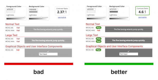
3 tips for designing better websites for colorblind users
Testing using a colour blindness simulator, using a full range of value and changing your colour palette are quick and easy ways to make your design accessible for colour blindness. Also see Color blindness considerations for designers and content managers
Accessibility for vestibular disorders: How my temporary disability changed my perspective
A temporary disability changed Facundo Corradini’s perspective on accessibility testing. On A List Apart, he shares the impact and how our design choices can affect people with vertigo and vestibular disorders. There are a lot more potential triggers than just animation.
Revisiting prefers-reduced-motion, the reduced motion media query
Two years ago Eric Bailey wrote an article about a media query to help people with vestibular and seizure disorders use the web. Here he returns to the subject and finds that most major desktop browsers (except Edge) now support it.
Tips for making interactive elements accessible on mobile devices
Front-end developer Ire Aderinokun gives an overview of some of the new Web Content Accessibility Guidelines that relate to interactive elements on a web page (for example, making it clear that an element is actionable).
Insights
Accessibility challenges in web apps
Web developer Marcus Herrmann writes about accessible techniques for modern JavaScript apps and covers challenges such as click targets that aren’t links, inputs and controls, changing and loading things asynchronously, and more.
Creating a more inclusive world: How to test products for accessibility and usability
Ashley Ferguson, a design researcher at Microsoft, covers three examples of accessibility traps (using colour alone to convey information, moving content, and inefficient keyboard access) that map to usability traps and offers tips for more usable alternatives.
Designing for accessibility by using Apple VoiceOver
UI/UX designer Nazli Kaya conducts a little accessibility test on her own website using Apple screen reader VoiceOver and explains how she fixed the issues that she found.
Accessibility lessons: Dealing with a large amount of form inputs
Over at GOV.UK, front-end developer Andy Sellick shares some advice on creating accessible forms with a large amount of inputs fields.
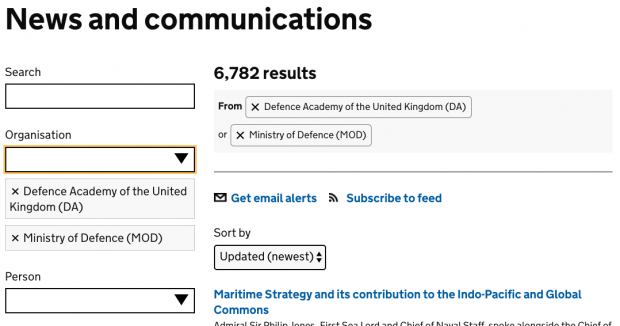
GOV.UK’s accessible autocomplete in a finder (multiple selection mode)
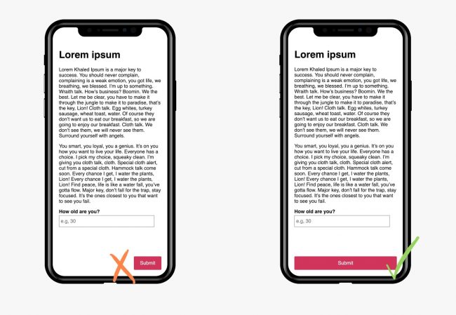
Building Better Forms™ by not taking away affordances
Don’t fiddle too much with your forms’ look and feel. A small innocent-looking piece of CSS, even when combined with semantically correct HTML, could leave you with a degraded user experience and make your forms less accessible.
Paint the picture, not the frame: How browsers provide everything users need
Eric Bailey makes a case for leaving key accessibility features to the browser to ensure the most accessible experience, instead of tweaking or trying to control browser functionality, which could alienate users.
Enforcing accessibility best practices with automatically-generated ids
Brad Frost describes how to enforce accessibility best practices in your design systems. The technique renders it impossible for users of a design system to omit an important attribute and accidentally create an inaccessible experience.
The ineffectiveness of lonely icons
If your target audience is a general population, you should not be using icons alone to convey anything meaningful. By doing so, you have made assumptions that are unlikely to be appropriate to a general audience.
See no evil: Hidden content and accessibility
This post explores different scenarios in which you may want to hide content, and how to handle such situations in an accessible manner. You’ll learn how to hide content for all users, for screen readers, for users not using screen readers, and for specific screen sizes.
Think like an accessible UX researcher
A three-part article on involving people with disabilities in UX research, covering defining your research problem, how many participants to include in your research and five common mistakes in usability testing and how to avoid them.
Tutorials
How to create a custom radio switch in CSS
In this tutorial, web developer Claudia Romano, co-founder of Cody House, takes a look at how to create a custom radio switch and how to keep it accessible.
This step-by-step tutorial examines how to use CSS to improve the aesthetics and appearance of radios — or radio buttons — and checkboxes, commonly found in web forms, while still preserving the accessibility of the input elements.
Linzi Berry, a design systems manager at Lyft, explains how to design accessible escape hatches for modals, dialogs and pop-ups.
A detailed look at the accessibility of Scalable Vector Graphics (SVGs) with an explanation of the basics and plenty of code examples.
Part 1 of this article explores how a good colour system for a digital product needs to be accessible, systematic, and scalable, while Part 2 dives into building an accessible colour system from scratch. Also see How to design an accessible color scheme.
How to keep your CSS Grid layouts accessible
CSS Grid can also lead to accessibility issues, mainly for screen reader and keyboard-only users (also see The Dark Side of the Grid (Part 1)). This guide will help you avoid those issues.
See the Pen
CSS Grid Nested Grid by Envato Tuts+ (@tutsplus)
on CodePen.
Accessibility and inclusion with the world’s most popular communication tool: Email
Creating more accessible and inclusive email marketing campaigns is easier than most people think. In this article, you’ll learn how to implement some basic code and follow design rules to create an accessible foundation for your newsletters.
Naming things to improve accessibility
One thing you can do to improve the accessibility of your work is to always ensure things have accessible names. In this post Hidde de Vries explains how browsers decide on the names for links, form fields, tables and form groups.
Using persona profiles to test accessibility
The UK’s Government Digital Service created accessibility personas to highlight common barriers faced by people with particular conditions and provide tips on how to design for them. In this article, they explain how they created login profiles for each persona to test them.
Also check out Inclusive UX: Building products, building communities by Ivana McConnell here on our blog.