The theory is: Gutenberg, the new block editor, works with any WordPress theme out of the box. It only changes the editing experience but not how content is stored and then rendered on the front-end by the theme.
Mind you, if you use a third-party page-builder like Beaver Builder, Divi, Elementor, or WPBakery to name a few, coupled with a theme, you will have to connect with the page builders’ developers and inquire about their Gutenberg-readiness. While the block editor has been the default editor for the last three months, I have seen some major adjustments for a co-existence between third-party page builders and Core’s Classic and Block editors.
There are also a few very popular themes in the Themeforest Marketplace (for example Avada and Enfold) that have their own proprietary methods of creating and storing content. Their developers mostly suggest to install the Classic Editor plugin to make their themes work again with a WordPress 5.x version.
How long will the Classic Editor be around? The Core Team published the “guaranteed supported until date” as 31 December 2021 (so roughly another two and a half years) .
Beyond these two caveats, third-party page builders and content lock-in theme architecture, it should work out of the box.
Baseline support, enhancements, extend and customise
“The new Blocks include baseline support in all themes, enhancements to opt-in to and the ability to extend and customize.”
That’s how the developer handbook for the block editor starts its Theme Support chapter.
In other words, there are a few features the block editor offers, that might not be available yet for your theme and your site, so it’s not pure binary, works or doesn’t work. There are multiple levels of Gutenberg-readiness.
It goes from enabling Align-wide and Align-full styling for the various blocks (columns, images, cover, gallery), to include styling for each core block to providing custom colour and font-size pickers for your customers content creators, so they stay within the brands boundaries.
In this article, I’ll talk about all these different ways your theme can interact with the block editor. We’ll talk about stylesheets, CSS specificity and layout. There are voices, and mine is among them, that building blocks are the domains of plugins. Themes provide the glue between features and front-end, and a site owner should be able to switch out their theme without losing content or composition. Of course, like everything else in life, the edges are blurry and the block editor is still in its infancy.
Here is what we’re going to look at:
- Block styles
- Align-wide and align-full
- Custom colour palettes
- Block font sizes
Let’s take it from the top:
Block styles
Some of the block out-of-the box styling might be a little bit awkward with your particular theme. We have seen sometimes a bit of an overlap in two-column displays, when images or video embeds bleed into the sidebar or overlap with other blocks or elements on your site.
You might want to ask your theme developer to add some styling for Gutenberg blocks and make sure that the styles are also available for the editor, as the ambition of Gutenberg is true WYSIWYG (what you see is what you get) editing, and the view in the editor is as close as possible to the final product.
The video above shows the view of the core blocks in the Twenty-Fifteen theme.
We started out with a lot of core blocks in a post and saved it as a text file. Now for every site we tested we created a new staging site and then created the new post via the Code Editor using this example post with embeds, buttons, and images in various forms.
Then we published/previewed the post and made a list of which blocks needed further styling within the existing theme.
By default, blocks are styled in the editor. However, not all block styles are displayed on the front-end. If you’d like to have them displayed there as well, you need to add the theme support in your functions.php.
In the release notes for Gutenberg version 3.0, Mathias Ventura wrote:
“During the whole process of Gutenberg, we have come to the realization that in order to have the most flexible system for styling within themes — and letting us get closer to visual parity between front-end and the editor — we had to separate presentational styles from structural styles when it comes to individual blocks.
So far, we have not been loading presentational styles on the front-end in order to avoid unintentional changes to site’s appearance, but that also causes issues for new themes that would like to start working from the visual design baseline that Gutenberg offers by default as shown on the admin side.”
add_theme_support( ‘wp-block-styles’ )
Ventura continues:
“The decision has been made to allow themes to opt-in to these styles with an add_theme_support( 'wp-block-styles' ) registration. This will allow us to keep (or reintroduce) some more opinionated styles for elements like Quotes, Tables, the Separator, and so on.”
Align-wide and align-full
Quite a few blocks can change their place within the content section of your theme, with two stylings: .alignfull and .alignwide.

Both are considered “opt-in” features. If a theme developer wants to make them available to their content creators, they need to be declared in the functions.php and then add styles for the standard class names.
In the functions.php:
//Add support for align-wide and align-full
add_theme_support( 'align-wide' );
This makes the additional available buttons visible in the block editor.
Default is aligned within the content:
.alignwideis larger than the normal content on the page..alignfullexpands the block over the full page width in the browser.
In your style.css you can then add the styles for .alignwide and .alignfull:
.entry-content > .alignwide {
	Max-width: 1100px;
}

.entry-content > .alignfull {
	margin: 1.5em 0;
	Max-width: 100%;
}
(This example code has been taken from the Gutenberg Starter Theme on GitHub.)
You could also use the CSS calc() function to dynamically style the blocks for alignfull and alignwide, relative to the size of the browser window and dependent on the viewport of the device.
- Bill Erickson has some detailed instructions for you in his February post.
- Kjell Reigstad used SASS for the Twenty-Nineteen theme:
It will get tricky when you deal with a design that has more than one column layout, and you want to still offer the two align styles.
Oliver Johas has a more elaborate tutorial available for you at CodePen:
Custom colour palettes
The next level of Gutenberg ‘readiness’ could come in the shape of theme-specific colour palettes.
The button, the paragraph and the quote blocks offer background and text colour choices to the content creator.

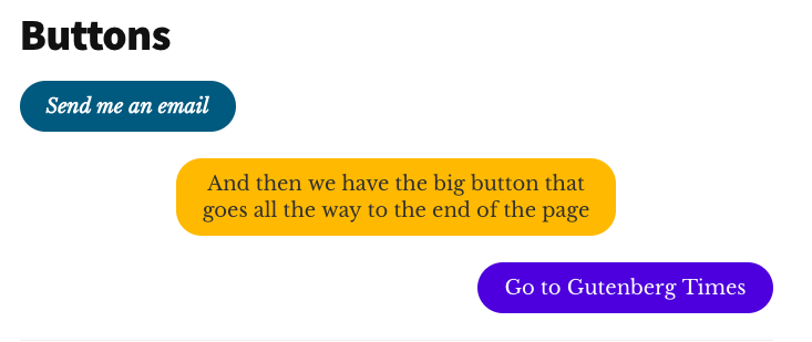
We can easily imagine that a content creator might get carried away and branding standards might go out the window. Before you break out in hives, imagining a throwback to Myspace and GeoCities times with user-styled content, rest easy.
The theme developer can give the content creators a little bit more freedom and flexibility in providing standard colour palettes with their theme and still keep standards intact.
The colour pickers appear in the sidebar of the block editor.
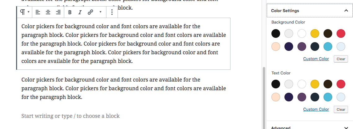
The colour picker in use for the Twenty-Fifteen theme
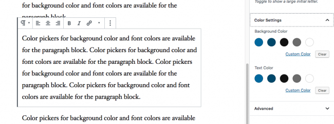
The colour picker in use for the Twenty-Nineteen theme
It’s a three-step implementation process:
Step 1: Register your colours in your functions.php as an array of arrays.
// Add support for custom color scheme.
        add_theme_support( 'editor-color-palette', array(
            array(
                'name'  => __( 'Strong Blue', 'gutenbergtheme' ),
                'slug'  => 'strong-blue',
                'color' => '#0073aa',
            ),
            array(
                'name'  => __( 'Lighter Blue', 'gutenbergtheme' ),
                'slug'  => 'lighter-blue',
                'color' => '#229fd8',
            ),
            array(
                'name'  => __( 'Very Light Gray', 'gutenbergtheme' ),
                'slug'  => 'very-light-gray',
                'color' => '#eee',
            ),
            array(
                'name'  => __( 'Very Dark Gray', 'gutenbergtheme' ),
                'slug'  => 'very-dark-gray',
                'color' => '#444',
            ),
        ) );
Side note:'__( )' is the syntax for translatable strings in the WordPress world, together with the 'gutenbergtheme' namespace.
If it doesn’t work with your theme, you need to add the following string to your functions.php:
load_theme_textdomain( 'gutenbergtheme', get_template_directory() . '/languages' );
If your theme isn’t for translation, you can also use ‘name’ => ‘Very Dark Gray’.
The attributes are name, slug and colour:
- The name is used for the hover text when your user moves their mouse.
- The slug is used to identify it in the class name attached to the block. That’s where your stylesheet connects.
- And the colour representation in hex value, so they are displayed correctly in the Block options.
The colours will be shown in order on the palette, and there’s no limit to how many can be specified.

Step 2: Assign class names to the blocks when the content creator assigns the colours to the block.
Let’s take a look at the output of the block on the front-end.

The first section was given the “Strong Blue” background and a “Light Gray” text.
And you see that the class attribute for the <p> tag contains two selectors regarding the background and the text.
- has-background and has-strong-blue-background-color
- has-text-color and has-very-light-gray-color
These class names have been assigned automatically to those paragraphs, using the slug attributes from your colour palette array.
array(
	‘name’ => __( ‘Strong Blue’, ‘gutenbergtheme’ ),
	‘slug’ => ‘strong-blue’,
	‘color’ => ‘#0073aa’,
),
array (
	‘name’  => __ ( ‘Very Light Gray’, ‘gutenbergtheme’ ),
	‘slug’  => ‘very-light-gray’,
	‘color’ => ‘#eee’,
),
Step 3: List the styles with their assigned class names in your stylesheet.
Two for each colour in your colour palette, one for the text and one for the background, adding “has” and color or background-color to the class names:
.has-strong-blue-color {
 color: #0073aa;
}

.has-strong-blue-background-color {
 background-color: #0073aa;
}
Here is the full list of colours for your custom palettes from the block.css file of the Gutenberg Starter Theme.
/*--------------------------------------------------------------
# Block Color Palette Colors
--------------------------------------------------------------*/
.has-strong-blue-color {
 color: #0073aa;
}

.has-strong-blue-background-color {
 background-color: #0073aa;
}

.has-lighter-blue-color {
 color: #229fd8;
}

.has-lighter-blue-background-color {
 background-color: #229fd8;
}

.has-very-light-gray-color {
 color: #eee;
}

.has-very-light-gray-background-color {
 background-color: #eee;
}

.has-very-dark-gray-color {
 color: #444;
}

.has-very-dark-gray-background-color {
 background-color: #444;
}
Naming your colours
When coming up with your colour names, you can have different approaches, especially if you reuse your theme on multiple sites and also want to reuse some of your code.
You can name them after the actual colour, like in our example, or you can use generic names like “primary”, “secondary”, or “tertiary” colour. The name attribute is also used for the tool-tips in the colour picker and read-back in screen reader software. If your theme is for a broader user base, non-colour specific names are not helpful to your visibly impaired editors.
Remove the custom colour picker

By default Gutenberg adds an additional custom colour picker to the sidebar, so if the user doesn’t like any of your branded colour, they can select their own. That might not always be wanted. You can disable it in your functions.php:
// -- Disable Custom Colors
add_theme_support( 'disable-custom-colors' );
Block font sizes
In a similar process to the custom colour palettes, you can also standardise the available font sizes for the paragraph block and others.
It starts with the registration of the theme support in the functions.php with a similar array of arrays for editor-font-sizes and the attributes, name, size and slug.
add_theme_support( ‘editor-font-sizes’, array(
	array(
		‘name’ => __( ‘Small’, ‘gutenbergtheme’ ),
		‘Size’ => 12,
		‘Slug’ => ‘small’
	),
	array(
		‘name’ => __( ‘Normal’, ‘gutenbergtheme’ ),
		‘size’ => 16,
		‘slug’ => ‘normal’
	),
	array(
		‘name’ => __( ‘Large’, ‘gutenbergtheme’ ),
		‘Size’ => 36,
		‘Slug’ => ‘large’
	),
	array(
		‘name’ => __( ‘Huge’, ‘gutenbergtheme’ ),
		‘Size’ => 50,
		‘Slug’ => ‘huge’
	),
) );
Then in the stylesheet you declare the class names and CSS for the text display on the front-end.
.has-small-font-size {
	font-size: 12px;
}
.has-regular-font-size {
	font-size: 16px;
}

.has-large-font-size {
	font-size: 36px;
}

.has-huge-font-size {
	font-size: 50px;
}
And, similar to the custom colour palettes, you can disable the ability to customise those font sizes as well:
add_theme_support('disable-custom-font-sizes');
To summarise:
- The block editor works out of the box, unless you use proprietary themes and third party page builders.
- You can test your current theme by using the test files and process described here, and it will only take you about five minutes.
- You can enable align-wide and align-full styles for images and cover blocks to extend beyond the one-column content width and stretch edget-to-edge.
- For brand standards, you can restrict the range of colour choices and font sizes for your text blocks.
If you are not the code-reading and editing site owners, there are a few plugins in the WordPress plugin repository that help you make your theme Gutenberg-ready and provide additional support for site owners:
- Enable Gutenberg Theme Support (by Israel Escuer and Jose Angel Vidania)
- The Blocks CSS plugin by ThemeIsle allows you “to add custom CSS to your Gutenberg Blocks straight from the editor”.
- The “Block Unit Test” plugin by Rich Tabor provides you with a new page to test default Gutenberg blocks.
Gutenberg-ready themes
Should your theme be more outdated than you originally thought, here are a few suggestions for Gutenberg themes. Of course, this list isn’t exhaustive. It should get you started, though.
- Music by ThemeShaper
- Twenty Nineteen by Allan Cole
- Atomic Blocks by Mike McAllister
- CoBlocks by Rich Tabor
- WordPress.com Business themes
On each theme’s page scroll all the way to the bottom to download the files for your self-hosted WordPress site.
For the WordPress 5.0 release, Laurel Fulford also made previously released default WordPress themes Gutenberg-ready. You can use Twenty-Seventeen, Twenty-Sixteen, Twenty-Fifteeen, Twenty-Fourteen, Twenty-Twelve and Twenty-Eleven with the new WordPress block editor.
Earlier this year, Heart Internet, published a collection of 12 Gutenberg-friendly free WordPress themes.
More developer resources
- WordPress Developer Documentation. The block editor documentation is not yet linked to the developer.wordpress.org site. The most current information is available in the Gutenberg Handbook for Designers & Developers. Those handbook pages are auto-generated from Code documentation on GitHub.
- Laurel Fulford: Styling Themes for Gutenberg — What we learned by developing three themes with Gutenberg in mind.
- Zac Gordon’s JavaScript for WordPress has a brand new course on Gutenberg theming in collaboration with Joe Casabona. They cover all the above items for developers and walk them through a Gutenberg starter theme.
- Bill Erickson published a whole blog series on Gutenberg theme development.
- Jason Yingling: Working with Editor Styles in Gutenberg
