The field of data visualisations has expanded rapidly in recent years. All kinds of exciting projects, such as Polygraph, are pushing the boundaries. Some are very insightful, while others can be classed as more expressive data art. However, if you’re new to data visualisations, it all can feel a little overwhelming.
Where do you start? And what kind of principles should you consider? To help you create better data visualisations, we talked to some leading experts and asked them for their tips and advice on best practices. Here’s what they had to say.
Focus on the idea, not the tool
UX designer and strategist Catherine Madden recommends, rather than getting hung up on the tools you need to use and/or learn, you should focus on the idea: “If possible, worry about execution only once you have a great concept and outline.”
Data visualisation designer Nadieh Bremer agrees. Even when you explore the tools, don’t trust that the default of charting tools is the best. “These have often been thought up by developers, who can do amazing things, but they typically don’t know any visualisation best practices.”
(As an aside, Heart Internet is proud to announce that we’ll be sponsoring Pixel Pioneers Bristol on 22 June. This one-day conference on web design and development will feature Nadieh Bremer giving a talk on how to create better data visualisations.)
Follow graphic design principles
Designer and creative coder Mike Brondbjerg argues that your designs should work at the service of the data if you want to create insightful visualisation projects and make them clear and accessible.
“Follow principles of good graphic design,” he suggests. “Make sure everything in your graphic supports what you trying to communicate, doesn’t distract, confuse or obfuscate the data. Get rid of everything that is superfluous. And if possible always make your data and process available to the viewer for further analysis and understanding.”

Uncluttered diabetes data from a project for Bite Medical & Abbott by Kultur Design, Mike Brondbjerg’s agency
Avoid visual clutter
Nadieh Bremer recommends either using an axis or labelling your data points directly (eg the bars in a bar chart).
“Using both is overkill,” she warns. “Personally, I prefer an axis, and perhaps, if one value is really important, label that for visual distinction. But in general more text in a chart functions as visual clutter that takes away our skill to easily see trends.”
Bremer also points out that axes and tick marks don’t need to be 2px pure black. “Make them thin and grey,” she suggests, “they’re only there for assistance. Your eyes should be drawn to the data, not the axes. Also, grid lines aren’t needed as often as you think.”

Nadieh Bremer recently collaborated with Google for a data visualisation project that used Google Translate data
Sketch out ideas
“Take some time to sit back and think about your data and what goal/question it is going to answer,” Bremer advises. “Then sketch out ideas on plain paper to not let yourself be constricted by the limitations of your tool.”
Catherine Madden agrees: “Sketch, sketch, sketch! I know not everyone can draw very well, but there is simply no better way to achieve clarity and think creatively.”
“Start with a mind map. Then sketch out some SFDs (Shitty First Drafts), for example on an iPad, to get them out of your system. Show people in your target audience your favourite draft concepts and listen for the questions they have. Then build something to answer those questions. Return to your mind map or SFDs as needed.”

All of Catherine Madden’s projects start with a mind map, using only information and questions in her own mind. This one’s for a project on the Future of Jobs.
Figure out users and their needs
For Shirley Wu, a software engineer that specialises in data visualisation for the web, one of the biggest lessons she’s learned is to figure out the user and their needs when developing for product.
“That might be confusing at first,” she explains, “because oftentimes what the user says is actually what they want, and the key is to dig in and figure out what they need underneath all of that. Then, design with those needs in mind. I find data visualisations for product really challenging, because the data is often vast and ever-changing. So having those specific needs in mind will help focus the visualisation design, and also make identifying edge cases with the data easier.”
Design with scale in mind
Wu also stresses that building out data visualisations for products isn’t just a front-end job.
“It also requires a backend team that can deftly munge the data and feed them to the front-end for display,” she argues. “So even if you aren’t starting out with big sets of data, design with scale in mind. When that dataset does eventually get big, hopefully both the front- and back-end teams won’t have to refactor a lot to accommodate.”
Dive deep into the data
Wu also creates one-off visualisations and is one half of Data Sketches, a data visualisation collaboration with Nadieh Bremer.
“I find designing one-off visualisations a lot more fun because the dataset is often unchanging and thus you can find insights in the data to weave into a story,” she enthuses. “So the priority there is to first identify the ideas, questions, or hypothesis you have about the data, and explore with those questions in mind – again, so that you can keep your designs focused. Once you’ve explored and gotten a sense of the data – looked into the extremes, the attributes of the data, any interesting insights or tidbits to share – then you can start sketching your ideas, thinking about what visual encodings to use, etc. Also switch back and forth when coding out those sketches, and sketching out your ideas, because (especially with larger datasets) oftentimes there are insights you won’t find until you really see the data displayed on the screen.”
Don’t assume that an excellent dataset should be your starting point and anchor, however. “Sometimes having access to lots of data can distract you from the ultimate goal,” warns Catherine Madden.
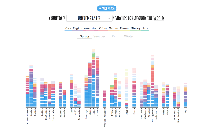
Shirley Wu also recently collaborated with Google News Lab and opted to explore Google Trends data. Check out Data Sketches, her project with Nadieh Bremer.
Explore different ways of displaying the data
When coding out your visualisations, don’t be limited by the examples out there. Wu suggests to pick and choose what fits best for your data. “That might mean learning SVG, and especially the SVG path commands, to bring your sketches to life.”
And when a project’s purpose is more about producing art than insight, you can be much more free with how you display your data, argues Brondbjerg.
“Try and find data that is meaningful and personal to you, visually interesting, and explore different of ways of expressing and encoding the data… variation of colour, shape, movement, proximity and relationships etc. Abstracting data for art and illustration is fine, but always use data that is appropriate, and whatever your project, never set out to mislead the viewer… I think we’ll all agree there’s already enough fake news around!”
Take inspiration from others
Nadieh Bremer also recommends stealing like an artist.
“Look at what other people have done and see if you can fit your data into any of their forms,” she suggests. “If yes, does it show insights? Make adjustments to the design to make it fit your topic and style more.”
Whatever you do, get feedback early and often. Catherine Madden recommends: “Prioritise input you receive from your target audience over others.”