
It’s now been 10 years since Typekit launched, finally bringing the ability to use real fonts on the web. Since then many other services have come along, and the availability and quality of web fonts has continued to grow. But no matter how important typography is to brand voice, general readability of text, and overall user experience — there has been a constant tension between the quest for better typography and the pressures of performance, limiting the number of font files we can use on a given site for fear of slowing down the page loading process. This is a legitimate concern, since after all there is no user experience if the content doesn’t show up! But we’ve been forced to trade our typographic ‘vocal range’ for page speed, and that has limited design across the entire web.
From many to one
A variable font is a single font that acts as many.
— John Hudson
The advent of variable fonts changes the entire equation. As described by John Hudson, a variable font is a single font that acts as many: all the variations of width and weight, slant, and even italics can be contained in a single, highly efficient and compressible font file. Even more, the format itself is completely extensible: the type designer has complete control over what variation axes are used, their ranges, and even the definition of entirely new axes.
There are currently five “registered” axes (width, weight, slant, italics, and optical sizing), but the designer can vary any axis they choose. Some examples include the height of ascenders and descenders (shown in the following figure), text grade, and even serif shape. The possibilities are nearly limitless. By removing the performance barrier, we open the door for more interesting and dynamic design and far greater ability to express the true voice of the brand. All this while maintaining fidelity to the typeface itself: Only axes exposed by the type designer can be varied. No artificial distortion is allowed.

Rhododendron, from David Jonathan Ross’ FontOfTheMonth.club, showcasing axes for ascenders and descenders
What’s really great about how they have been implemented for the web is that they tie into existing CSS attributes seamlessly, and can be tucked inside a CSS Feature Detection block, so they only get pulled in by browsers that can understand them. As of today, every major shipping browser can indeed display them. The notable exception on desktop is IE 11, but the @supports technique works just fine, so there’s no harm in putting them in production today.
The most frequent axes will likely be weight and width, which use the existing attributes of font-weight: [1-1000]; and font-stretch: [number]%; — and usually either slant or italic. Both of those use font-style but the syntax differs between them slightly: either font-style: italic; or font-style: oblique [number]deg; (indicating the number of degrees of slant). Each of the number ranges is up to the type designer, though the goal is to have a general standard of 400 for normal weight, 100% for normal width, and a value for slant that is generally between 1 and 20.
Here’s an example showing the weight axis in Plex Sans Variable, from IBM and Bold Monday:
See the Pen
Variable Font Demo: Weight by Jason Pamental (@jpamental)
on CodePen.
Move the slider left and right to see the range from thin to heavy. You can also explore other CodePen examples highlighting width, slant, and italic axes. Or play around with fonts showcasing separate italic and slant axes, and ascender/descender heights.
Web design, reinvented
While the technology is still maturing and type designers are working to become more fluent in this new way of working, the promise for design on the web is nothing short of revolutionary. The typical scenario has been to constrain any given web design to three- to five different fonts to represent every aspect of a site’s design language and voice — including every permutation for body copy and headings. At its simplest implementation, variable fonts would give us the freedom to use different weights for every level of heading, thus greatly increasing their clarity and readability. This is how graphic designers have worked with type for decades, and it can make a huge difference in legibility at different font sizes.
One could also use slightly narrower character widths for headings or on data-dense displays of information. In fact, the entire typographic system could be designed to be proportional: Weight and width could become multipliers on the standard body copy settings. Doing so would allow these aspects to scale easily along with the body copy, should its settings change based on screen size or user preference. All of the above comes with an accompanying increase in performance due to fewer HTTP requests (fewer font files) and overall savings of data to download (though this will vary by font and compression used).
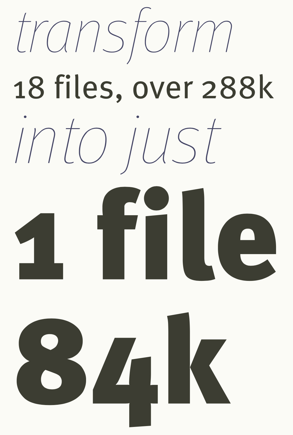
Example text showing the range of weights and italics all contained in a single file for FF Meta
In a project I worked on for Monotype to showcase their first variable font release (FF Meta), the difference was truly striking. Nine different weights of both Roman and Italic versions of the typeface resulted in 18 files — a total of more than 288k of font data — all of which was replaced by a single file of only 84k (as illustrated above, with several different weights and italics). While this is not necessarily representative of every situation, it’s not uncommon either. My own site, for instance, uses a variety of weights, optical sizes, and widths of Roslindale, from David Jonathan Ross’ “Font of the Month Club”, and does so with a single 62k file.
Still, while these freedoms allow us to be more expressive, some of the truly interesting capabilities will help transform the reading experience itself.
Example showing a range of different weights and optical sizes of Roslindale. Note how, as the text becomes larger, it gets narrower, and the contrast between thick and thin parts of the letters becomes more prominent
Reinvented reading on screen
Some of the biggest challenges in creating a good reading experience are tied to the lack of finesse in proportion and fine details. The combination of modern CSS and OpenType features and variations presents a powerful combination. Being able to set features like ligatures and hyphenation based on language, turning hyphenation on and off based on screen size, and even tailoring the character width on the smallest screens in order to fit more characters per line without reducing font size, can all make dramatic improvements in the smoothness and comfort of the reading experience.
The possibilities don’t end here either. Putting more control in the hands of the reader is not only possible, but also entails more functions than one might expect. Giving easy access to adjusting font size, text grade (think “higher contrast between foreground text and background colour” without reflowing the copy), and even potentially serif or terminal shape, could all open up a world of improvements for accessibility in general, particularly for users with low vision or some forms of dyslexia.
Ready for a close-up

An 18th century cut of Garamond in optical sizes. The first image is at 6pt size, the second is at 72. Note the difference in stroke contrast — it’s much more refined in the larger size
Optical sizing is another feature that was common in metal type, but was largely lost in the transition to photo-typesetting and digital techniques. More specifically, despite the fact that some designers still create separate optical sizes for different ranges, it’s rare and somewhat limited. While not commonly found on sans-serif designs, in past decades (or, more accurately, centuries) it was quite common for the physically smaller sizes of a typeface to be cut with slightly heavier strokes, more open bowls and counters, and — in some cases — even wider apertures, in order to preserve readability. Newspapers in particular found this critical to ensure lines did not get lost or letters did not suffer too greatly from ink gain.
Optical sizing has made a return in variable fonts, and can be either automatically applied where available, or set explicitly by the web designer or developer. As mentioned, while it’s not as frequent a feature in sans-serif typefaces, it can be used to quite dramatic effect in higher stroke-contrast serif designs. It can make an enormous difference in readability at physically smaller text sizes, to say nothing of how much more refined the type can look at larger ones.
Here’s an example of Amstelvar showcasing the use of optical sizing:
See the Pen
Variable Fonts Optical Size Demo with Amstelvar (only opsz) by Jason Pamental (@jpamental)
on CodePen.
The example on the left shows the lack thereof, while on the right it’s adjusted to match the type size. Notice the differences in stroke thickness, particularly in the headings.
Polish and poise
With the benefits already discussed, the case for variable fonts is pretty compelling. Still, good typography is not all there is to great design. The range of axes like width and weight give us tremendous freedom to embrace a more editorial design on the web without having to load an exorbitant number of file assets. With the above-discussed variable fonts in place, we have the opportunity to expose them for use by content publishers. Imagine a role for designers inside the Content Management System (CMS) where the website is housed. Through the use of simple controls built into the CMS, the designer would be able to typeset specific headlines or pull-quotes, thus enabling a whole new level of design inspired by what we have been able to do in print, without having to write custom code every time.
A whole new type of web
As mentioned earlier, since September 2018 all the major web browsers support variable fonts. Both dominant mobile platforms support them as well (you can check support on caniuse.com). Given that you can use CSS feature detection with them already, nothing is standing in the way of putting them into production today. There are lots more resources available to help, too.
Check out the Variable Fonts Guide I wrote for MDN, the web typography tips from my weekly email newsletter, and a new site from Australian developer and speaker Mandy Michael. You can also find loads of variable fonts themselves on v-fonts.com and have a play with them in the browser at axis-praxis.org and play.typedetail.com.