D3.js is the de facto library to create dynamic, interactive and engaging data visualisations on the web. D3 development frequently starts by working from one of the community’s many examples. These examples are helpful as a way to jumpstart a project, but by working this way developers struggle to establish solid foundations for further development.
How can we create maintainable and extendable D3 charts that all developers enjoy working with?
Creating D3 visualisations with Test Driven Development is one way of producing code that is easy to extend, refactor and change. In this post, we will go through the process of creating a heatmap chart using a Test Driven approach. The result is a great looking chart with a complete set of tests that has code good enough to be used in a production environment. Let’s get going!
Why D3 and TDD?
D3 is a compelling library based on web standards such as HTML, SVG, CSS, and Canvas and shines when using its interactivity capabilities and animations. D3 is a low-level library and offers a large number of operations on its different modules, making it a powerful yet complex library with a steep learning curve.
Test Driven Development (or TDD) is a software development process in which developers create the tests for the functionality first, then write the minimum amount of code necessary to make those tests pass. The Three Laws of TDD and the Red-Green-Refactor cycle establish the general rules of this methodology. TDD creates short feedback loops, produces excellent quality code, and is really fun to practice.
So why do this library and methodology work together so well?
First, because the example-based charts are not reusable, extendable or even testable, and they ultimately produce a big ball of mud that only the original creator can handle. Also, D3 development is hard, so there is a high chance that our initial approach to a problem will not be the best one.
We will benefit from having a reliable suite of tests that allows us to iterate over our code. Combining D3.js and TDD will force us to create testable and modular code that can be shipped to production, integrated into your continuous integration system and extended when needed without drama.
Creating a heatmap
A heatmap is a data visualisation that shows data variations by using a colour scale. You can find some examples of it on your profile page of GitHub (a yearly heatmap), or in the home dashboard of Google Analytics (a weekly heatmap). We will build this chart to give you an idea of what it’s like to work with D3 in the TDD way.

Yearly heatmap in GitHub’s user profile
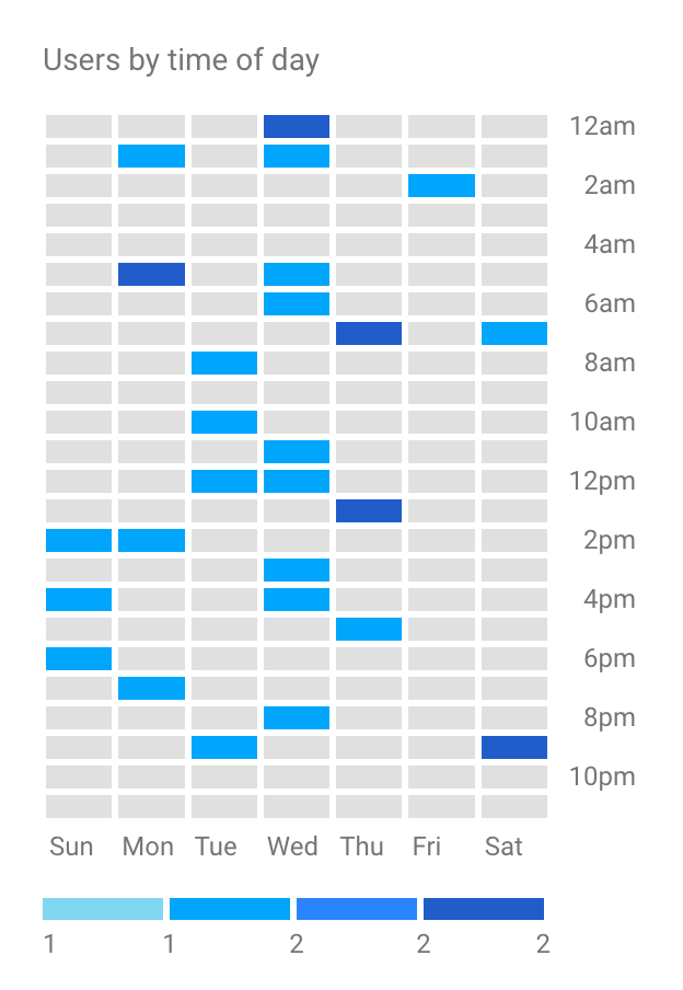
Weekly heatmap in Google Analytics’ Home dashboard
Technology setup
The first thing we need to do is to set up the environment to test our code. On this occasion, we will use Karma as the test runner and Jasmine as the testing framework. As we do not want to spend time on the setup, we will use Karmatic, a wrapper project that allows for an almost magical plug and play installation of both tools.
You can skip these initial steps by forking the repo with the code using this branch. If you want to set it up yourself, I will be assuming you have a recent version of node and yarn installed on your machine.
Let’s have a look at the specific steps we need to follow:
First, we will create a new folder and set up a new package with “yarn init”, filling the prompted fields with the information you think necessary.
Next, we will install Karmatic by typing “yarn add karmatic -D”, using the “-D” flag to add it to our devDependencies (you can learn more about the type of dependencies in the yarn docs).
Installing D3.js is also a requirement, so we will do it by running “yarn add d3”.
Once that’s done, we should enable to run npm tasks by creating the “scripts” object in the “package.json” file:
"scripts": {
    "test": "karmatic",
    "test:watch": "karmatic watch --no-headless"
}
Then, running “yarn test” should give you a message such as:
$ karmatic
Executed 0 of 0 ERROR (0.001 secs / 0 secs)

error Command failed with exit code 1.
This is fine, as we have not created our first test.
Creating the chart structure
We are going to use the Reusable API code pattern to build our heatmap chart. This code pattern has been used in several D3 libraries and was first mentioned in a 2012 post by Mike Bostock – the creator of D3.js.
Let’s have a look at an example of this structure:
const d3 = require('d3');

// Reusable chart
function heatmap() {
    const width = 600;
    const height = 400;
    const margin = {
        top: 10,
        right: 10,
        bottom: 10,
        left: 10
    };

    let svg;
    let chartWidth;
    let chartHeight;
    // Rest of variables

    function exports(_selection) {
        _selection.each(function(_data) {
            chartWidth = width - margin.left - margin.right;
            chartHeight = height - margin.top - margin.bottom;

   	     //Chart creation code here
        });
    }

    return exports;
};

export default heatmap;
The previous code returns a function that will accept one or several D3 selections as input. Then it will extract the data from that selection to build a chart, using the D3 selection as a container. This pattern also allows us to configure the visualisation, as we will see in the next sections.
Using the Reusable API to create charts differs a lot from what we usually see in the regularblock examples. I have written before about this pattern and its benefits for the modularity, composability, simplicity, reusability, and testability of our charts. It will be the Reusable API structure that enables us to build visualisations on a TDD basis.
Creating our first test
Once our environment is ready, we can start writing a failing test. We will create a folder labeled “src” and inside produce a file called “heatmap.test.js”. Let’s see how we will set up the test suite:
const d3 = require('d3');
const heatmap = require('./heatmap').default;
const data = [...];

describe('Heatmap', () => {
    let container;
    let heatmapChart;

    // adds an html fixture to the DOM
    beforeEach(() => {
        const fixture = '';

        document.body.insertAdjacentHTML('afterbegin', fixture);
    });

    // remove the html fixture from the DOM
    afterEach(function() {
        document.body.removeChild(document.getElementById('fixture'));
    });
});
In the first snippet, we are adding and cleaning a fixture “div” from the DOM that we will use to hold our test chart. Once this is in place, we will be able to start with the test rendering suite setup:
describe('rendering the chart', () => {
    beforeEach(() => {
        heatmapChart = heatmap();
        container = d3.select('.container');

        container.datum(data).call(heatmapChart);
    });
});
Here we see how developers will use the Reusable API. First, we create an instance of the heatmap; then we create the container selector that will hold the chart and finally, we mix them by adding the data to the container and calling the heatmap on it.
The data for our chart will be an array of 168 arrays (the hours in a week), each one containing three elements that represent the day of the week, the hour of the day and finally the value. A schema such as:
[
  [dayOfWeek, hourOfDay, value],
  [dayOfWeek, hourOfDay, value],
  ...
]
And now that we are ready to write our first failing test, we’ll find an element classed “heatmap” in the DOM:
it('should render a heat map', () => {
    let expected = 1;
    let actual = container.select('.heatmap').nodes().length;

    expect(actual).toEqual(expected);
});
Our test will not find anything until we create our new chart file in “src/heatmap.js” and fill the chart code comment in the Reusable API code example from before with the following code:
if (!svg) {
    svg = d3.select(this)
        .append('svg')
        .classed('heatmap', true);
}

svg
    .attr('width', width)
    .attr('height', height);
And we will get our first green test! You can examine the resulting code for this setup step in the ‘step-setup’ branch of the repository.
Drawing a basic heatmap
Let’s move forward and draw the boxes on our chart. As we want to create an hourly heatmap over a whole week, we will need to draw 24 * 7 different boxes. We’ll use this fact in our test:
it('should render a box for each hour in the week', () => {
    let expected = 24 * 7;
    let actual = container.selectAll('.box').nodes().length;

    expect(actual).toEqual(expected);
});
This test fails as expected. Before we jump into creating the code that passes this test, I’d like to create some SVG group elements “g” that will help us organise and position the SVG markup we are going to write. For this, we will include the following tests:
it('should render a container-group', () => {
  let expected = 1;
    let actual = container.select('g.container-group').nodes().length;

    expect(actual).toEqual(expected);
});

it('should render a chart-group', () => {
    let expected = 1;
    let actual = container.select('g.chart-group').nodes().length;

    expect(actual).toEqual(expected);
});
To make these tests pass, we will need to create those elements, and we will do it only when creating the initial SVG root node. Let’s take a look at the code:
function buildContainerGroups() {
    let container = svg
          .append('g')
            .classed('container-group', true)
            .attr('transform', `translate(${margin.left}, ${margin.top})`);

    container
      .append('g')
        .classed('chart-group', true);
    container
      .append('g')
        .classed('metadata-group', true);
}
This code applies< =”https://bl.ocks.org/mbostock/3019563″ target=”_blank”>the Margin Convention of D3 charts and creates the group elements. We will also refactor our previous code to encapsulate within a ‘buildSVG’ function:
function buildSVG(container) {
    if (!svg) {
        svg = d3.select(container)
          .append('svg')
            .classed('heatmap', true);

        buildContainerGroups();
    }

    svg
        .attr('width', width)
        .attr('height', height);
}
We will call “buildSVG” from the main module thread passing ’this’ as the container.
So now, we should only have one test failing, the one checking for the boxes. A key element in a heatmap is the colour scale that helps us figure out the colour that corresponds to each value in our data set. As this scale is not public, we will not test it, and this is the code:
function buildScales() {
    colorScale = d3.scaleLinear()
        .range([colorSchema[0], colorSchema[colorSchema.length - 1]])
        .domain(d3.extent(data, function (d) { return d[2] }))
        .interpolate(d3.interpolateHcl);
}
The “colorSchema” is an array of colours that range from the lightest to the darkest. Now, we have all we need to write the code for drawing the boxes:
function drawBoxes() {
    boxes = svg.select('.chart-group').selectAll('.box').data(data);

    boxes.enter()
      .append('rect')
        .attr('width', boxSize)
        .attr('height', boxSize)
        .attr('x', function (d) { return d[1] * boxSize; })
        .attr('y', function (d) { return d[0] * boxSize; })
        .style('fill', function (d) { return colorScale(d[2]); })
        .classed('box', true);

    boxes.exit().remove();
}
In the preceding code, we are using D3’s enter/update/exit pattern to create one rectangle element with class ‘box’ for each entry in our dataset. We are also giving the boxes a fixed size “boxSize” and position them in regards to the day of the week (d[0]) and the hour (d[1]). Lastly, we are using our newly created “colorScale” to style the box with a colour that relates to its value (d[2]).
If everything is right, all of our tests should be passing now — you can check the code at this step in this branch. We will also have the first render of our heatmap! We can take a glimpse at it by placing a “debugger” at the end of our test, opening the ‘debug’ tab and the browser dev tools in our test runner window:

Initial render of our heatmap
Adding axes
Next, let’s spend some time adding the labels for the days — vertical axis — and the hours — horizontal axis — of our heatmap. We are going to code both axes at once, and we’ll start by creating two tests:
it('should render the day labels', () => {
    let expected = 7;
    let actual = container.selectAll('.day-label').nodes().length;

    expect(actual).toEqual(expected);
});

it('should render the hour labels', () => {
    let expected = 24;
    let actual = container.selectAll('.hour-label').nodes().length;

    expect(actual).toEqual(expected);
});
We are looking for seven elements with a “day-label” class and 24 elements with an “hour-label” class. These tests fail, so let’s set up the elements we need to make them pass. First, we will need to create variables with the actual labels and their sizes:
// Day labels
const daysHuman = ['Mo', 'Tu', 'We', 'Th', 'Fr', 'Sa', 'Su'];
const dayLabelWidth = 25;

// Hour labels
const hoursHuman = [
    '00h', '01h', '02h', '03h', '04h', '05h', '06h', '07h', '08h',
    '09h', '10h', '11h', '12h', '13h', '14h', '15h', '16h', '17h',
    '18h', '19h', '20h', '21h', '22h', '23h'
];
const hourLabelHeight = 20;
Now, we should add some container groups to hold the labels, adding this code to the “buildContainerGroups” method:
container
  .append('g')
    .classed('day-labels-group', true);
container
  .append('g')
    .classed('hour-labels-group', true);
Finally, we can create the labels with the following code for the day labels:
function drawDayLabels() {
  let dayLabelsGroup = svg.select('.day-labels-group');

    dayLabels = svg.select('.day-labels-group').selectAll('.day-label')
        .data(daysHuman);

    dayLabels.enter()
      .append('text')
        .text((d) => d)
        .attr('x', 0)
        .attr('y', (d, i) => i * boxSize)
        .style('text-anchor', 'start')
        .style('dominant-baseline', 'central')
        .attr('class', 'day-label');

    dayLabelsGroup.attr('transform', `translate(-${dayLabelWidth}, ${boxSize/2})`);
And for the hour labels:
function drawHourLabels() {
  let hourLabelsGroup = svg.select('.hour-labels-group');

  hourLabels = svg.select('.hour-labels-group')
      .selectAll('.hour-label')
        .data(hoursHuman);

    hourLabels.enter()
      .append('text')
        .text((d) => d)
        .attr('y', 0)
        .attr('x', (d, i) => i * boxSize)
        .style('text-anchor', 'middle')
        .style('dominant-baseline', 'central')
        .attr('class', 'hour-label');

     hourLabelsGroup.attr('transform', `translate(${boxSize/2}, -${hourLabelHeight})`);
}
In both snippets, we are using the “boxSize” variable to position and center the labels, along with the “text-anchor” and “dominant-baseline” properties. At the end of this step, the code of which you can find in the ‘step-axis’ branch, we will render a chart such as:
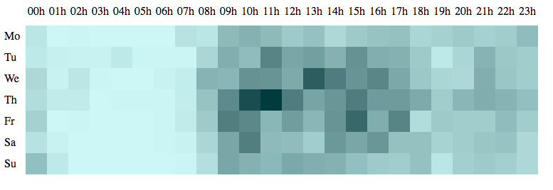
Basic heatmap with labels
Styling and adding animations
Our heatmap has potential, but it doesn’t look great yet. Let’s add some styles to make it more appealing!
For that, we will attach a simple stylesheet that loads a Google font and adds some spacing and some colour to our labels. We can make use of a simple HTML file and a basic Webpack configuration that will use an “index.js” file to create our chart. Also, we will add a coloured stroke to our boxes when we draw them:
function drawBoxes() {
  boxes.enter()
      .append('rect')
        .classed('box', true)
        .attr('width', boxSize)
        .attr('height', boxSize)
        .attr('x', function (d) { return d[1] * boxSize; })
        .attr('y', function (d) { return d[0] * boxSize; })
        .style('fill', function (d) { return colorScale(d[2]); })
        .style('stroke', "#FFFFFF")
        .style('stroke-width', 2);
}
Then, if we change the “colorSchema” to be:
let colorSchema = [
    '#C0FFE7',
    '#95F6D7',
    '#6AEDC7',
    '#59C3A3',
    '#479980'
];
We will render something like this:
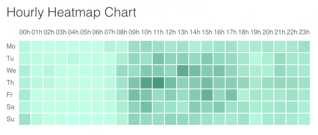
Styled heatmap
Much better, right? However, I feel we are not making the most of D3, so let’s use one of the more celebrated features of the library: its animations!
We could set an opacity of 0.2 and set an initial gray colour when drawing the boxes. Later, we will raise the opacity to 1 and animate the boxes colour to its proper value. This is how we do it:
boxes.enter()
  .append('rect')
    .classed('box', true)
    .attr('width', boxSize)
    .attr('height', boxSize)
    .attr('x', function (d) { return d[1] * boxSize; })
    .attr('y', function (d) { return d[0] * boxSize; })
    .style('opacity', 0.2)
    .style('fill', '#BBBBBB')
    .style('stroke', boxBorderColor)
    .style('stroke-width', boxBorderSize)
    .transition()
        .duration(animationDuration)
        .style('fill', function (d) { return colorScale(d[2]); })
        .style('opacity', 1);
As you can see, we are setting the opacity and gray fill with “.style” calls, then marking the beginning of the animation by calling “transition”. We are setting the duration of the transition — we could also add an easing function or a delay — to two seconds, and then set the opacity to 1 and the fill colour to the one provided by our colour scale. Here are the results:
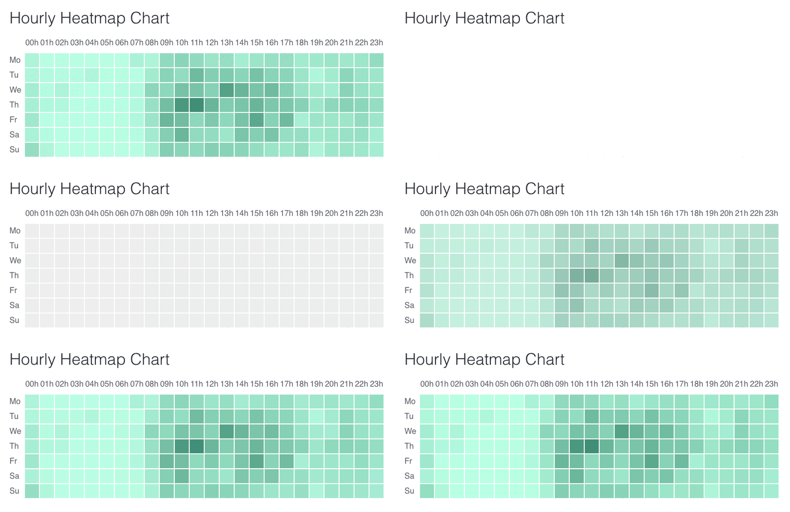
Heatmap with fade-in and colour animation
You can find this code in the ‘step-styles-and-animations’ branch of the repository.
Chart accessors
The Reusable API pattern allows us to configure our chart by creating ‘property accessors.’ They are essentially getter and setter functions, but all in one. For the sake of brevity, we have omitted this code and tests, and you can find them in this branch. There you can see how to add accessors to the colour schema, height, width, and margin or our heatmap.
Now, in the “index.js” file, if we change the colour schema this way…
const heatmapChart = heatmap();
let container = d3.select('.container');

heatmapChart
    .colorSchema([
        '#ffd8d4',
        '#ff584c',
        '#9c1e19'
    ]);
container.datum(data).call(heatmapChart);
… we will see what our chart looks like:
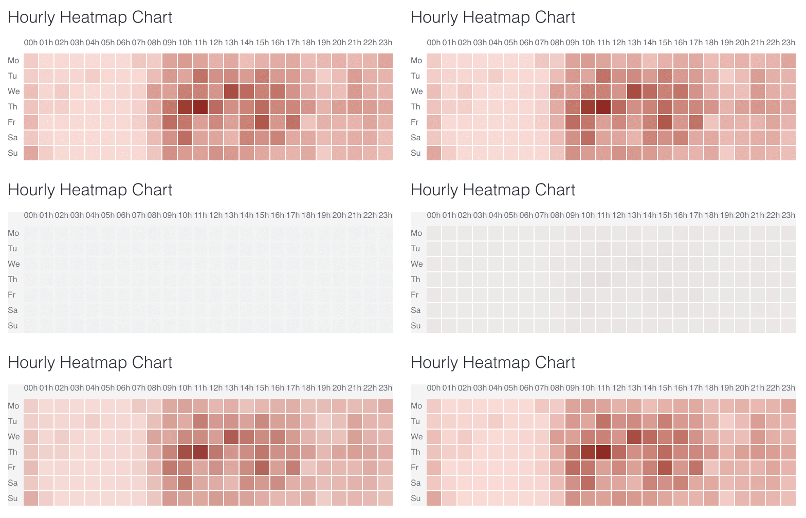
Heatmap with configured colour schema
Loading real data
Until now, we have been using fake data to render our heat map. Let’s change this by loading some actual weather data. We are going to use data from the Weatherbit API.
I have always thought that the wind in San Francisco regularly picks up around 2pm. We are going to check if that’s true. For that, we will find a meteorological station in San Francisco, for example, the one at 3221 20th Street (with coordinates “37.7585,-122.4137”).
Then, checking the documentation, we see that the proper URL schema to get the info is:
https://api.weatherbit.io/v2.0/history/hourly?lat=X,lon=Y&start_date=2018-03-23&end_date=2018-03-29&key={API_KEY}To get the API key, we will need to create a free account using this link. After we get the key, we will need to type the date we want in the format “[YYYY]-[MM]-[DD]” and pass the units as Imperial units ‘I’. This results in the following URL:
https://api.weatherbit.io/v2.0/history/hourly?key=<yourKey>&lat=37.7585&lon=-122.4137&start_date=2018-03-23:00&end_date=2018-03-23:23&units=IAs we want to show a week’s data of hourly wind speeds, and the free tier of the API only allows one day of hourly data, we will need to do seven calls to get the data we need. For this, we will use Promise.all and the new d3-fetch library added to D3 version 5. Here is how we create the requests:
// Fetch data
const requestURLs = [
'https://api.weatherbit.io/v2.0/history/hourly?key=&lat=37.7585&lon=-122.4137&start_date=2018-03-23:00&end_date=2018-03-23:23&units=I',    'https://api.weatherbit.io/v2.0/history/hourly?key=&lat=37.7585&lon=-122.4137&start_date=2018-03-24:00&end_date=2018-03-24:23&units=I',
...
];
const requests = requestURLs.map((url) => d3.json(url));

Promise.all(requests)
    .then(function(values) {
        let dataByHour = getFormattedWindSpeed(values);

        console.log('dataByHour', dataByHour)

        container.datum(dataByHour).call(heatmapChart);
    });
Note how we will need to do some data formatting to adapt the shape of the API output into the format our heatmap. As we mentioned earlier, this is a flattened list of values with this shape ‘[weekDayNumber, hour, value]’. I will omit this code here, but you can find the code in the repository.
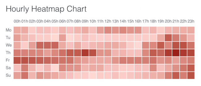
Hmm… It seems I was not right about my 2pm hypothesis. Or at least that did not happen in the week from the 19 to the 25 of March. What about the previous week? This is what I got:
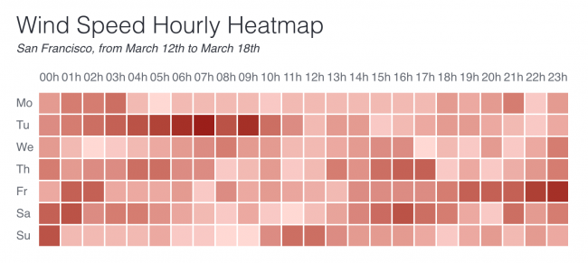
Well, here we see a block of moderate wind starting at 1 or 2pm, but it’s not quite sharp. What we can see is that wind is not an explosive condition in San Francisco. It grows progressively until reaching the top speeds; then it fades gradually as well. This kind of analysis is what heatmaps are suitable for: to show variance on the values and highlight patterns.
Summary
In this post, we have set up an environment for creating D3.js visualisations with Test Driven Development. We created a heatmap visualisation by writing code to pass one test at a time, following the three rules of TDD. We also used a public API to load real data, apply it to our heatmap and interpret the resulting chart to extract insights from the data.
This visualisation is far from complete. All heatmaps should include a legend that shows the values represented by the range of colours. You could implement that legend as part of this same heatmap or by creating an independent visualisation that could be reused with other charts. Our heatmap will also benefit from having a tooltip, making it more interactive and engaging.
I want to encourage you to fork the repo – or continue developing your code – to build these and other features! Share your code in the comments and let’s start a conversation!

