One of the most striking features of the new website design, I think you’ll agree, is that we’ve moved away from the more uniform approach of the old website and added much more colour to it, instead of lots of white space.
User experience has become more and more important in recent times, and the decision to add more variety came about by putting ourselves in the user’s shoes and wanting to make the site easier to use and more pleasant to interact with.
What’s more, we wanted to give our products more identity and make it easier to distinguish between them and where they fit in our range, as well as making the entire site easier to digest. In a nutshell, we gave all of our products their own colour and unique icon.
But what were the reasons behind this decision and how did we do it?
Iconography
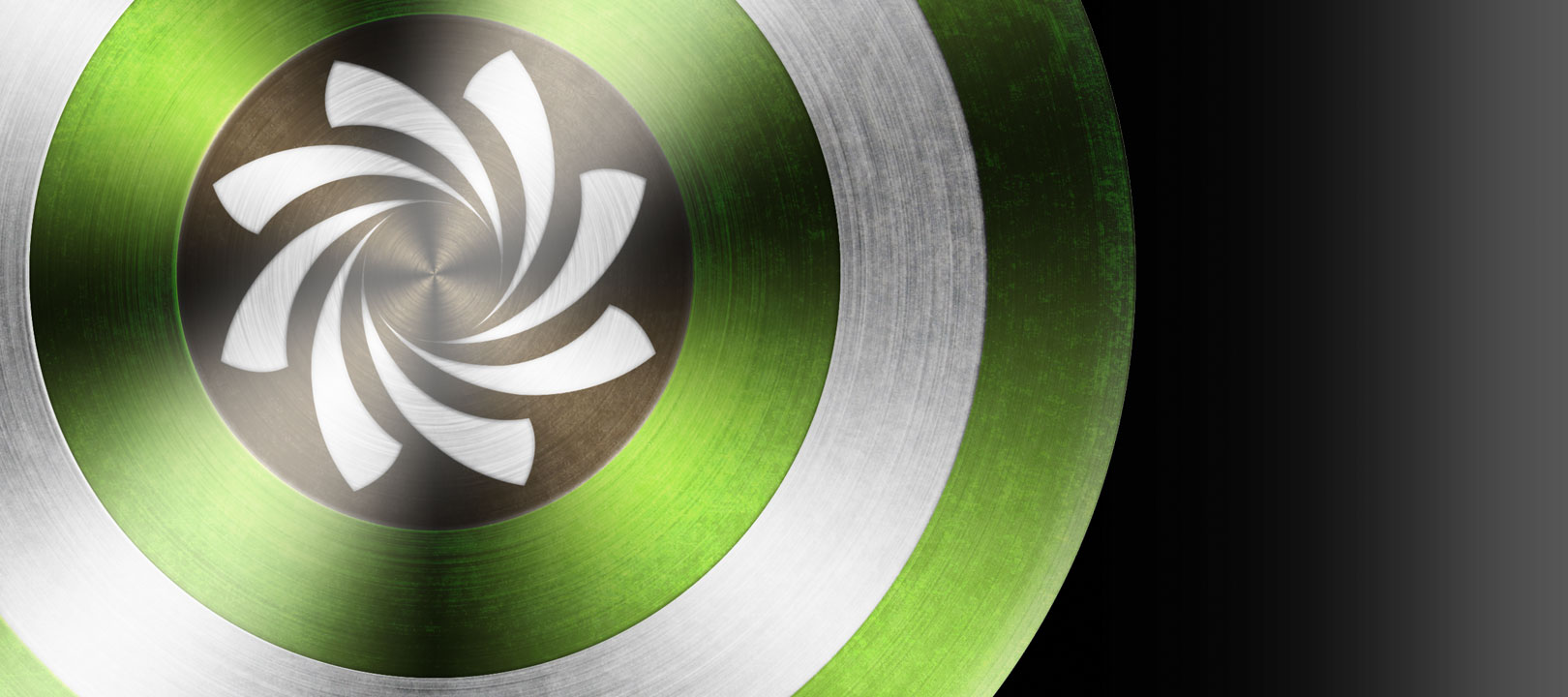
Aside from the colours, we decided that each product needed its very own icon to help bring out its identity so visitors to our site could instantly find what they were looking for. What’s more, the icons help to describe what the product is all about.
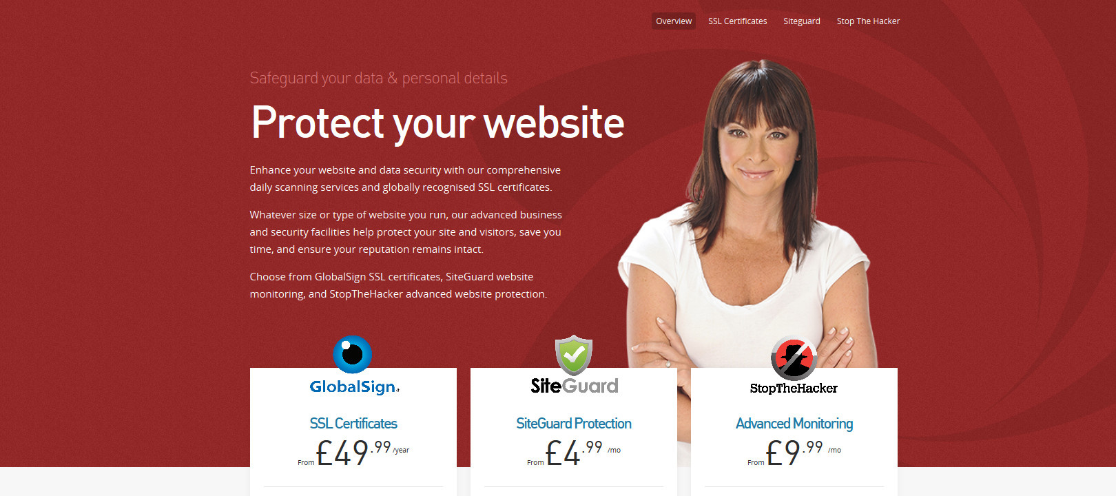
For example, website security products are represented by a padlock, instantly letting the viewer know that these products are to keep their data safe. Some of our products are naturally harder to explain with them being more intangible. How do you explain a Hybrid Server in one image?
Essentially, we had to go back to basics. What were the key features of each product? What did they do? For the Hybrid Server icon, we borrowed the DNA strand from our ads, for Dedicated Servers, we simply used an image of a server. To make sure that we captured the fundamentals of the product, we just simplified it as much as possible and came up with an image to accompany it.
This allows both frequent and new visitors to get to grips with the products they are interested in quickly, as those who use the site often will be able to navigate the site without having to read it, whereas newcomers will get an idea for what the product is all about straight away.
Consistency
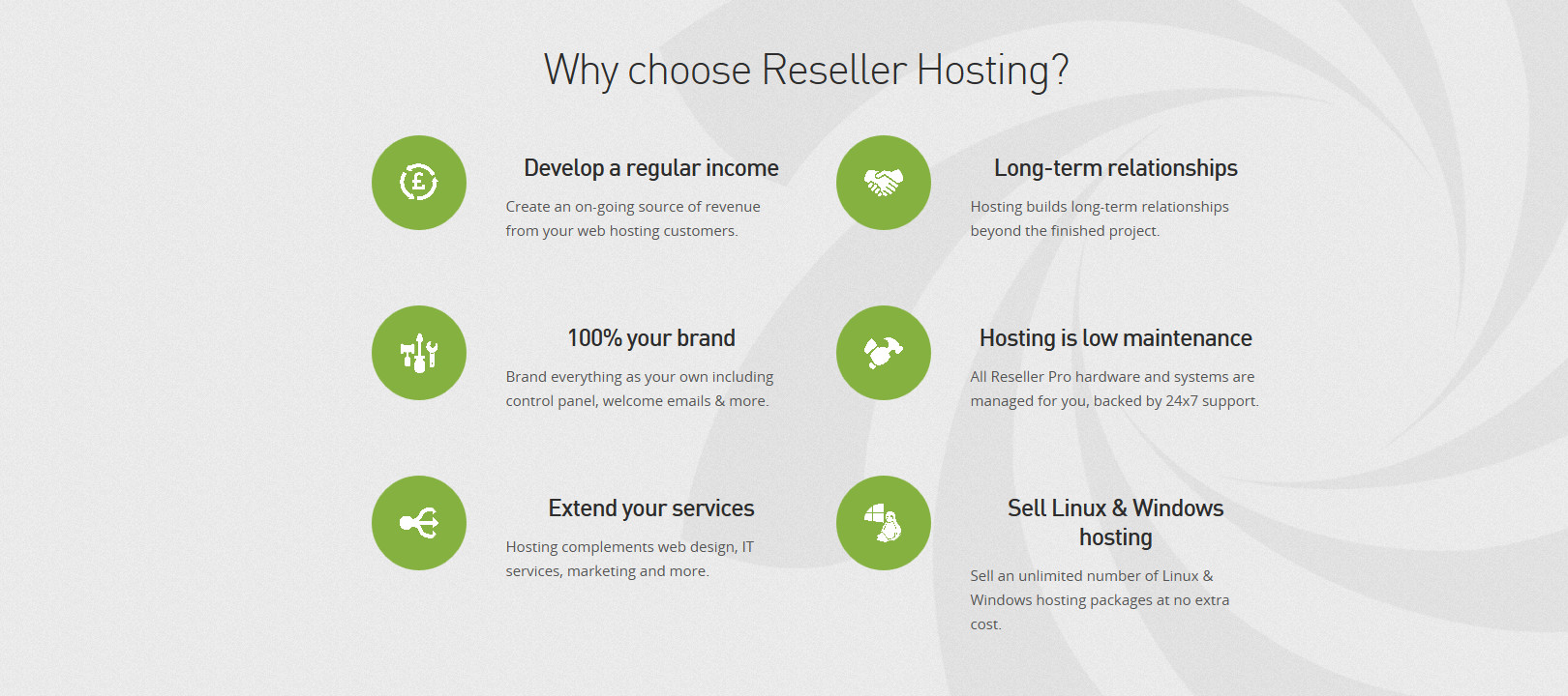
On our old home page, our main products were displayed in different coloured boxes, but after you clicked through to their dedicated pages, the colours disappeared. With the new website, we decided that we would create clearer distinctions between each product, and have a consistent colour scheme to guide our visitors through the pages. The icons and symbolism also help visitors to instantly recognise a product type without even having to read the copy.
This also helps visitors to clearly distinguish between product types and find what they are looking for much quicker and easier, and makes navigating the pages simpler.
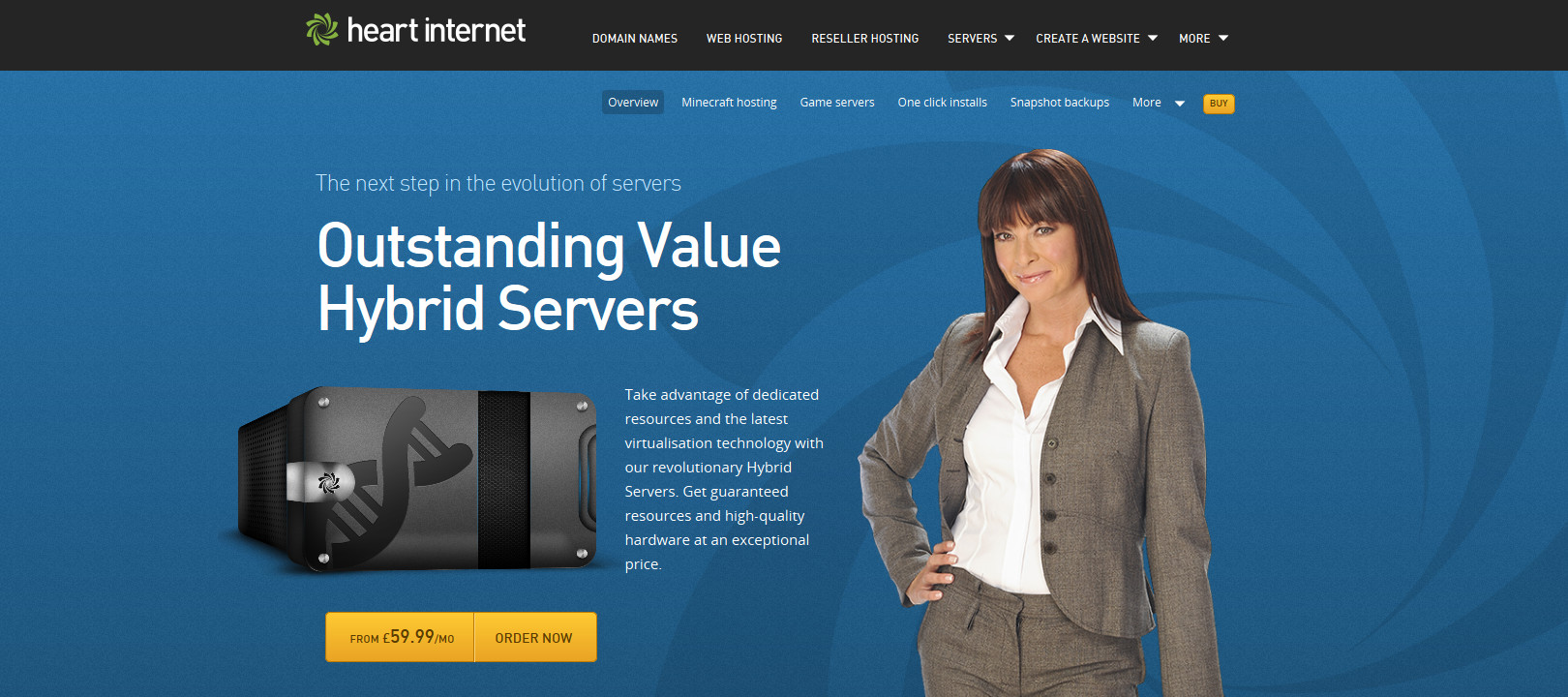
For example, all of the information relating to web hosting products and services has its own shade of green, whereas anything related to our more advanced server products (VPS, Hybrid Servers and Dedicated Servers) is in blue. Blue was a great choice because it denotes authority, and is synonymous with technology. We know that our more advanced server customers know their onions in terms of what they want from a VPS, Hybrid Server or Dedicated Server, so the cool and clean ultramarine blue fitted precisely with that group of products.
Representation
Each of the new colours is connected with the products they represent, and they were chosen to add more depth and identity to them. In other words, we didn’t just splash random shades of green, blue, pink and red all over the website for the sake of it, we made sure that they had relevant connotations with the products they represent.
For example, web hosting is a hands-on product which is at the root of what we do, so choosing an earthy green made sense here as we wanted to show people that this is the place to get going and grow your website.
Other areas of the website suited different colours, particulalrly red which usually denotes ‘stop’ or ‘danger’, themes that we thought were suited to our website security products. Seeing as using these products helps you to prevent malware and other types of intrusion attempts, red was a natural choice for this area of the site.
Vibrancy and creativity
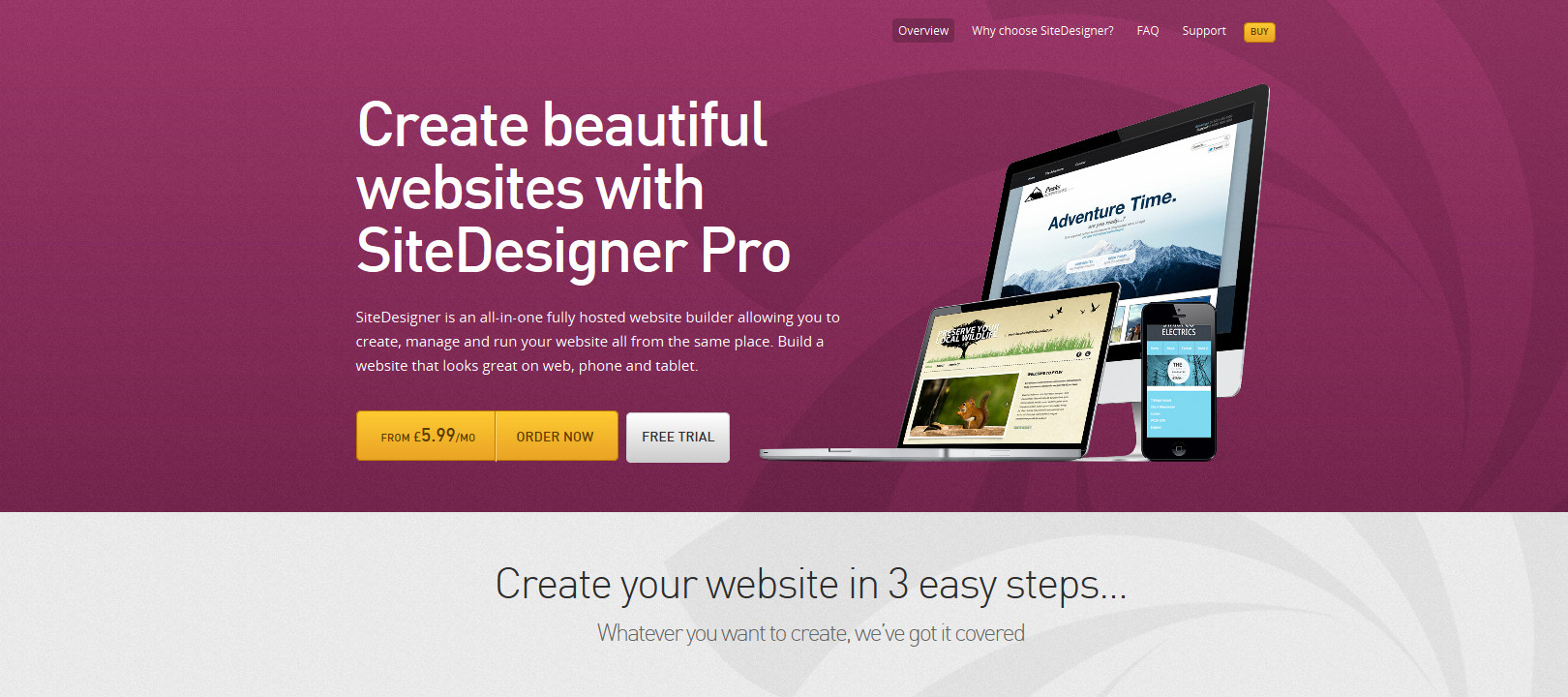
For our website builder products, we wanted to show people how they can be creative and build amazing websites for themselves, even if they don’t know HTML or CSS. The rich shade of purple is extremely eye catching and really helps to brand this part of the site as being vibrant and exciting.
Staying faithful
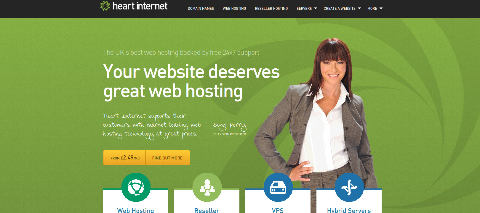
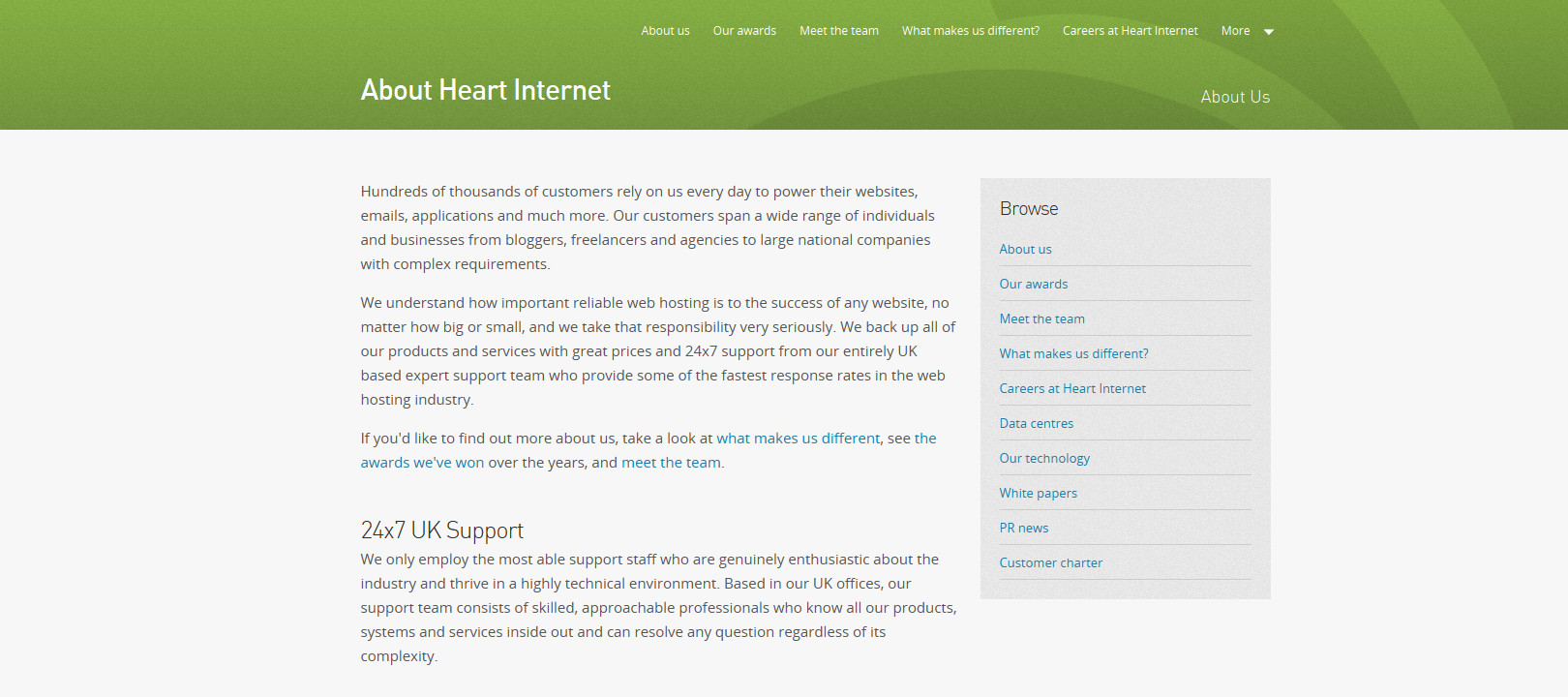
Of course, given our position as the UK’s top reseller hosting provider, we had to lend the Heart Internet green to our Reseller Pro pages, which you will also see is the most common colour used on the new site. Everything that relates to us as a company, including the ‘About us’ and ‘Kudos’ sections features this shade of green, reminding people that providing top drawer reseller hosting is our bread and butter and what has made us so successful.
Integrating more colour and product identity was hugely important with our new site, especially as we have lots more products now than when we launched the old one. Colour coding them and giving each set of products their own icons was a simple and effective method we used to help people digest the site, whether they have been using it for a while or are still at the research stage.
How much thought do you put into the colours and icons you use on your website(s)? Let us know in the comments below.