Have you ever struggled to buy a metro ticket at a kiosk? Or been frustrated at a self-checkout counter at a supermarket? Or struggled with self-check-in at an airport?
Have you ever wondered how those experiences were created, and why they sometimes seem poorly designed? What tools and methods do we need to design for things in the physical world? This is the unique area of UX for ergonomics that sits in a small niche between traditional UX and industrial design.

We are Mariana, senior strategist, and Kevin, principal interaction designer, at frog. We’ve worked on a number of projects combining physical and digital elements and think that human factors or ergonomics can sometimes be undervalued or taken for granted when designing digital products that live beyond traditional devices, such as phones or computers.
We know good design for websites and apps, but what is good design for digital interfaces within physical products? Many things we rely on don’t apply, and there are many new things to consider. In this article, we’ll explore what’s different and/or new, as we explore the ergonomics of these devices and the physical/digital design challenges involved.

We’re going to talk about a few things:
- The basics of ergonomics and UX
- What’s unique about the form factor
- What’s unique about the hardware
- What’s unique about the context
- Find out how you’re not like your user
- How you can prototype these experiences
The basics of ergonomics and UX
In recent years, with the emergence of larger and larger phones, people have been discussing ergonomics more than before.
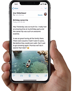
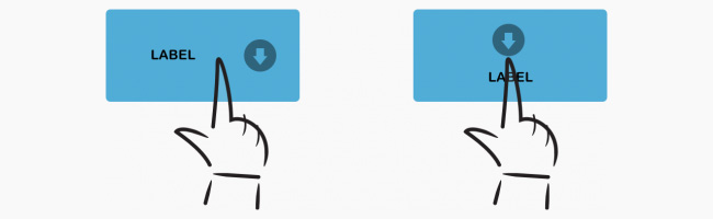
Reachability
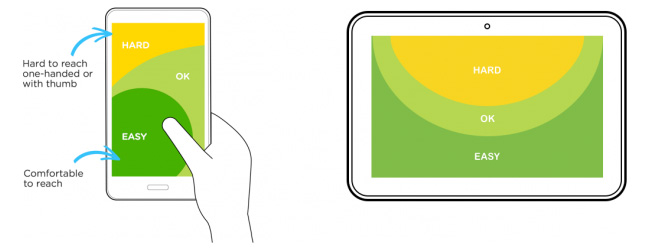
(Source: Luke Wroblewski’s Designing for Large Screen Smartphones)
Here you can see the recommended screen areas and distribution for mobile/web application design. These areas help to ensure the designed interactions remain comfortable in relation to how the person will hold the device and navigate. But when do these differences matter?
Hand position
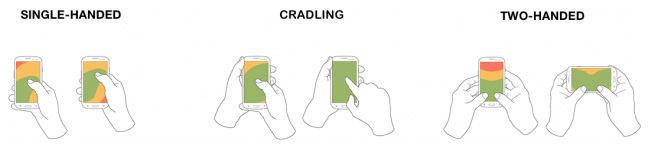
(Source: Luke Wroblewski’s Designing for Large Screen Smartphones)
It’s not only about size. It’s about how people hold their device when using an app. Some apps, like maps, need to designed to be used on-the-go, so they need to support one-handed navigation, whereas other apps, like Netflix, are used primarily while stationary, and so we can expect two-handed usage.
Interaction vs reading

(Source: Luke Wroblewski’s Defining Mobile: 4-5.5 Inches, Portrait & One-Thumb)
We also need to consider the difference in usable areas between reading and interacting. What are the actions to be used and their frequency? The two modes of usage are not the same.
Takeaway: Find out how people are holding a device when using your app, for what purpose they’re using it, and design accordingly.
Fitts’s Law
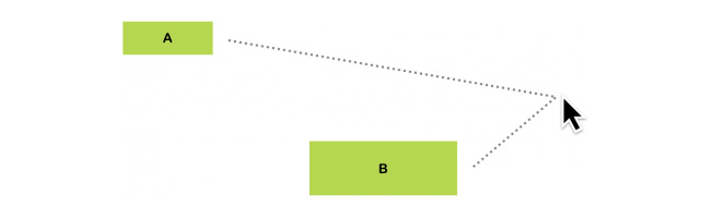
One of the few UX laws related to ergonomics is called Fitts’s Law. We won’t go into details, you can read more about it in Kevin Hale’s “Visualizing Fitts’s Law”; but the gist of it is that it’s easier to click or tap on bigger items that seem closer than it is on items that are smaller. While that might seem obvious, there are interesting implications worth exploring.
Infinite corners and edges
The combination of a mouse and monitor adds an interesting variation to this law, as these have corners. Any targets located at the corner are incredible easy to fit, as they are like infinitely big buttons. This means that each monitor has four giant buttons that anyone can hit easily. This is why Microsoft Windows uses the bottom left point for the Start Menu, and the top right for the close button.

On touchscreen devices it’s a little different, however, because using a mouse is different to using your finger. Instead of infinite corners, we have infinite edges. These four edges can be used to swipe in or out. Usually they are reserved for system level interactions. For example, swiping from the bottom in iOS brings up the Control Center, and swiping down from the top on Android brings down the Settings screen.
Takeaway: Understand how Fitts’s Law creates special areas on your device, and how you can use them to create new and unique interactions.
What’s unique about this form factor?
Building on these principles, when we have a unique form factor, what different aspects of it are in play? Where is the screen positioned, low or high? Is the screen flat, angled, or upright? Is it big or small?
How might people react to and interact with these three displays differently?
Putting the digital ergonomics principles and form factor characteristics together, we get a better understanding of how the digital principles relate to and leverage the physical characteristics and vice versa.
We should also then consider physical ergonomics or human factors, besides the hand size and thumb position in relation to the screen. The device form and position in relation to the human body.
Example: Exploring a museum
How do you experience a museum app compared to interacting with a museum exhibit? You navigate your phone, going through the main menu, scrolling through or swiping images of a collection; by using your hand to hold the phone and your thumb or index finger. This is different from being at the museum and interacting with a kiosk as part of the exhibit, by standing in front of it and using your arm’s full movement to go around a screen and observing by moving your head.
In assessing the characteristics of the form factor, there are also technical aspects to evaluate. What are the hardware restrictions or constraints of the chosen form factor? How do people interact with the position, shape and size of the form factor?
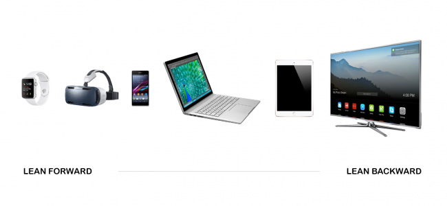
Posture
How are people physically engaging with the devices? We often talk about lean-forward devices like smart watches or phones, or lean-backward devices like TVs. Lean-forward devices can have smaller fonts, higher information density, whereas lean-backward devices require lower density of information. Depending on a person’s position towards the screen, the perception of size is also different. We need to keep this in mind when assessing our form factor.

What’s unique about this hardware?
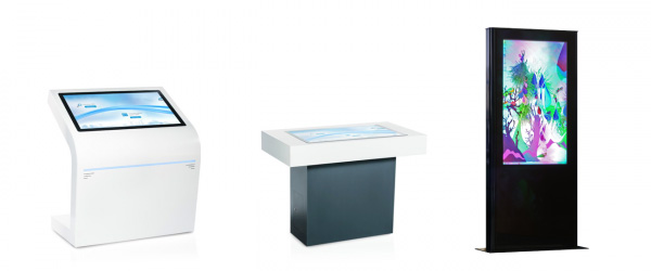
Many screens which are used in the public space have unusual properties that we don’t see on things like tablets or phones. This is due to a few reasons, such as the fact that devices often need to be vandalism-proof, suitable for outdoors, and are not mass-produced at the same level as mass-consumer devices. This means screens often have different properties, and we need to design for them specifically.
Thickness of glass

(Source: Bridge’s Touch Screen Ergonomics: The key to seamless usability)
For screens on ATMs and public transport kiosks, often the glass is extra thick. This causes perception problems between what the user sees and what they touch, causing mis-taps, which could result in long queues at peak times and frustration.
Viewing angle
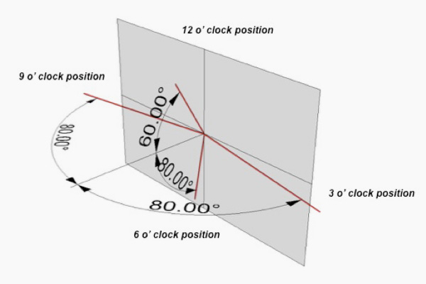
(Source: Bridge’s Touch Screen Ergonomics: The key to seamless usability)
Every screen has a viewing angle, which means at what angle you can see the screen contents correctly and clearly. Most commonly, this is how far to either left or right you can move and still see the screen. Many cheaper screens have a lower viewing angle range, and this can affect situations when two people are using the screen at the same time sitting side by side. For example checking-in to an airline. Ideally, as a designer, you can be involved in or influence the purchase process of a given screen and buy something that’s right for the needs to be addressed, but if not, it might affect the design solutions you come up with.
Takeaway: The viewer or viewers might not necessarily see the images and/or text the same way as you see them while designing (in front and centre of your computer screen).

(Source: Bridge’s Touch Screen Ergonomics: The key to seamless usability)
The second aspect of this is a vertical viewing angle in order to cater for a variety of heights of users as well as the position of the device or screen in relation to the viewer.
Takeaway: This issue can be minimised by using more vertical spacing than normal in text and menu items.
For devices with screens that are positioned at a low height, it’s important to a) make hit areas very large, and b) position text, so the user’s own finger doesn’t obscure the text they are trying to tap.
What’s unique about this context?
Any product doesn’t just live in a lab or controlled environment, so when we design products for the public space, we need to consider the context. For example, is the device indoor or outdoors? What kind of clothing is the user wearing (maybe related to the weather or special gear)? Is there a single user or are there multiple ones?

For example, people interact with public display terminals in multiple ways. We call this the three-read experience. A person has a different experience beside the terminal, near it and far away from it:
Beside
Standard interactions like navigating and finding information.
Near
Reading headlines or smaller pieces of information (non solicited), such as general directions or larger images.
Far away
Attracting people to the device. How can they understand the value of it, and whether it’s interactive or not?
Find out how you’re not like your user and define an accessibility strategy
Often, we define a user group or persona. But it’s as important to know in which ways you as the designer are not like the user(s).
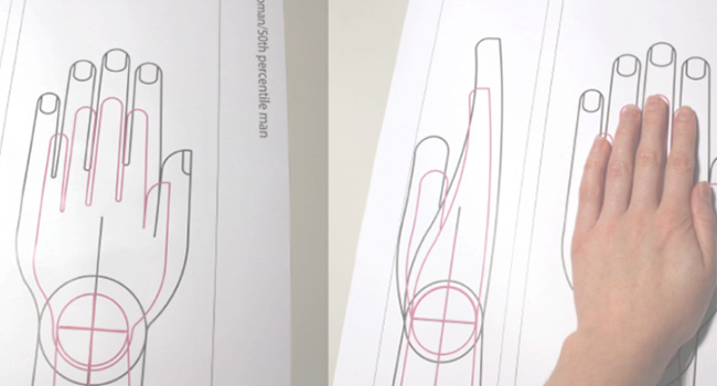
First learn about yourself. What type of user are you? In which percentiles are you within your “population”? There are many charts showing population distributions, so check your proportions and figure out how similar or different you are. Also, explore how different your “population” reference is from the people for which the device is intended; not necessarily other nationalities but you may be designing for children.
Many public installations have accessibility requirements. A shopping centre may not, but we still recommend you consider how these kind of requirements might change the system or device you are designing.

Designing for inclusivity and accessibility doesn’t just require looking at a few individuals that may represent different types of users, or referring to “the user” as an abstract concept that represents one set of parameters. It requires looking at a bigger population to understand the relevance of dimensions, defining criteria that account for different interaction needs (visibility, voice, body movement) and using representative anthropometric data, which will drive the design.
Additionally, it’s important to consider the adjustability potential. This will allow you to fit a product to a wider range of users. You may want to adapt the product to a specific user, for example, and make the product adjustable or create different sizes of the same product. However, there is a trade off to make between costs, available space and fit (see Inclusive Design and Making in Practice).

Example: Designing home appliances for all family members
A couple of years ago one of us worked on a project to design a line of big luxury smart fridges. The team had a more regular fridge size available to test out ideas and understand the dimensions and distribution of cold areas (also drawers and shelves). We were trying to decide whether to put the control display in the middle or at the top of the fridge. So we made a foam square with the real dimensions of the fridge. Two of the industrial designers were quite tall, maybe 1.85m (6 ft), but another team member was 1.6m (5.2 ft). It became clear, when all were standing in front of the model, that if the display was going to be at the top, it had to have an inclination of 45 degrees, so that shorter people could see and actually use it in a comfortable way. We could not have seen this so clearly without having a real size foam fridge and such different team members.
How do we prototype this?
While figuring out what’s possible and feasible in terms of digital interactions and physical form factor and who the user(s) is, we define and refine design principles. However, to make these even more helpful, so that we can eventually judge if this is a good design, we need to consider what is important for the user(s) in this experience. There is no better way to understand these principles, especially when dealing with physical products, but to act things out. Here are some fun and interesting examples of prototyping.
Example: How do you test a rear seat UI quickly?
Guerrilla Ergonomics Testing from Kevin Cannon on Vimeo.
It’s far from perfect, but quick experiments like this can lead to very useful insights. You don’t need to wait to have a car and a device to start your testing. With this, we learned that swiping left-to-right was much easier than up-and-down, and so changed our UI accordingly.
Example: How do you prototype 3D?
Papier Proto Indoor Nav 2 from Kerstin Michaelis on Vimeo.
You can even prototype 3D maps with paper.
It’s often tempting to go high-tech with prototyping, but sometimes, some quick paper prototyping and clever camera work, can teach you a lot about your concept early on.
Example: How do you get the scale right?

(Source: Simon Drexler)
When we’re working with larger displays, it’s very easy to make mistakes regarding the scale of items. One way of getting it right during the design process, is having a similarly sized display as part of your design and prototyping process. Shown here is someone’s workspace as they worked on an interactive terminal.
It’s a bit harder, but you can prototype the context too, not just the product!
Sketches and prototypes can and should be supported with experiential prototypes and tests. This means trying out both the digital and physical experience and putting it into the context of where it will live and who will be using it.
A team was working on a smart lighting system at frog in Munich. At an early stage, they wanted to learn how people would interact with the system and its multiple components (light bulbs, controls, etc). However, the system was still too unstable to bring it to people’s homes for a test. So the team transformed a meeting room into an apartment mockup inside the studio. This “apartment” was used to conduct multiple experience and usability testing sessions at different stages of the design and development process. Because the space made participants “feel at home” in a way, the team was able to learn faster early on and draw deeper insights into people’s behaviours. The team not only learned how people would use the system components but how they would potentially use them in their own homes. (Eventually people were able to take some product samples to their actual homes for testing).
Of course, many projects won’t have the budget for this sort of prototyping or enough time to set this up, but you can get creative with cardboard, posters or other materials and achieve similar results.

So, when tackling these kinds of design challenges, be sure to explore the possibilities given by the form factor and don’t hesitate to go deeper with empathy into understanding who will be using your product, where, when and why. Most importantly, be ready to get creative when prototyping the device, the context and the experience with and around your product.