Sending emails is still one of the best ways to market to existing and new customers. But it can be difficult to design an email that works across all the different email clients – choosing a design that is eye-catching but still looks right on Outlook, Gmail, Apple Mail, Yahoo, and all the other mail clients out there.
Most email clients accept HTML emails, which means you can have images, colours, and really make your emails stand out, but each client will render it in a different way. Here are some of our tips for making sure your emails work every time.
Picking the height and width
Use 550 to 600 pixels…
When planning your initial design, make certain that your template is 550px to 600px wide. Google recommends this, and the preview panes in desktop email clients can incorporate both horizontal and vertical scroll bars in order to view extra-wide emails.
…but make the width responsive
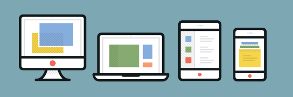
Since emails are viewed on a variety of devices, including phones, tablets, and laptops, it makes sense to code your email to respond to the width of a device.
This can be done in the CSS with @media queries. So, for example, if I want to make sure that my main table fits perfectly on a phone screen, I would set up the following:
<style type="text/css">

@media only screen and (max-device-width: 480px;) {

table[class=maincontent] {

width: 320px !important;

}

}
Which would mean that every time a device has a maximum screen width of 480px, the main content table would only be 320px wide.
Be concise with your message…
On a mobile, the more content you include, the longer the email will be, meaning that your audience will have to keep scrolling and scrolling and scrolling. By keeping the message concise, the height will be reasonable.
…and put the most important information first
Many email clients have preview panes, and by putting the most important information first, you can be sure your audience gets hooked in right away.
Choosing a typeface
Don’t expect consistent results with webfonts…
Webfonts, such as the wide range available from Google, are great for websites, but don’t work consistently in HTML email. You will get better results on mobile devices, so use them only in conjunction with @media queries, using @font-face and @import.
…so stick with ‘safe’ fonts
The default fonts installed on PC, Mac, and devices are:
- Arial
- Arial Black
- Comic Sans
- Courier New
- Georgia
- Impact
- Times New Roman
- Trebuchet MS
- Verdana
These work best for body text, as you will then be assured that everyone sees your email exactly as you see it. And make sure you use a font stack with a generic font style as a fallback, such as:
font: Trebuchet MS, Arial, sans-serif;

But you can always use an image
If you absolutely have to use a specific typeface, and you know it’s not a commonly installed font, include it as an image.
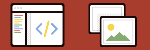
Adding images
Don’t make your email just out of images…
While you might be able to get every last pixel where you want it to be if your email is made of images, some email clients will mark it as spam, and once it’s in a spam folder, that’s it for that email.
…and make sure you use alt text
Whatever images you do use, make certain that you’ve included alt text. Many clients do not initially download the images, and if you have an important message in an image, you want to make absolutely certain people see it rather than just an empty box.
Think about using background images…
To make a design more interesting, you can use background images, especially on call-to-action buttons. You can add them in with CSS.
…but make sure your images aren’t too large
Don’t make your mobile customers use up all their data downloading your images. Keep the images down to a minimum and always make sure the file size is fairly small. No one is expecting print-quality images in an email!
Specify the height and width…
Not all email clients pay attention to the actual size of the image, and you don’t want stretched out or too small images. Make sure you create the image at the height and width you exactly want, then specify it in the HTML as well.
…and make sure the CSS is right
Always add display:block to images in order to prevent unwanted spacing or format issues. Add it to the image itself, and then also in the CSS at the head of the document. And if you were thinking of using float on images – don’t. If you want an image to be to the right or left of some text, use align, like so:
<img src="https://www.yourdomain.com/newsletter/october-offer.jpg" height="200" width="100" style="display:block" align="right">

I hope these tips have helped you create great emails that’ll work across all the different clients. Next time, I’ll get deeper into how to make responsive emails, so that your email really shines.
Icons from the Dashel Icon Set by Print Express.
A couple of years ago, responsive designs for emails were considered a bad idea because of the very poor support for responsive design in email clients. I’m aware that Outlook still uses Word’s rather poor HTML renderer (as opposed to Internet Explorer’s not-quite-as-bad renderer).
Has that changed? Can your common or garden email client handle even @media queries?
The @media queries only come into effect when a webpage or email is seen on a screen size smaller than a certain width, such as tablets and mobile devices.
Desktop computers, laptops, and some tablets have large enough screen sizes to view an email without the need for @media queries.
With the exponential rise in smartphone usage over the recent years, and the matching increases in emails opened and viewed on mobiles, responsive email marketing is now an essential way for companies to market their business.
It’s worth noting that not all mobile email apps/browsers/devices support @media queries, but those that do have a large market share – especially those that use iOS and Android platforms. Devices that don’t recognise @media degrade the email gracefully simply by reverting to your default styles and typically show the desktop version, and support for @media queries is only likely to increase in the future.
You can read more at:
https://www.forbes.com/sites/jaysondemers/2015/04/08/how-important-is-a-mobile-optimized-email-newsletter/
https://www.campaignmonitor.com/dev-resources/guides/mobile/
Are you really recommending the use of Comic Sans?
We’re just listing every font that is commonly accessible on the web.
Our opinions on font choices remain unspoken.