
Is less really more in web design? Debate around the use of white space in digital media sometimes feels as old as the hills.
Let’s begin by defining white space. White space, also referred to as negative space, is the absence of content between screen elements.
The space around a call to action? The distance between lines of text or paragraphs? The margins of your web page? All examples of white space, regardless of background colour.
What are the benefits of white space?
White space is good for you. If you have no negative space on the page, how will the reader notice anything?
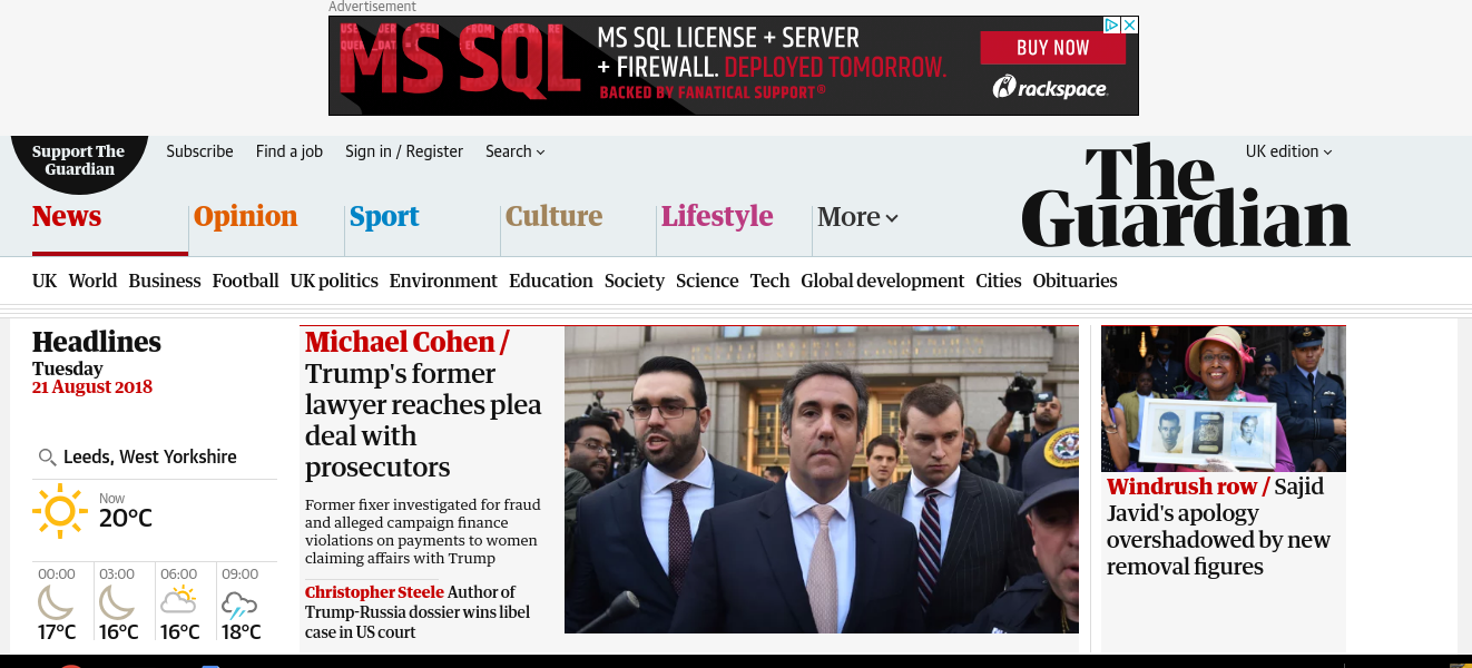
Even content-heavy news sites need some white space for readability. For example, The Guardian is careful not to entirely crowd out its home page with sidebar information and display ads.
White space is good for you. If you have no negative space on the page, how will the reader notice anything?
Even content-heavy news sites need some white space for readability. For example, The Guardian is careful not to entirely crowd out its home page with sidebar information and display ads.
Space helps your page breathe, and brings attention to those elements — such as call-to-actions — that you want your visitors to notice. Look at this page from MailChimp.
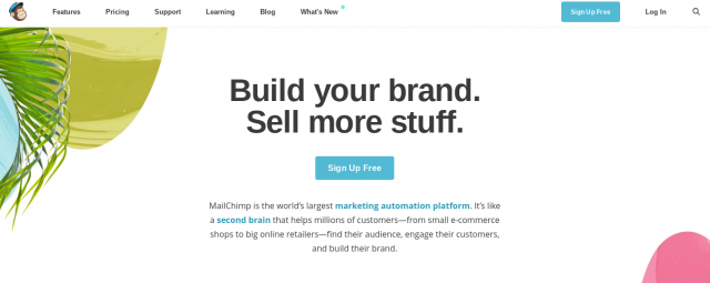
It’s pretty clear what MailChimp wants you to do. It wants you to sign up for free. The expanse of space around the sign up button and the large typeface above the CTA naturally draw the eye to the middle of the page. White space, font size, and on-page placement help you understand exactly what the home page is about — new customer acquisition.
For MailChimp, getting new clients to sign up is a more important use of its digital real estate than anything else. Indeed, existing customers may need to squint twice before locating the “Log In” button in the top right-hand corner.
Breaking it out
It is important to pay attention to a range of on-screen elements when considering how to deploy white space in a balanced and effective way.
These elements include:
- Dropdown menus
- Margins
- Image size
- Image captions
- Headers
- Footers
- Bulleted lists
- Chatbots
- Newsletter pop-ups
- Lettering
Your distribution of white space should feel proportionate across all devices, regardless of how far you already scrolled down the page. If the top of the page allows your eyes to breathe easily, so should the rest of your site.
Bear in mind that the smaller your typeface, the less space there will be on the page. Apart from inducing squint mania even in those with good vision, tiny lettering is bad news for the significant number of people who find it difficult to read small text.
One in 30 people in the UK struggle with some form of sight loss, with approximately 350,000 formally registered as blind or partially sighted. Be mindful of the temptation to boil down your text too small. More space around lettering not only looks good, it makes you more accessible.
If a picture is worth a thousand words, that’s a lot of words to look at. So you better make your lettering look nice.
Lunar athletics?
Of course, there’s a fine line between the creativity associated with white space and extreme minimalism. In a memorable phrase, Sherice Jacob writing for Crazy Egg said having too much white-space is similar to “pole vaulting on the moon”.
“You’ve got all this open air on your page and no real direction. Too much space detracts from your content rather than pulling the reader in and enticing them to learn more.”
While the point is a valid one, there are always exceptions. Just ask Google.
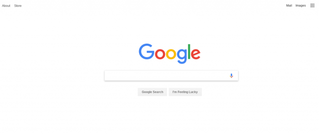
The most commercially successful use of white space ever?
Google takes its negative space seriously indeed. Chris Halaska, senior interaction designer at the global behemoth, reminds us there is always a balance to strike on this topic. He admits not everyone is a fan of heavy white space, but says it is not how much you use but how you use it.
“Without knowing why we use it, the negative space obviously pushes content below the fold, is a missed opportunity to add more to the page, and makes everything less exciting”, Halaska writes. “These are true to some extent, especially on mobile, but the positives outweigh the negatives in the majority of cases.”
Smart composition in layout creates hierarchy on the page, he says. “The correct use of space, imagery, text, and colour can help guide the user from one point to another, communicating the designer’s intent.”
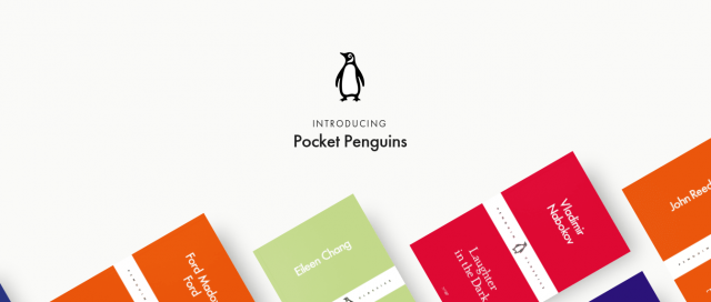
Take a look at the home page for Pocket Penguins for an inventive use of white space that demonstrates what Halaska is talking about when it comes to design intent.
Go on, read me
The heavy concentration of white space above the fold directs your attention to the Pocket Penguins logo. Your eye is then effortlessly drawn down the page, into the books, and below the fold.
It almost mimics the sensation of getting lost in a good book. And it starts with the intelligent application of white space.
“The less content you can see at one time the less cognitive load is involved, which makes it easier to scan and digest the screen leading to a happier and calmer user. Research states that even though it takes longer to read through the content, it increases overall comprehension.” – Chris Halaska, Google
Why negative space is really positive
Luxury brands love to use white space to draw attention to the beauty of their jewellery or the wonders of their timepiece. Businesses like white space because it helps focus the visitor on the things they want you looking at. Apple has built a trillion dollar business marketing itself through negative space.
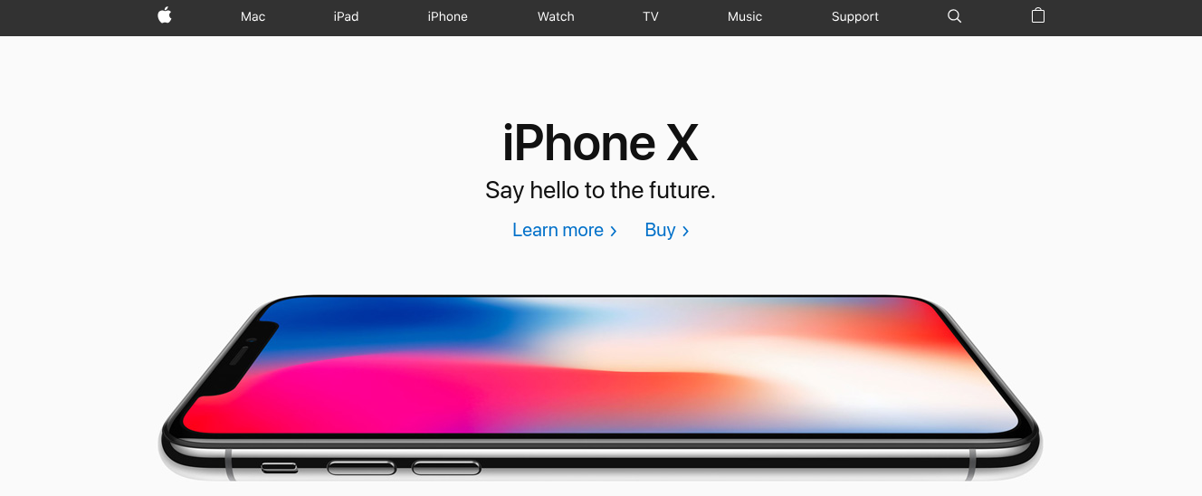
Not since the Garden of Eden has an Apple been so tempting
Whether to sell phones, books, luxury watches, or to promote an idea or an approach to life, white space can work for you. From its deployment in signage to its use in logos and poster art, negative space is actually the opposite: it is a positive contribution to your design.