
Last year, I wrote a post examining the ways that the web uses images. Utilising data from the HTTP Archive, I was able to look at how 500,000 websites deliver images and how many sites had room for improvement in their image delivery mechanisms in order to decrease page load time.
Heart Internet asked me to refresh the data, and to provide a readout of the state of image delivery on the web in 2019. Before we do that, it might make sense to discuss what has changed over the last year when it comes to images on the web:
1. The WebP format has moved from Chrome-only to support in Firefox and Edge browsers, increasing the potential user base for this image format that offers better compression for the same image quality.
2. Chrome has enabled native lazy loading in the browser.
The HTTP Archive has changed too. The data set now contains five million websites, and the Lighthouse tests inside the HTTP Archive have evolved as well, with different (and more nuanced) scoring methods. So with that in mind, let’s take a look at how the web is using images, and how the numbers have changed in the last 18 months.
Four image optimisation strategies
The HTTP Archive data is based on Lighthouse tests for five million websites. In August 2019, the median mobile webpage was 1745 KB (up 12% from May 2018), and has 891 KB of images (up 13.2% from May 2018). So the web is getting bigger, and the images being delivered on mobile are increasing in tonnage. The median website is 51% images by tonnage. If the images could be made smaller, we could have a profound effect on the amount of data needed to load a website, which will speed up load time and improve front-end performance.
Interestingly, the median image count per website has dropped from 35 to 28 (a 20% drop) over this same time period. This tells us that discrete images are not growing by 13% year over year, but by 33%!
To understand the best practices in use on the web today, I will focus on four strategies in the Lighthouse data set (that is included in the HTTP Archive data).
- Image Optimisation
- Responsive Images
- Image Format
- Lazy Loading
Let’s see how things have changed.
Image Optimisation
Lighthouse tests all JPEG (and only JPEG) images on the page to see if they are at a quality of 85% (or lower). If images are served at 85%, the test passes. Google recommends a quality setting of 85% as a good balance of image quality versus image size.
In 2018, 43% of the web passed this test, and 33% failed:
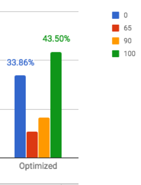
In 2019, there was not a lot of movement in this statistic: 45% of sites score a 1, and 35% score below 0.57 (in US schools that would be considered a failure!). This tells us that the adoption of image optimisation basically remains unchanged year over year.
Responsive Images
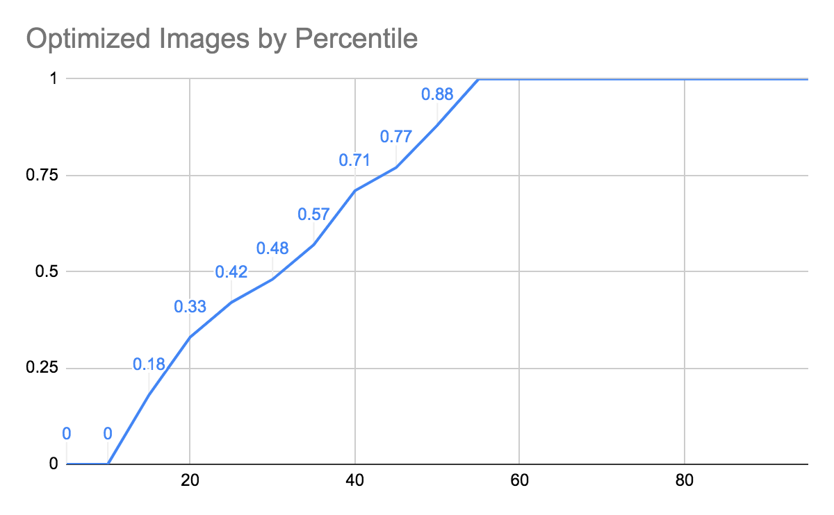
Lighthouse calculates the size of the rendered image and compares it to the downloaded image. If the image on the screen is over 25 KB smaller than the image downloaded, the audit fails. The goal here is to offer appropriately dimensioned images to the device requesting the files (no desktop retina sized images on a small smartphone).
In 2018, 22% of sites failed, and 57% scored a perfect score:
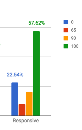
In 2019, all sites are passing from the 35th percentile, so 65% of the web passes. This is an increase of ~10%, which is good to see. There are still 20% of sites scoring below 0.5, so it appears that the sites with partial passes in 2018 have made the jump to a full pass, since there is very little change in the number of sites that fail the test. The slope of this line is very steep, showing that many sites have implemented at least some images that are responsive on their sites:
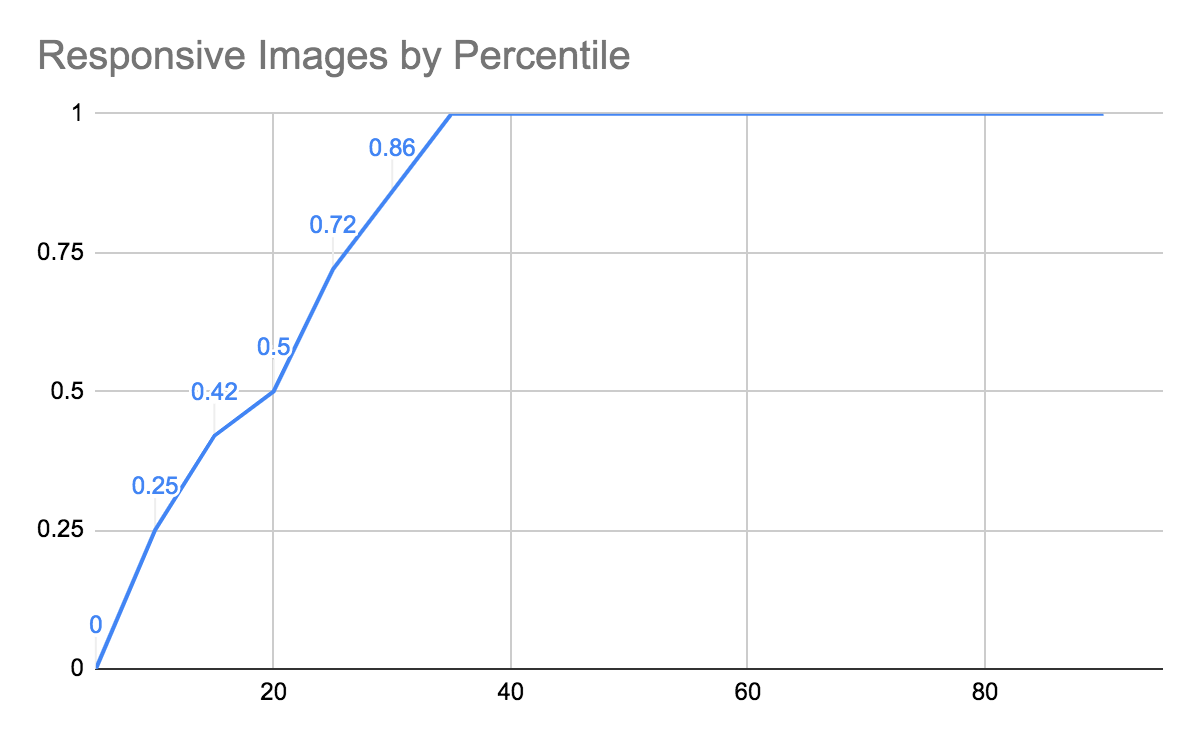
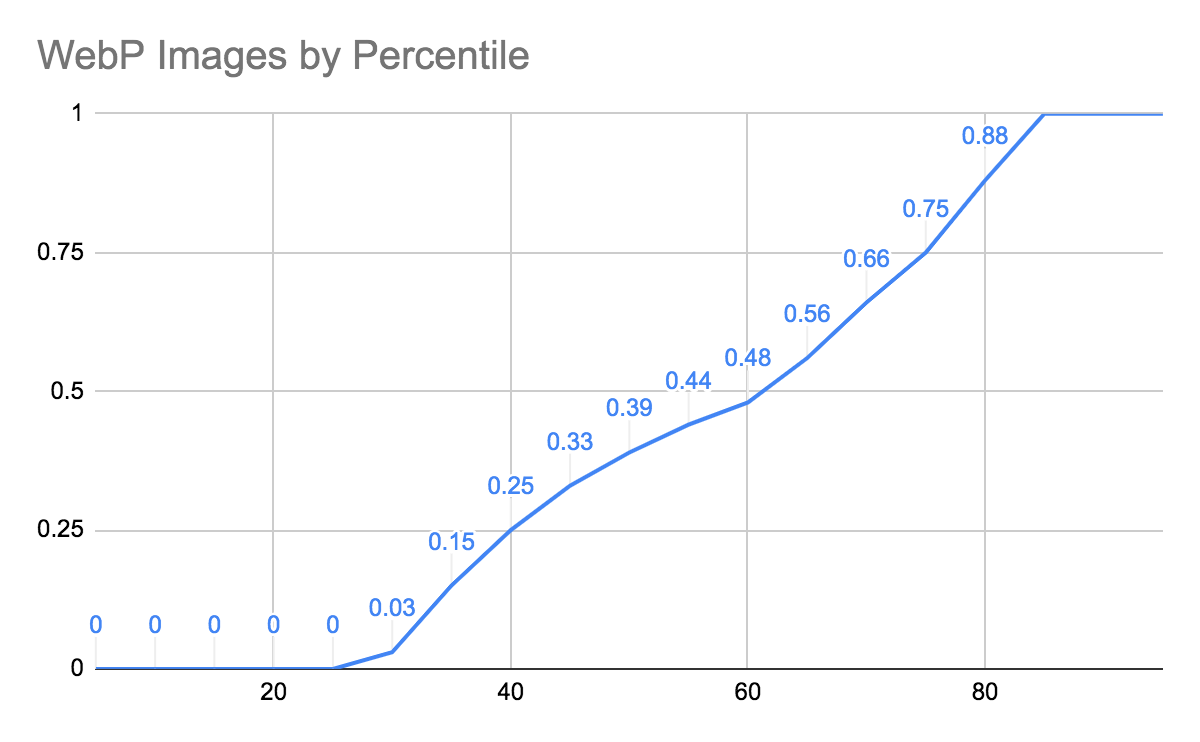
Image Format
Lighthouse checks to see if a next gen format (JPEG2000, WebP) will save over 8 KB on any given image. Since all mobile HTTP Archive tests are run on emulated Chrome, the format of choice will be WebP. As mentioned in the introduction, WebP support has increased across several browsers in the last year, so sites may have reached a percentage of users that makes sense for adding WebP support.
In 2018, support for WebP was very low — only 16% of sites passed this test:
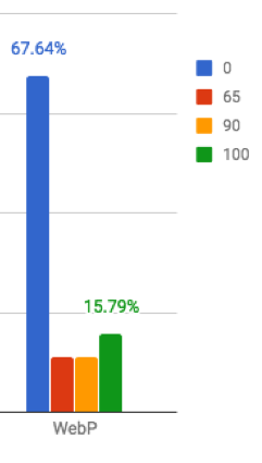
In 2019, despite the number of customers who can utilise the smaller WebP format, adoption of alternative image formats unfortunately remains virtually unchanged: 65% are failing this test, and just 15% are passing.
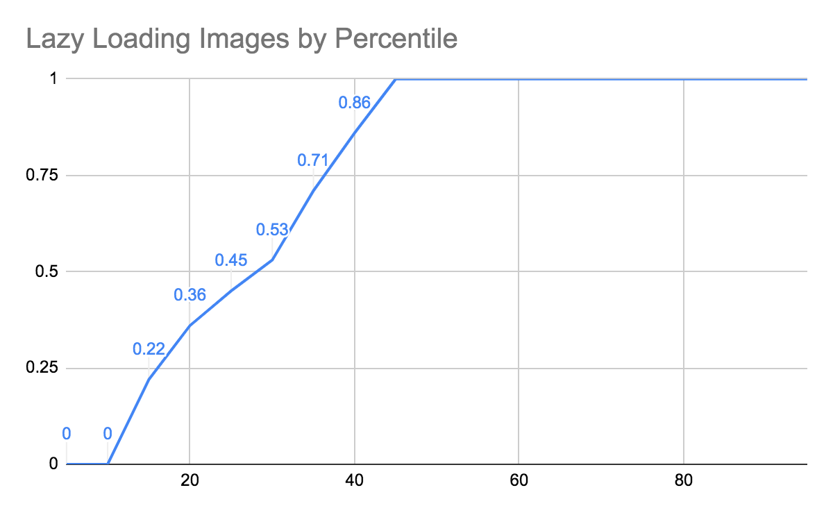
Lazy Loading
Lighthouse identifies images that are off screen. If these images are loaded before time-to-interactive, the test fails. The test passes if images off screen are requested before the page is interactive. By deferring load of images that do not appear immediately, the page will be interactive faster.
In 2018 only 22% of the web had enabled lazy loading.
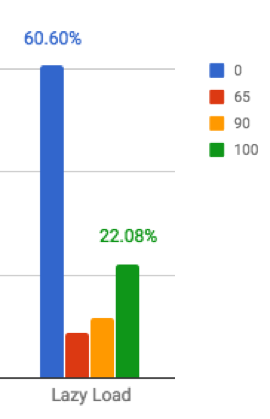
However in 2019, we do see a big jump in lazy loading adoption, with only 10% failing and 55% getting a 100% complete pass:
Potential savings
The Lighthouse scores are all well and good, but what do these scores actually mean?
The test also calculates how much faster the page load would be with a fix implemented, and the reduction in image payload, measured in KB. In the table below, I report the median savings for tests that score under 0.5, and for those sites that score a 0.
There are a couple of cells highlighted. With 66% of the web failing the image format best practice, a median value implies that 33% of the web could cut 6.6 seconds off of their mobile website load time by switching to WebP images.
The ability to quickly cut several seconds from the load time of a website makes image optimisation a great first step at improving the speed of your website.
Conclusion
Examining Lighthouse test scores across five million pages using the HTTP Archive, we find that of the four best practices, only responsive images (with ~10% more sites passing) and lazy loading (with a huge 33% of the web adding adoption year over year) have seen any noticeable change in scoring.
Sites that are not passing these optimisation tests are leaving a quick performance pickup on the table. By following the suggestions in the Lighthouse test suite, you might find that you can shave off several seconds of your mobile sites’ load time.
Also see Doug Sillars’ other performance posts on the Heart Internet blog: Best practices for incorporating video, Best practices for optimising video streams on the web and A performance review of popular JavaScript players.