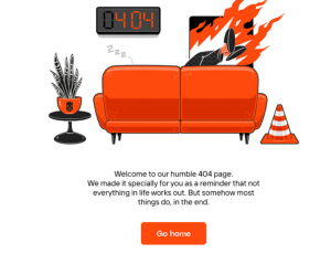
![404 error pages we love [2022]](https://www.heartinternet.uk/blog/wp-content/uploads/2022/01/404.jpg)
The title of this blog might seem a little unbelievable to you. After all, can anyone love an error page?
After all, they interrupt visitor experience, they’re often a sign that something has gone a little bit awry on a website, and they can cost businesses customers – some research suggests that as many as 73% of people will leave a website and never return if they encounter a 404 page.
However, web designers and developers are getting more and more creative with the content of these pages.
In this blog we’ll look at 10 examples of 404 error pages that you can’t help but love, before looking at a few features that can contribute to an effective and memorable 404 page.
- Lama Lama
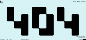
This is the 404 error page of the Amsterdam-based digital agency Lama Lama. The page reflects the brand’s personality perfectly – the agency’s philosophy is ‘we love to play’.
The page is interactive, too, featuring mouse-over effects and an invitation to ‘draw something’ in the same style as the 404 page.
- Niccolo Miranda
This 404 error page is part of the portfolio site for Amsterdam-based designer and developer Niccolo Miranda. Just like the rest of Miranda’s website, it showcases his skills and creativity.
- DFY
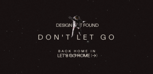
This creative digital solutions agency’s 404 page features an astronaut that looks like it is floating away into space and the words ‘Don’t let go’.
Cleverly, it also features a countdown clock that informs the lost visitor that they will be returned to the main site in seconds.
- Lunchbox
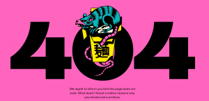
A bright pink background, bold typography and eye-catching graphics welcome you to the 404 page of this food ordering tech company. The well-thought-out words on the page read ‘We regret to inform you that that this page does not exist. What does? About a million reasons why you should use Lunchbox’.
- Humbleteam
The 404 page of this digital design agency is 100% on brand. It showcases both their brand colours and the company’s sense of humour.
- Eva Habermann
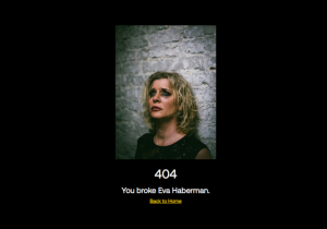
Visitors who enter a faulty URL on the website of actress Eva Habermann are met with a dramatic photograph of her in tears and the words ‘You broke Eva Habermann’.
- 495 Russian Vodka
Featuring a black and white colour scheme, well-drawn graphics and subtle animation, the 404 page of this vodka company is simple yet incredibly effective.
- Matthew Fisher
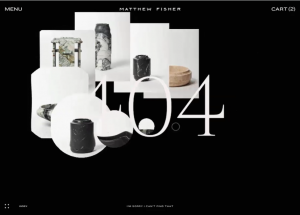
At first glance, the 404 error page of artist Matthew Fisher looks like a simple black and white error message page. Then a ripple animation appears that showcases some of Fisher’s work. The page then returns to its original appearance, but visitors can use beautiful mouseover effects to revisit the products.
- Kffein
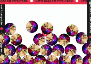
This slightly-bonkers error page certainly grabs your attention. When you land on this 404 alert, the page is flooded with circles, in a bingo ball effect. Each circle is filled with images of a startled looking cat on a psychedelic cosmic background. Visitors to the site can use the mouse to move the cats around and, as each one is moved, a meow sound is released.
- Myriad

This retro 404 error page displays the test card – the image that appeared on televisions in the 60s, 70s and 80s when there were no programmes on. The page belongs to the website of creative video agency Myriad.
So, what can we learn from the above examples?
4 top features of successful 404 error pages
- A link to the homepage
This goes without saying. However, the ‘go back’ button must be obvious and clear so that the visitor doesn’t miss it and leave the site.
For something even more effective, set up an automatic redirect that takes visitors straight from the 404 page to the homepage – the DFY error page, listed above, does this.
If you have a WordPress site, you can use the All 404 Redirect to Homepage plugin to achieve this.
- A search box
When a visitor lands on a 404 page, they already feel like they have had their time wasted.
To ensure they don’t waste any more time, you could include a search bar on your 404 page, to help them locate the information they were initially looking for.
- Branding
As displayed above, 404 error pages are a great way to showcase a brand’s personality. Don’t be afraid to use humour and to do something different, to ensure you maintain the visitor’s attention.
- A discount code
SEO expert Neil Patel estimates that the conversion rate of a 404 error page is way below 2%.
However, he advises that adding a discount code to this page can help maintain a visitor’s interest and help turn them into customers.
Be sure to include the discount offer just as the visitor is intending to leave (your site will need to feature exit intent software) rather than the second they land on the 404 page.
Web designer and web developer-grade hosting from Heart Internet
At Heart Internet we offer a number of hosting options that are suitable for professionals.
Check out our WordPress Pro plans, which come with the resources to build up to 50 websites – depending on the package you choose.
Or take a look at our VPS plans, which come with between one and 16 CPUs, 2 to 64GB RAM and 40 to 800GB storage.
As always with Heart Internet, you can count on 99.9% uptime and superior customer support.