
In the age of social media, people like to share interesting and visually stunning pieces of content, things which can be perfectly combined with a well thought out and beautiful infographic.
Infographics enable you to fuse aspects of PR, SEO and networking as the content you create will spread a strong, positive message about your brand, become link bait on social media and other key media portals, and introduce you to important decision makers that can get you in front of your target audience.
Speaking from personal experience, infographics are also an extremely enjoyable project to be involved in and can be a great exercise in writing short copy, researching, getting creative, building links and swelling your contacts book.
Infographics are a chance to go beyond some of the more traditional forms of marketing such as press releases, guest articles and print advertising. You can simultaneously entertain and inform your audience about best practices, key research, advice, news and more.
They can take many forms such as stories, walkthroughs, guides, reports, comics; we’ve even seen some that are CVs! The tone is another diverse feature, with some cracking us up in hysterics whilst others have driven home more serious messages.
Basically, if you’re looking at producing some great content marketing, you won’t go wrong with an eye-catching infographic.
Where to start
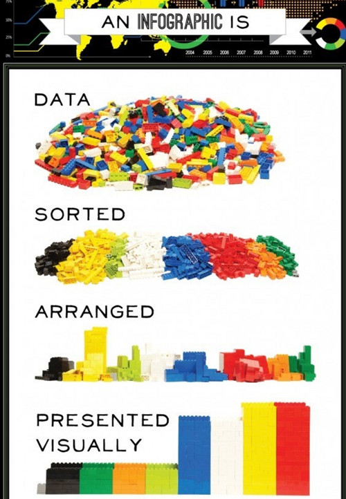
One of the most important elements to an infographic is a story, flow, or narrative. There has to be some kind of angle or central focus of the piece, otherwise it can end up as an information dump with limited appeal. Traditional infographics are a visual representation of a set of data, and this is, by far, the easiest way of constructing an infographic.
With this approach, you have two choices. You can either generate the data yourself through a survey, or you can use secondary sources to pull information together. Both of these approaches are fine, and both have their pros and cons, but it’s all a question of resources.
Create the data
Generating data yourself can be time consuming and costly, and if you think of something you wished you’d asked after you’ve conducted your survey, you’ll kick yourself. On the other hand, conducting your own research can establish you as a thought leader and expert in your field; great PR as well as great content. If you have the budget, there are lots of market research companies that can do the research for you, but be prepared to barter. If you don’t want to spend as much, try using Google Consumer Surveys to get your results, which is considerably less expensive.

Hunt the data
Using secondary sources limits your data to what’s available, and it can shred your patience trying to find what you’re looking for. Also, you have to make sure that the data you acquire is from an authoritative source, otherwise your infographic won’t carry much weight or authority. However, this method can prove much quicker and help you build links with the data sources.
There’s no reason you can’t mix and match these approaches. If you have one big juicy stat that can form the basis of your infographic but nothing else, try beefing it up with some secondary sources to give it more longevity. As long as you source the data somewhere on your infographic, you’ll avoid any complications in terms of plagiarism or intellectual property theft.
Explore
At this stage, the more data you can get your hands on, the better. See what other information is out there that you might be able to use to beef up your infographic. If nothing else, you might get another idea that you can use at a later date.
Of course, you are ultimately aiming for quality over quantity, but casting your net a little further may just give your infographic that little something extra that it needs.
Get organised
Once you’ve collected your data, start thinking about how you are going to communicate your findings. You might have pages and pages worth of data and if so, you’re going to need to trim it down. Try to pull out the most interesting bits of information you’ve found and which are the most relevant to your original idea. Think about it from a reader’s perspective and ask yourself which are the most interesting stats you’ve found, put to one side any that don’t make the grade.
Once you’ve separated the wheat from the chaff, start thinking about how you are going to present your information. Sort it out into a logical flow of information and how you’d like to guide your reader through the infographic.
The data on your infographic is the skeleton of the finished piece. If it isn’t put together properly, it will fall down in an instant. Before you even think about the design, it’s critical that what you are saying has substance, and that’s why you should start here. Once the skeleton is constructed, you’re ready to put the flesh on.
In the next post in this series, I’ll go through some important steps in briefing designers. If you’re already a designer, stay tuned for tips on how to distribute your finished infographic.