
In my last post on infographics, I talked about how writing a great brief can help you stay focussed on the project, whether you’re the designer or not.
One of the points I raised was the importance of an overall theme and consistency of design to help drive the infographic. A clever theme that reflects a pop culture reference, trend, industry, place or person can act as a hook to draw attention and increase clicks.
However, it’s important to remember that theme does not always mean gimmick, a stunning design is just as, if not more, important. Choosing your theme can be as simple as deciding on a stylish colour scheme, eye-catching typography or head-turning imagery that complement the information you present. Keeping a consistency throughout the design will create a natural cohesion to the piece, and help you sell your message to the audience effectively.
To give you some inspiration, here are seven great infographics that are driven by awesome themes:
What makes an employee happy?
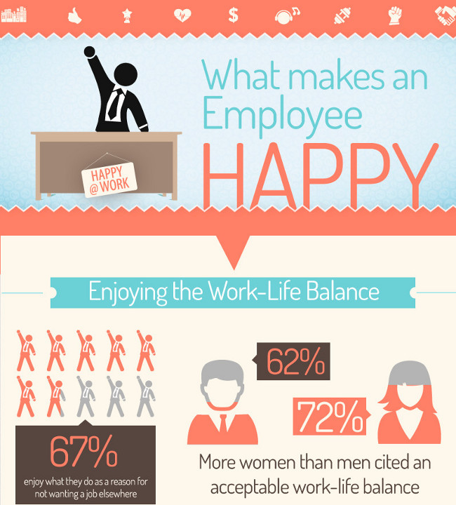
I was drawn to this one due to the simple colour scheme and image style. The information on the infographic is all about what makes people happy at work, and the gentle colours and use of icons are relaxing. The stats are brilliantly complemented by short and engaging copy and it’s incredibly easy to take in.
Marketing Strategy in a Digital World
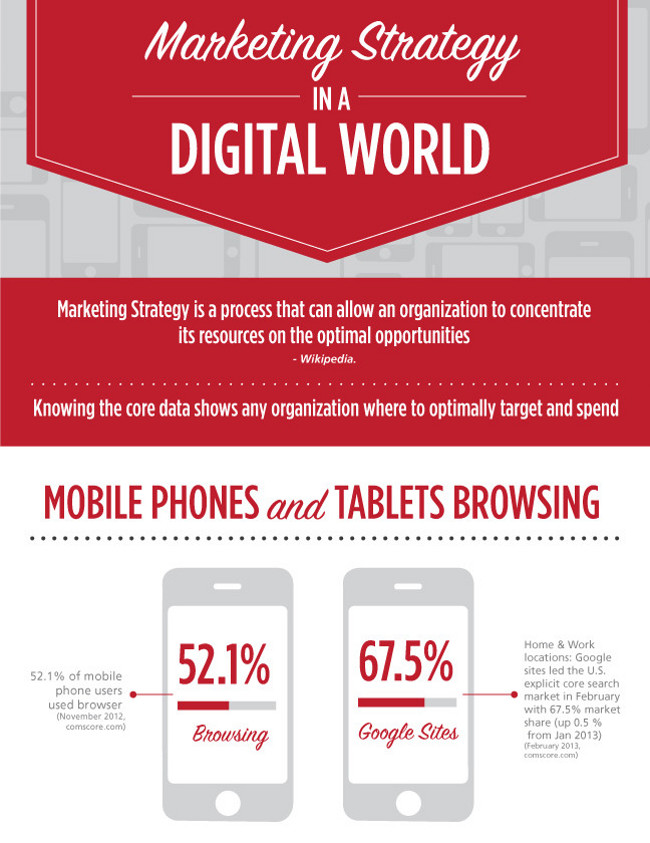
This one almost sells itself through the typography alone. It’s clean and clear, and the use of the red to drive the information makes it easy to read and guides the reader through it. The imagery used is subtle, making the stats stand out and appear really strong, driving home the key messages excellently.
How Glastonbury gets its toilet sh*t together
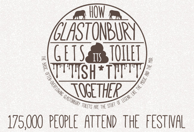
Obviously, the title of this one grabs you straight away. As shocking as the subject is, the design complements it exceptionally. The creators of this infographic stick to the plumbing and pipe works style imagery throughout, whilst keeping the subject featured in the title present throughout. This infographic was created for a portaloo firm and, rather than skirting round the subject, they embrace the business they are in and prove they know their, well, let’s just say onions. The result is a funny and entertaining infographic that carries a strong message about how this firm can deliver on their promises in providing waste solutions for a massive event like Glastonbury. More importantly, this proves that you can make an infographic out of anything.
If Your Blog were a Beer
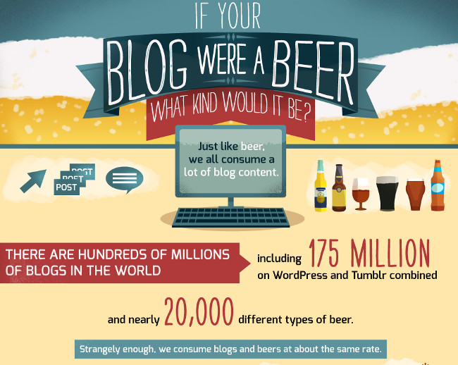
Another great title, nailed home by a strong theme. This infographic, produced by Visual.ly themselves, takes something popular (and with many different types) and relates it to something which the audience is likely to be into i.e. blogging. By using the different types of beer to liken blog styles to, the structure is clear and the imagery demonstrates the points that are being made really well. Essentially, this one had me at “beer”.
The Dollar Bill Deconstructed
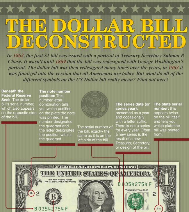
Here’s an example of an obvious theme that’s paid off (sorry). The background and imagery for this infographic follows the strict brief of looking like a dollar bill. The colours and type used all reflect that, and this is a brilliant example of a more gimmicky approach. Of course, the theme for this infographic chose itself, but the detail that this one goes into is impressive.
The Value of Video Marketing
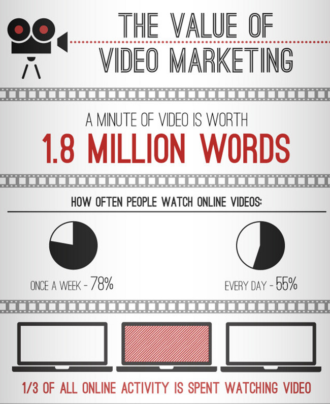
This infographic is a master class in minimalism. Very little information, but it is driven by the subtlety of the film rolls that break up the content. The imagery captures the stats perfectly and complements the style of the copy and typography used. It also delivers a key message about the importance of video marketing, which might even prompt the reader into getting involved with it themselves.
The Google Graveyard
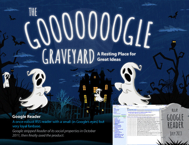
Here’s another example of implementing a more gimmicky approach to great effect. Taking the idea of abandoned ideas, the creators of this one used a spooky theme to present their story. The ghostly theme is a good one because it personifies the “dead” ideas featured in the infographic and gives it a fun feel with the cartoon ghosts. The abundance of ghosts and Halloween-esque imagery on the internet means that this theme is extremely versatile and relatively easy to find and used in the right way, like this one, will stand out and get attention.
In the fourth and final post in this series, I’ll go through how to market and distribute your finished infographic.
Have you seen any great themes for infographics recently? Let us know in the comments below