
In my last infographics post, I discussed how to gather the data for an infographic to make sure that you have some interesting and authoritative information to present to your audience. Here, we’ll go through the importance of a great design in helping to make your infographic irresistible, so that others will share and discuss it.
The very nature of infographics is their visual appeal, and an eye-catching design can alert attention that other forms of content, like press releases, simply can’t compete with. Presenting the data in a unique or attractive way adds more life to your infographic and broadens its appeal.

Whether you’re a designer or not, if you’ve never made an infographic before, you’ll need a strong brief to stay organised and focussed on the task at hand.
If you’re a designer, try looking around for other infographics you like and drawing inspiration from them. Places like Pinterest and Visual.ly are bursting at the seams with great infographics. Once you have your ideas, make sure you help yourself out by making some notes and sketching out what you are aiming to do to make sure your infographic turns out the way you had planned. From here, you can write yourself a brief to work from so you don’t lose sight of what you’re doing and the reasons why you’re doing it.
If, like me, you aren’t a designer, you’re going to need to recruit the skills of someone who knows what they’re doing; and for that, you’ll need to write a thorough creative brief and find a designer who has a proven track record of creating beautiful infographics. A good place to start is to search the web for “infographics designers” and create a shortlist of the ones who stand out. Then, contact your favourites and ask for a quote based on what you have already prepared. Some designers will charge for the research, which is why it’s a good idea to have all your data ready first, as this can keep the cost down and enable you to control the information you want on the infographic.
Here are four tips that will help you write a great brief for an infographic.
The title
This isthe most important part of your infographic. Your headline has got to capture the imagination of people instantly and encourage them to read on. A great title will also help focus the design on the idea and angle of the infographic.
Try and sum up the whole story of your infographic in the title in as few words as possible. This might be by asking a question, making a bold or dramatic statement, or sensationalising the subject. For example, if you are comparing two subjects, consider using “versus” as a means of pitting the two areas against each other. This can invoke a lot of other ideas for the rest of the infographic too. Work with your designer to make the headline appear eye-catching and interesting from a visual perspective to encourage the audience to read it in the first place. Some of the best headlines we have seen have stood out simply because the designer has used a great font to carry it.
If you can’t think of a great headline to begin with, give yourself a working title until you think of something better, that way you won’t neglect the rest of the infographic. Great headlines take time to devise and you may find inspiration in the rest of your work.
Theme
Deciding on a theme will help you no end when writing your brief. Your theme will pull all the rest of your content together and give you a clear indication of the style and imagery you want to use to encompass everything in the infographic.
For example, the theme for our “anatomy of a web designer” infographic was born out of the title. As soon as we said “anatomy”, we immediately thought of old renaissance style medical journals. From here, our designer took a look at associated imagery and used it to build the infographic and present the info.

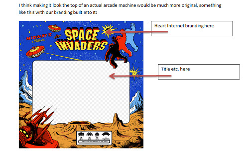
Some infographics have no obvious gimmick like our renaissance or space invaders infographics, but are nevertheless beautifully designed with a clean and clear approach. It all depends on your audience and the message of the piece. If it is something very serious for example, loads of cartoons would be a little unwise.
The copy
Who is the infographic aimed at and why? If these two questions can’t be answered instantly and in a few words, then you are wasting your time. If you know the answer to both of these questions, make sure you use copy that speaks directly to them so that you maximise the impact of what you are working on. You’ll also need to be flexible and creative with your copy as the infographic design might not allow for what you had originally written for it.
Consider the tone of voice and language style that best speaks to your target audience and be consistent throughout. Avoid big blocks of text and long sentences, stick to short snappy nuggets of copy that help drive the information. Lots of text will be off putting and look unattractive to your readers. Try to make the imagery complement the copy and tell the reader the rest of the story, this will make the infographic more enthralling and cut down your word count considerably.
Be clear about exactly what you want
Don’t just have an idea, be thorough about what you want it to look like. Write a tight brief with clear instructions throughout. Whether it’s yourself or someone else creating the design, reference points are always handy and constructing the infographic might take a while if you have a lot of other work on, making it easy to forget ideas and plans.
Sometimes, I’ve even gone as far as literally laying out the text exactly as I want it to appear when I brief the designer. Of course, some things don’t work as well in reality and look better a different way, but that’s all part of the process. The likelihood is that the infographic will go through three or four drafts before it’s finished, so make sure you scrutinise every aspect of the piece as you go along.
For me, it’s all a matter of team-work and communication, if you’re on the same page as the designer and you can help each other out, a great infographic will be born. If you’re working alone, ask your peers for advice as they might be able to spot something or make a suggestion you’d never have thought of.
In my next post, I’ll show you the importance of consistency within the design of your infographic, including typography and colour palettes to help enthral the reader.
What are your top-tips for writing top creative briefs? Share them in the comments.