
Creating an effective and unique 404 page is an art. If you’re not sure what a 404 page is, it’s simply a ‘Page Not Found’ message that your customers arrive at by accident. If they link to a page which has moved, or doesn’t exist anymore, a 404 will tell them they’ve gone wrong.
A 404 is a homepage for people who got there by accident. You need your 404 to reflect the nature and tone of your business. You need it to welcome the unwary traveller, and help them on their way through your website.
A good 404 will help prevent bounce back to the search engine. It will assist a potential customer to find the page they’re really looking for and, therefore, it’s great for dwell time, it’s great for business, and it’s an essential part of your customer service.
Remember when DVDs had ‘Easter Eggs’ hidden on them? They were little fun things, like out-takes, that were tucked away on a sub-menu, which you would stumble upon by accident – and which you could then tell your friends about. A good 404 page is a bit like that!
But, when was the last time you found yourself on a 404 page?
Are 404 pages a thing of the past?
Thanks to the automated broken link checkers you’ll find in many web-builders, such as WordPress, the 404 page is considered by many to be a lost art.
But you can’t always control how others link to your site, and you certainly can’t legislate against people mistyping your URL. So, whilst it’s true that finding yourself on a 404 page is a less common occurrence than it once was – it still happens.
But, before we dig into them, let’s look quickly at the alternative…
Why 404 when you can 301?
A 301 Redirect is simply an instruction to redirect traffic from one URL to a different URL.
If you’ve migrated your website, 301s are essential to your customers still being able to find you, as the Bookmarks they will have saved may now be dead links.
This is great for customer service, and equally successful for SEO, as it maintains the integrity of your inbound links, boosts dwell time, reduces bounce, and generally means you’re websiting like a boss.
The problem with 301 Redirects arise when only a few pages have been moved or deleted within an otherwise unchanged site. Being automatically directed to a different page can confuse the visitor. They may find themselves typing in the same URL again (just to be sure they got it right) only to be taken to the wrong place once more.
If you understand your analytics and the motives of your users, there’s a good chance you can link them to the page they actually want – then all is good – they might not even notice the change. But if they know the page they want, or they are clicking on a dead link, then that could lead to confusion and frustration.
You don’t want your customers to be frustrated at you, that could cost you a sale.
So, in that case, the sensible solution is the 404 page. Something that tells them they’ve gone wrong and helps them to go right.
404 – The Accidental Homepage
A homepage needs to represent your business in as efficient and swift a way as possible. You only have a scant few seconds to grab a possible customer’s attention, after all. So, your homepage needs to reflect the nature and tone of your business; it also needs to make it as easy as possible for people to navigate their way around your site.
Well, that’s every bit as true for your 404 page – with the added ingredient that no-one who arrives there is expecting to. Unless they’re being sent there by a blog like this one, of course.
404 – The 4 golden rules
You need your 404 to work effectively for you. You can track this using a Google Analytics tool – to ensure that your 404 isn’t bouncing people back off your site but is, instead, ensuring that they get where they need to be.
A big part of this will be the page’s design, so let’s look at some best practice:
1: Apologise. Your 404 page is not where they want to be. Assume the fault is yours – that’s just good customer service.
2: Theme. Whatever design you go with, make it one that is appropriate to your business – if it links thematically to who you are and what you do, that will reassure and engage the interest of the wandering customer.
3: Be clever or be funny. Look through the list below, and you’ll see that all of the 404s we’ve selected are either clever, or funny, or both. Humour is a great lubricant for the wheels of business, especially when your customer doesn’t get exactly the result they were expecting.
4: Navigate. Make sure your 404 offers the navigation that the customer needs – that might include a search bar, links to your major services, or simply a shortcut to your homepage. If your 404 is a dead-end, you’ve just lost that customer.
Let’s look, then, at some examples of successful 404ing, and discuss quite what makes these pages work so well.
If a good 404 page is an art, then it follows that artists will have interesting 404 pages.
10 – Worrydream.com
The award-winning web-designer, Brett Victor delights in rewriting the rules of design, so it’s only right that his 404 page be a dead end. It takes you nowhere.

If this image rings a bell, that might be because it is a visual reference to René Magritte painting The Treachery of Images – also known as This is Not a Pipe – in which he challenges the very notion of what art is.
Philosophically, there might be a point he’s making about art being an end unto itself. Who knows? What’s undeniable, though, is that this 404 page, whilst unique and amusing … Isn’t much use to him.
Unless you want to be awkward – this isn’t the type of 404 page you need for your business.
9 – VisitSteve.com
Another artist, Steve Lambert, has gone the other way – his 404 page is piled-high with links and navigation options. He absolutely doesn’t want you to hang around on this dead page too long.
This comedian and performance artist has created an introductory video which is deliberately awkward (he has labelled it ‘The Most Awkward 404 Page’ after all) specifically because he doesn’t want you hanging around on the wrong page. Yes, we watched the whole video – so you don’t have to!

If your website is all about you, it’s only right and fitting that your 404 page be about you, too!
This works because it introduces us to Steve, clearly demonstrates that he has a sense of humour, but also that he understands the function of a 404 page – which is to help people swiftly move on to another page on the same site.
8 – Gymbox
And, while we’re on the subject of awkward… London’s self-proclaimed ‘best equipped gym’ has this gif as its 404 page. It features one-man meme-machine, John Travolta, but possibly not as you’ve seen him before. Let’s just say that this image isn’t designed to invite people to hang around on the wrong page for too long.
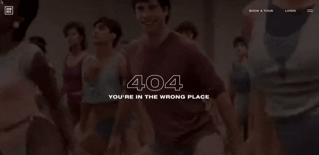
Those budgie-smugglers Travolta is wearing are going to send you scurrying right back to the home page … with your tail between your legs.
In case you’re at all interested, the image is from the lost cinematic classic ‘Perfect’ from 1985 – featuring John Travolta and Jamie Lee Curtis both going for the burn.
7 – Magnt
The web design firm, Magnt, has – as you might expect from people who do what they do – a very clever 404 page. It simply offers a pictographic depiction the two reasons you could have arrived at that page.

If you’re in the business of being creative, it’s never a bad idea to walk the walk in every page of your website – even the one people aren’t supposed to find.
Magnt also compliment you on your good taste in arriving there, by pointing out that CNBC has rated their 404 page as the second best on the internet.
In case enquiring minds want to know the 404 page CNBC thought was better, was for the entertainment site Mashable.
6 eHarmony
Although they aren’t in the marketing business (per se), eHarmony obviously have some good content writers on their team – because their 404 page is a perfect synthesis of form and function.

Gotta love the clever copy on this. Pretty sure the John Travolta pelvic gif wouldn’t serve the same purpose, here!
This 404 has a thematic link to the site it’s part of – and they use their 404 as a complete navigation page including Call To Action buttons to ‘log in’ and ‘join now’, social media navigation, the works. That’s a great way to make sure that customers who stumble upon this page, won’t just pass like ships in the night.
5 – Amazon
Amazon’s issue with its 404 page would be the same for any big retailer – only magnified by the company’s vast size. People don’t go to a retailer’s site unless they want something, and online retail has taught us to expect things all-but immediately.
So, arriving at a 404 page would be infuriating.
But nothing calms down a grumpy customer faster than a cute furry animal.
Amazon’s 404 page softens the blow by showing you pictures of fluffy puppies. It gives you a hot-line straight to the homepage, it still offers you the all-important search-bar (which is the core of Amazon’s business) but it also offers you an option to learn more about the dogs of Amazon.

This well-behaved 404 works in several ways – not least in that it makes Amazon appear to be a dog-friendly workplace.
There are, reputedly, 6,000 cute doggy pictures there are on the site – so you could be clicking the refresh on that 404 page forever more! The Dogs of Amazon even have their own blog!
4 – BBC
You’ve dropped a clanger, if you find your way to the BBC’s 404 page. So, they greet you with the Clangers. Obvs.
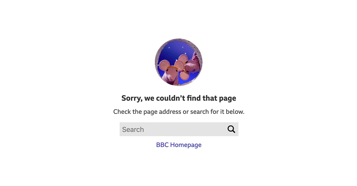
The sheer emptiness of this page tells you, immediately: Houston, we have a problem. But some top-level navigation and a search bar should get you back into the right orbit.
Because of the sheer size of the BBC site, the full navigation bar is a multi-layered and complex beast. They’ve got around that, on their 404 page, by ignoring it and simply offering you some department options, a search bar and a quick trip to the homepage.
The only issue we have with this is that it is the BBC’s only 404 page. Given the vast range of beloved IPs they could draw on, they could create a range of different 404s just to add a level of gamification … “Which one will I get today?”
3 – Marvel Comics
An entertainment site that does make good use of its Intellectual Property on its 404 page – is Marvel.
Marvel Comics have produced some of the most recognisable characters in all popular culture, so it would be remiss of them not to employ them in their 404 page.

Several favourite Marvel characters appear here in images which can also feature some limited animation.
Above the variable images, you’ll find the standard navigation bar you’ll get on every page on the site. In this way, the page functions as a bit of fun (if you refresh it, you get a different hero), you’re reminded of the product range Marvel sells, and you have uninterrupted navigation to the rest of the site.
2 – Lego
One of the strangest – and most successful – business transformations of recent decades has been Lego’s shift from being a manufacturer of toy plastic bricks, to being the centre of a multi-billion, multi-franchise, multi-media empire.
Those odd little Lego people have now occupied the universes of Star Wars, DC Superheroes, Harry Potter, Jurassic World and Stranger Things.
Their 404 page, mind you, ignores all that and employs Emmet Brickowski – from the Lego Movie.

Lego should be fun, and it’s right and proper that their 404 page reflects that. That said, they don’t want you hanging around too long on the wrong page, they want you to follow the Call To Action button and start shopping.
We suspect the reason they aren’t using their more famous characters will be to do with licensing.
Unlike Marvel, they don’t own the characters they’re famous for. Paying for permission to use characters like Batman and Darth Vader on this 404 would make for a very expensive page that Lego really don’t want you to be on.
1 – IMDb
When most of us use IMDb, it’s to win an argument about who was in such-and-such a film, or to find showing times at our local cinema. But, within the industry, IMDb is an essential tool for connecting people together.
Its 404 page breaks one of the cardinal rules of 404ing, in that it doesn’t look like an IMDb page at all. There’s no branding, no navigation bar, no call to action. Nada.
That will be because professionals who are looking for specific information will, typically, not have time to hang around – they will need to know, at a glance, that they’re on the wrong page.
But those who do take a few moments will see one of the first things IMDb became famous for – movie quotes. Hit the refresh button and it will take you through a parade of (sometimes subtly altered) famous movie lines which tell you this isn’t the webpage you’re looking for.

This works because it’s simple, unfussy design won’t confuse or delay anyone who doesn’t want to hang around. But simply reading the short quote should give a chuckle and send you on your with a smile.
Of course, if you’re time-rich and obsessive compulsive, you might feel the need to keep clicking the refresh until you’ve seen them all – and collect the set. If nothing else, that will give you a few laugh-out-loud moments, whilst bumping-up the website’s dwell time a treat!
Whilst we’re talking 404, let’s finish up on our own page. This combines a simple design, with a touch of humour and – importantly – a navigation bar at the top, so you can find where you really need to be.

404 for you …
Do you work for a company with a great 404 page we should know about? Have you designed any yourself? Share the links with us on social – let’s make them 404s for everyone!