The main aim of the London Underground is to get people where they want to go as quickly as possible. Everything is geared towards efficiency, from the font sizes used on signage to the different colours of the tube lines. Although people are quick to complain about delays and closures, in and of itself it’s an incredible feat that up to 4.4 million people per day can travel across 250 miles of London (source) with a minimal amount of effort to understand where they need to go and how they’re going to get there.
But how can the world’s oldest metro system help you improve your website? Read on to find out more…
Signs and symbols
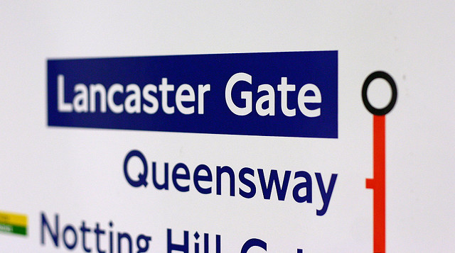
Similarly to roads and public areas generally, the Underground uses universally recognised signs and symbols to visually guide people. They take up less space than words and are instantly processed without needing to read or think, as well as being universally understood regardless of age or nationality.
But it’s not just about the signs themselves. Their placement is incredibly specific, too. In the Underground, you’re only ever presented with signs at the point you need to act and make a decision about where to go. This is designed specifically to stop bottlenecks of hesitation from information overload, where people stop dead in order to think and make a decision. This reduces crowding and queues and ensures a near-constant flow of people.
When it comes to your website, the same is true. It’s not just about the icons you use, but where you place them and what they help users achieve. With web design, there’s always a risk that icons and symbols will be used to fill a space or purely for aesthetic reasons rather than having a functional use of improving user experience. Another common pitfall is using too many icons and links in a small area. To improve this, imagine a single page as a single underground journey with potential directions to take. If you’re faced with a lot of information and/or decision-making in less than a second, think about how you can simplify what you’re offering your users and how you can help them achieve their aims more efficiently whilst minimising frustration and anxiety.
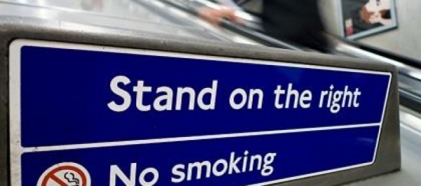
Where signs at the Underground do include text, they are clear instructions such as “Stand on the right”, which are quick to read and have no universally common symbol to denote. Do the same for your website through calls to action such as “Buy now” and “Learn more”. If you use any icons or symbols that could be interpreted as having multiple meanings or instructions, remove them and replace with text where possible. If someone wouldn’t understand your icon in isolation without any other hints, consider if it’s right for your page.
Journey to the centre of the earth
Your visitors progress through your website similarly to how passengers progress through the underground. In both situations, people depend on instructions and benefit from guidance about which direction to take. But unlike the tube, your website signposts go far beyond images and written text thanks to links. Consider:
Breadcrumbs – Does your website utilise breadcrumbs effectively? Can visitors easily understand where they are and go backwards as well as forwards?
Tracking experiences – Do you actively use heatmapping to see how users behave? Have you set up goals and funnels in your analytics software? Do you encourage feedback from visitors? Can visitors achieve what they (and you) expect them to (e.g. place an order, sign up to a newsletter, send you an email)?
Clarity – Are there any points on your website where your visitors may be confused about what to do next? Does every page include a clear primary call to action? Are users ever pulled in too many potential directions?
Having an overall clear goal for your website/business helps you focus your site around what’s important and guides you into creating effective paths to guide visitors.
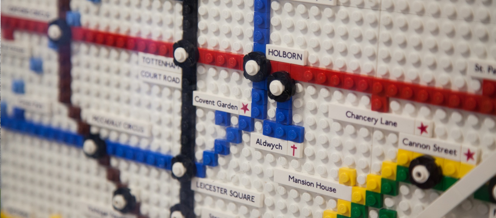
The Tube map
A global icon of British culture, the underground map is extremely simple for the wealth of information it presents to users. Aside from the key, the only words are station names, and universal icons (disabled facilities, railway stations etc.) are utilised effectively to provide additional information without distraction.
Back in 1908, the Tube map was considerably more complex, and important elements – including the ends of some lines – had to be ignored altogether for spatial reasons:

It wasn’t until 1938 that Harry Beck designed a diagram version that eliminated everything but the important details: where stations were in relation to each other (rather than where they were in relation to particular parts of London), which eventually developed into the version we know today. Beck undertook the task as a side project, and the authorities were sceptical until it proved popular with the public. This is a great example of how listening to your customers and accommodating their preferences can change your approach for the better. User-driven user experience through analysing data and utilising feedback through forms and surveys can make a huge impact on how people use your services and their attitudes towards them. Help your visitors on an efficient journey through your website with clear, predictable routes. Establish common journeys (such as landing page through to order completion) and work on making them easier to improve user experience and sales.
The line colours were originally chosen based on what would print well, but Transport for London (TfL) takes them very seriously and even has a Colour Standard PDF. It states, “Consistent use of colour across journey planners, signage and livery etc, also helps guide passengers to their destinations,” showing that their principles and approach are consistent across their print and digital information as well as their real-world practices.
When it comes to branding, creating a document or folder of information outlining everything from logos to heading styles really helps create a foundation for consistency. Even if it’s only you working on the website, it’s always handy to have details of fonts, colours and other style choices as they are usually the first things forgotten when you move on to a new project.
For on-page site maps, headings, and order processes, consider differentiation to denote importance. For example, the Underground map uses a circle to represent main stations whilst minor stations have a line. You could take a similar approach using different bullet points and heading styles to denote hierarchy, for example for distinguishing between categories and products.
There are actually ten different official versions of the Tube map. This caters for minority needs, for example there is a Bicycle map which shows sections of the network that allow bikes. For your website, look at adaptions you can make for accessibility or specific needs, for example having an integrated currency switcher or the ability to expand/open additional information. You may also want to look at creating different site maps for your visitors and the search engines to accommodate both sets of needs, or create landing pages focused around key links and common processes.
Typography
With roots going back a century, “Johnston” has become the instantly recognisable typeface of London transport. Despite various different forms and minor changes over the years, it’s one of the longest-running examples of corporate branding in history.
The font’s use has been extended beyond transport thanks to Olympics and Westfield London shopping centre signage as well as its use in TV programmes such as Sherlock. Nevertheless, TfL keeps firm control over it; it is not commercially available and licenses must be requested and allocated on an individual basis.
Having a particular font family for your business can really help make it instantly identifiable whether someone is visiting your website, reading your business card, or looking at your flyer. Try to keep the number of fonts you use to a minimum, and go for practicality over style to ensure it stays timeless and is easy to read. “Johnston” and its other derivatives were all originally developed and used based on legibility, particularly at small sizes and at a distance.

If you’re interested in reading more about the history and development of Johnston, check out A Typeface for the Underground and the Johnston type article on Wikipedia.
TfL has very strict guidelines, and their Design Standards and Digital Toolkits are well worth a look too if you love branding and design.
Guidance through processes
The final part of this post looks at how the London Underground optimises user experience through process guidance, specifically buying and using tickets. Just like everything else with the Underground, this is geared towards efficiency.
The process of buying and using a ticket has four key UX elements:
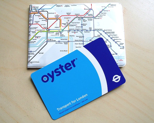
Efficiency – Ticket machines have a clear, simple touch screen process that guides the user through choosing a ticket and method of payment. Users can also choose to prepare ahead of time by topping up an Oyster card or using a contactless bank card, avoiding the need to queue at all, reducing the number of people faffing with paper tickets, and helping the environment.
Simplicity – Users are encouraged to use Oyster cards and contactless cards, eliminating queues at both the ‘buying’ and ‘using’ ticket stages. Touch screen machines are optimised so that users only need to make one decision at a time and aren’t overloaded with options and information. Symbols and signage are utilised effectively.
Choice – Users have the ability to buy tickets in different ways (from humans, machines, prior to arriving at the station), different types of tickets (e.g. travel cards for particular zones/time periods, Oyster cards, group tickets, contactless cards), and different methods of payment (cash, card, online). Although this is a complex element for a system designed to be as simple as possible, it caters to users’ needs. It’s also simplified to some degree by the separation of processes: there is a flow of Buy Ticket > Pass Through Barrier > Get on Train; regardless of how many different choices at the Buy Ticket phase, it doesn’t lengthen the stages of the overall process any further as only one action needs to be taken.
Familiarity – Each Underground station has consistencies in terms of the methods of buying and using tickets, passing through barriers, entering and existing, and directional signage. The user has a clear understanding of what they need to do regardless of which station they are at.
In many ways, the process of a user buying and using an Underground ticket is very similar to the process of a user completing one of your website goals (such as placing an order, registering for an account, or filling out a contact form). Focusing on optimising key user experience elements like efficiency, simplicity, choice, and familiarity not only makes it more likely a goal will be achieved, but also ensures customer satisfaction. Always view user experience and your website processes as works in progress, and track and review regularly to see where improvements can be made and new technologies utilised for ease of use.
What changes have you made to your website that have improved user experience? Let us know in the comments!
One interesting thing that you don’t mention is that the system doesn’t try to guide less experienced users towards acting like more experienced users. People who know their way around underground stations take routes that are different from the ones the signs indicate; the signs are presumably designed to give routes that optimise the overall experience in the knowledge that power users will ignore them. (The clearest example of this is the way that signs typically get you out of stations by walking along the platform till you’re level with the escalator, but it’s quicker to get off the platform as soon as possible and walk along a broader less cluttered hallway.)
Nice one Richard, that’s a really interesting addition.
Thanks for commenting!
Jenni